Supported User Interactions
yFiles for HTML offers a wide array of predefined actions for common editor functionality (such as clipboard support or zooming) and actions specific to editing graphs. Most interactions described in the following sections result from a specific input mode handling input events, typically because they are child input modes of GraphEditorInputMode or GraphViewerInputMode. These child input modes are available on GraphEditorInputMode and GraphViewerInputMode as properties with the same name as the respective input mode. Some interactions are also supported directly by GraphComponent, even without any input mode. Naturally, interactions that change the graph are only supported with GraphEditorInputMode, not GraphViewerInputMode.
|
Tip
|
Unless otherwise stated, all user interactions that support mouse gestures also support touch gestures. |
A frequent customization is to change the gesture for an interaction.
This is usually done with a property whose name ends in Recognizer and whose type is a function that takes an Object and an EventArgs instance and returns a boolean value.
event recognizers are essentially predicates that match specific events.
You can write them manually, but predefined EventRecognizers exist for many common events, such as mouse button presses and modifier keys.
You can also easily combine event recognizers using helper methods:
const ctrlClick = (eventSource: any, evt: EventArgs) =>
  EventRecognizers.CTRL_IS_DOWN(eventSource, evt) &&
EventRecognizers.MOUSE_LEFT_CLICK(eventSource, evt)Zooming, Panning, and Scrolling
Exploring the graph often involves panning and zooming the viewport. These are common interactions in almost every application. Technically, both interactions move and resize the viewport. Zooming is handled by GraphComponent, while panning is handled by MoveViewportInputMode. When the graph extends beyond the current viewport, scrollbars appear, which are also handled by GraphComponent.
The default zoom gesture is using the mouse wheel. If your application requires the mouse wheel for scrolling the viewport, you can configure this using the mouseWheelBehavior property, which offers three main modes:
- MouseWheelBehaviors.NONE
-
The mouse wheel will have no effect.
- MouseWheelBehaviors.ZOOM
-
The mouse wheel and pinching on a touchpad will zoom the viewport. This is the default setting.
- MouseWheelBehaviors.SCROLL
-
The mouse wheel will scroll the viewport vertically and horizontally when turning the mouse wheel while pressing the Shift key. No modifier key is required if bidirectional wheel events are available (e.g., touchpad or two-axis mouse wheel).
ZOOM and SCROLL can be combined. In this case, scrolling is the default behavior when using the mouse wheel. Zooming occurs when the mouseWheelZoomEventRecognizer is activated (by default, Ctrl) while using the mouse wheel.
On touchpads, this combination enables bidirectional panning with two fingers and pinch zooming:
Additionally, you can combine these values with ONLY_WHEN_FOCUSED to specify that the mouse wheel should only function when the GraphComponent has focus.
Panning the viewport in GraphViewerInputMode is done by holding the left or middle mouse button and dragging.
In GraphEditorInputMode, the Ctrl or Space key must also be pressed to distinguish the gesture from edge creation and marquee or lasso selection. Common adjustments to the panning gesture include:
- MoveViewportInputMode.beginRecognizer
-
Changes the mouse interaction to initiate the panning gesture.
- MoveViewportInputMode.dragCursor
-
Changes the mouse cursor during the gesture.
You can disable panning entirely by disabling the MoveViewportInputMode via its enabled property.
To make GraphEditorInputMode behave like GraphViewerInputMode regarding panning and marquee selection, revert the recognizer to a simple mouse drag and disable marquee selection:
Using the horizontalScrollBarPolicy and verticalScrollBarPolicy properties, you can configure the scrollbars on the GraphComponent to be always visible, never visible, or visible only when needed (the default).
Zooming and panning via multi-touch gestures are also supported by default. To pan the viewport, touch the screen and move your finger while maintaining contact. To zoom, touch the screen with two fingers and pinch to zoom out or stretch to zoom in. Common adjustments to the panning and zooming gesture include:
- MoveViewportInputMode.beginRecognizerTouch
-
Changes the interaction to start the viewport move gesture.
- MoveViewportInputMode.beginPinchZoomRecognizer
-
Changes the interaction to start the pinch gesture.
- MoveViewportInputMode.allowPinchZoom
-
Enables or disables zooming using two-finger touch gestures.
Advanced customization of zoom and scrolling features is discussed in Restricting the Viewport and Zooming, Panning, and Scrolling.
Creating Nodes
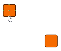
Creating nodes is one of the basic user interactions provided by GraphEditorInputMode. By default, a new node is created when left-clicking or tapping on an empty area in the canvas.
You can disable node creation using GraphEditorInputMode’s allowCreateNode property. Further customization options for node creation are discussed in detail in Creating Nodes.
|
Tip
|
Nodes can also be created with Drag and Drop. |
Creating Edges
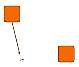
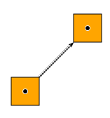
Creating edges is another basic interaction provided by GraphEditorInputMode. By default, when you hover over a node, possible port candidates are highlighted, indicating where edge creation can start.

Starting a drag operation with the left mouse button on a port candidate will initiate edge creation. Releasing the mouse button over another node creates the edge. When using a touch device, edge creation starts similarly: long-press the source node, drag the touch pointer to the target node, and release.
You can introduce bends into the edge during creation by clicking or tapping at an empty location on the canvas. Right-clicking or long-pressing a second touch pointer will undo the most recent bend. If no bends are left, it cancels edge creation.
Unless self-loops are allowed, ending the gesture over the start node will cancel edge creation.
The mouse cursor changes into CreateEdgeInputMode.validBeginCursor (by default a hand cursor) to indicate that dragging the mouse at the current location will start edge creation. By default, releasing the mouse button before the mouse has left the start node will cancel the edge creation gesture.
|
Tip
|
Creating edges is supported by the following auxiliary interaction concepts: |
Pressing Shift ⇧ during edge creation constrains the current edge segment to be orthogonal or diagonal.
You can disable edge creation by disabling the CreateEdgeInputMode via its enabled property or with GraphEditorInputMode’s allowCreateEdge property.
GraphEditorInputMode’s child input mode CreateEdgeInputMode can be customized in various ways. The most common customizations can be done via the following properties:
- CreateEdgeInputMode.allowCreateBend
-
Allows you to disable adding bends during edge creation. Note that to completely disallow creating bends, bend creation for existing edges must also be disabled.
- CreateEdgeInputMode.edgeDefaults
-
Specifies the defaults for newly created edges, most notably their style. This works the same way as setting defaults for new edges on a graph.
- CreateEdgeInputMode.allowSelfLoops
- CreateEdgeInputMode.minimumSelfLoopBendCount
-
Specifies whether self-loops (edges that connect a node to itself) can be created, and the minimum number of bends they must have.
Further customization options for edge creation are discussed in detail in Creating Edges.
Creating Self-Loops
Edges that start and end at the same node are called self-loops. By default, creating self-loops with at least two bends is supported.
minimumSelfLoopBendCount can be set to 0 to allow creating self-loops without bends. If creating self-loops is not
allowed, or if the edge being created has fewer bends than minimumSelfLoopBendCount, ending the edge creation gesture
over the start node will cancel edge creation.
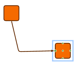
Reconnecting Edges
You can also reconnect created edges to other nodes. When you select an edge, handles for its source and target ports are displayed.
You can reconnect the source or target side of the edge by dragging one of the handles to another node.
Reconnecting Edges describes this in detail.
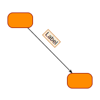
Adding and Editing Labels
GraphEditorInputMode supports adding labels to graph items interactively. The default keyboard shortcut is F2, which opens a text area to add a new label or edit an existing label for the currently selected item. The newly entered text can then be committed using Enter ↵, at which point it becomes the label of the respective item. You can change an existing label with F2 as well. Label editing can be canceled with Esc, in which case either no label is added, or the edited label remains unchanged. To add a new label to items that already have one or more labels, use Shift ⇧+F2. GraphEditorInputMode delegates the actual label editing or adding to its subordinate mode EditLabelInputMode.
GraphEditorInputMode offers several simple ways to customize label editing and adding:
- GraphEditorInputMode.labelEditableItems
-
The types of items for which labels can be edited. This can be either NODE, EDGE, PORT, or a combination of these.
- GraphEditorInputMode.allowAddLabel
-
Specifies whether labels can be added to graph items by pressing Shift ⇧+F2 (or F2 on items that don’t already have labels).
- GraphEditorInputMode.allowEditLabel
-
Specifies whether labels can be edited by pressing F2. When turned off, this also affects adding a label by pressing F2.
- EditLabelInputMode.autoRemoveEmptyLabels
-
Specifies whether labels with empty text are automatically removed. Sometimes labels display more than just their text (e.g., an icon), in which case the empty text may be intentional.
Further customization options for label editing are discussed in detail in Adding and Editing Labels.
Creating Bends
Interactively designing an edge path can be done by creating bends, another of the basic graph structure-related interactions that GraphEditorInputMode provides. Bends can be created during edge creation, but if the edge path after creation isn’t satisfactory, they can also be added later. By default, the gesture to add a bend is to simply press the left mouse button on an edge path and drag. This will split the edge segment at the drag point and introduce a bend that will be placed where the mouse button is released.
You can turn off bend creation on GraphEditorInputMode via its allowCreateBend property.
|
Tip
|
Creating bends is supported by the following auxiliary interaction concepts: |
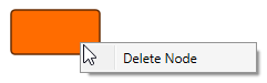
Deleting Items
All items in the graph can not only be created, but also removed. By default, pressing Del will delete selected items. Deleting an item will also delete associated items, such as labels or incident edges when a node is deleted.
GraphEditorInputMode has two properties for easy control of what can be deleted:
- GraphEditorInputMode.deletableItems
-
The types of items that can be deleted. Note that dependent items will be deleted regardless of this setting. For example, incident edges or labels will be deleted when deleting a node, regardless of this setting.
- GraphEditorInputMode.deletablePredicate
-
A predicate that controls which items can be deleted. This allows finer control than simply specifying the item type above.
Further customization options for deleting items are discussed in detail in Deleting Items.
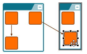
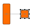
Moving Items
GraphEditorInputMode provides functionality to reposition items by dragging them. By default, you can press the left mouse button on an item that is movable and drag the mouse to the desired location. Releasing the mouse button confirms the item’s new position. Similarly, pressing the left mouse button on a selected item allows you to move all movable selected items simultaneously by dragging the mouse. Releasing the mouse button finalizes the new positions of these items.
Selected items can also be moved using touch gestures by dragging them. Touch support for moving unselected items is disabled by default to prevent conflicts with edge creation gestures. You can configure this by adjusting beginRecognizerTouch; see Moving Items for more details.
GraphEditorInputMode manages item movement through two child input modes:
-
moveUnselectedItemsInputMode: Responsible for moving unselected items.
-
moveSelectedItemsInputMode: Dedicated to moving selected items.
Both input modes are differently configured instances of the MoveInputMode type.
You can define the movable item types separately for selected and unselected items by setting GraphEditorInputMode.movableUnselectedItems and GraphEditorInputMode.movableSelectedItems.
Further customization options for moving items are discussed in detail in Moving Items.
|
Tip
|
Moving items is supported by the following auxiliary interaction concepts:
|
Moving Labels
Moving labels is handled by GraphEditorInputMode's child modes moveUnselectedItemsInputMode and moveSelectedItemsInputMode, similar to other model items. However, labels can only be moved to positions allowed by their label model by default. Free models like FreeNodeLabelModel or SmartEdgeLabelModel support free movement and also support snapping.
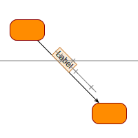
Other label models, such as ExteriorNodeLabelModel, support only distinct positions or provide distinct candidates (e.g., EdgeSegmentLabelModel). The latter can still place labels at supported positions outside the candidates when the Ctrl key is held down.
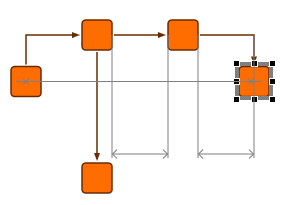
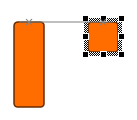
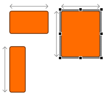
Resizing Nodes
By default, the GraphEditorInputMode displays a set of handles for selected items. For nodes, these are eight handles located on the sides and corners, which you can use to resize the node by dragging them with the mouse.
Since resizing nodes is done via handles, you can adjust the behavior using the GraphEditorInputMode’s showHandleItems property. You can also disable node resizing completely by setting a value that does not include NODE.
graphEditorInputMode.showHandleItems =
GraphItemTypes.ALL & ~GraphItemTypes.NODEYou can further customize the resizing behavior using the GraphEditorInputMode’s child input mode, HandleInputMode, which is discussed in more detail in Resizing Nodes.
|
Tip
|
Resizing nodes is supported by the following auxiliary interaction concepts:
|
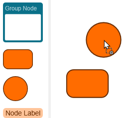
Grouping
Graphs in yFiles for HTML support nesting nodes in so-called group nodes, as described in the introduction to the graph model. GraphEditorInputMode allows you to interactively create and handle these group nodes as well.
By default, you can group selected nodes in a newly created group node by pressing Ctrl+G. You can also remove the selected nodes from a group by pressing Ctrl+U.
|
Note
|
When ungrouping nodes, they will still appear on top of the group node but are no longer part of that group node. This may not be immediately evident because the group node will still be underneath the nodes. However, the difference becomes apparent when you move the nodes afterward. |
You can also resize selected group nodes to fit their contents by pressing Ctrl+Shift ⇧+G. Furthermore, you can move nodes to another group node (or simply out of their current group) by holding the Ctrl key during a drag.
GraphEditorInputMode offers a number of properties to configure grouping features and behavior:
- GraphEditorInputMode.allowGroupingOperations
-
Enables or disables all grouping-related interaction features. You can further configure these features with the properties below. When disabled, the other properties below have no effect.
- GraphEditorInputMode.allowGroupSelection
-
Enables or disables the group selection shortcut Ctrl+G.
- GraphEditorInputMode.allowUngroupSelection
-
Enables or disables the ungroup selection shortcut Ctrl+U.
- GraphEditorInputMode.allowAdjustGroupNodeSize
-
Enables or disables the adjust group node size shortcut Ctrl+Shift ⇧+G.
In addition to these features, you can collapse and expand groups if folding is enabled.
Keyboard Input
Many of the interactive features provided by GraphEditorInputMode can be accessed via keyboard shortcuts, some of which are mentioned in other sections. Central to managing keyboard input is the KeyboardInputMode, which is a child input mode for both GraphEditorInputMode and GraphViewerInputMode. Therefore, the keyboard shortcuts are disabled when the KeyboardInputMode or its parent input mode is disabled. Adding custom shortcuts is discussed in Keyboard Input.
|
Note
|
Assigning a keyboard shortcut to a specific command is accomplished through the configuration in KeyboardInputMode. However, the actual implementation of the command typically lies elsewhere. In many cases, GraphEditorInputMode executes most commands. Consequently, the keyboard shortcuts will only be functional if GraphEditorInputMode is installed and enabled. |
In addition to common keyboard shortcuts like Ctrl+C for copy or Ctrl+Z for undo, yFiles also supports keyboard navigation and selection, which is managed by the child input mode NavigationInputMode within both GraphEditorInputMode and GraphViewerInputMode. This feature enables users to move between nodes using the arrow keys. Shift ⇧+arrow keys can be used to select nodes in a specific direction, while Ctrl+arrow keys are used to move the focus in a particular direction.
A list of the supported keyboard shortcuts is given in List of Keyboard Shortcuts.
Mouse Clicks, Taps, Stylus Clicks
GraphEditorInputMode and GraphViewerInputMode support notifications for left and right mouse or stylus clicks and double clicks, as well as taps and double taps on items. This support is a convenience extension built on top of the lower-level events provided by ClickInputMode. ClickInputMode, however, can still be useful if you want to handle clicks and taps regardless of whether they happen on an item or not.
|
Tip
|
yFiles for HTML supports different pointer types: mouse, touch, and stylus. Unless stated otherwise, this documentation applies to all three types. For better readability, the term "click" includes mouse and stylus clicks as well as touch taps. Similarly, the term "left button" refers to the left mouse button, the primary touch device, or a stylus contact. |
|
Tip
|
There are no special events on GraphEditorInputMode, GraphViewerInputMode, or ClickInputMode which report middle mouse clicks. Instead, you have to use the clicked, item-clicked, or item-double-clicked event and check by means of its arguments if the middle button triggered the event. |
Both GraphEditorInputMode and GraphViewerInputMode handle clicks on items in the same way. If an item is clicked, it will be focused and selected, in that order. The behavior of clicks can be adjusted with a few properties on either GraphEditorInputMode or GraphViewerInputMode, and their child input mode ClickInputMode:
- GraphViewerInputMode.clickableItems
- GraphEditorInputMode.clickableItems
-
The type of items that should be clickable. If an item is not clickable, no events will be raised for that item, and no default actions (focus and selection) will be taken.
- ClickInputMode.clickReportingPolicy
-
How single clicks are reported when they are part of a double click. By default, two single-click events, followed by a double-click event, are raised.
Since clicking and selection are closely related, the properties that relate to both clicking and selection are discussed in Selection.
Further customization options for click handling are discussed in detail in Pointer Handling.
There are also other more complex gestures with touch input, such as:
-
Create edges via long press on a node and then drag.
-
With the same gesture, you can create bends on an edge.
-
Panning and pinch/stretch zooming the viewport.
-
Long press and drag on an empty canvas invokes the marquee selection.
Selection
GraphComponent manages a set of selected items, as described in Selection, Focus, and Highlight. Both GraphEditorInputMode and GraphViewerInputMode offer support for interactively managing this selection. Selected items are used for many commands and interactions, such as clipboard commands or deleting items.
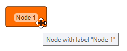
Items can be selected in both GraphEditorInputMode and GraphViewerInputMode by simply left-clicking them. Selected items are highlighted with an item-specific selection indicator (for example, a rectangle around a selected node).
|
Tip
|
When using a touch device, tapping on the device is equivalent to left-clicking with regards to selection. This means that in the following section, everything that is described as working with clicking will also work with tapping. Similarly, when using a stylus, the left click usually is equivalent to the stylus contact, i.e., pressing the tip on the surface. For better readability, the term "click" includes taps and stylus clicks as well. |
Selection in general, and click selection in particular, can be configured on GraphEditorInputMode and GraphViewerInputMode with these properties:
- GraphViewerInputMode.selectableItems
- GraphEditorInputMode.selectableItems
-
The types of items that can be selected (via any method).
- GraphViewerInputMode.selectablePredicate
- GraphEditorInputMode.selectablePredicate
-
A predicate that controls what items can be selected. This allows finer control than just the item type above.
- GraphViewerInputMode.clickSelectableItems
- GraphEditorInputMode.clickSelectableItems
-
The types of items that can be selected by clicking them.
|
Note
|
clickSelectableItems can only constrain selectableItems further. |
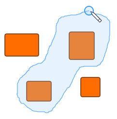
Multiple items can easily be selected at once with marquee selection or lasso selection. Both selection modes work by holding the left mouse button on an empty canvas area and dragging the mouse, or long-pressing and dragging using touch devices. Marquee selection will show a rectangular area in which all items will be selected when the mouse button or touch pointer is released. Lasso selection will show a freehand path within which all items will be selected when the mouse button or touch pointer is released.
There is also a shortcut for selecting all items, Ctrl+A, as well as for deselecting all items, Ctrl+Shift ⇧+A.
Lasso selection is disabled by default in favor of marquee selection. However, you can simply enable the lassoSelectionInputMode on GraphViewerInputMode or GraphEditorInputMode. By default, lasso selection takes precedence over marquee selection (via the respective priorities of the input modes), so enabling the lassoSelectionInputMode is enough to switch from marquee to lasso selection.
marqueeSelectableItems is an additional property that specifically controls what items can be selected by marquee or lasso selection.
You can customize marquee and lasso selection on GraphViewerInputMode and GraphEditorInputMode and their child input modes MarqueeSelectionInputMode and LassoSelectionInputMode:
- GraphViewerInputMode.marqueeSelectableItems
- GraphEditorInputMode.marqueeSelectableItems
-
The types of items that can be selected via marquee or lasso selection.
- MarqueeSelectionInputMode.marqueeCursor
-
The mouse cursor to use during the marquee selection gesture.
- MarqueeSelectionInputMode.beginRecognizer
- MarqueeSelectionInputMode.beginRecognizerTouch
-
Changes the interaction to start marquee selection.
- LassoSelectionInputMode.lassoCursor
-
The mouse cursor to use during the lasso selection gesture.
- LassoSelectionInputMode.validEndCursor
-
The mouse cursor to use when hovering over the end point for the gesture (by default this is where the gesture started).
- LassoSelectionInputMode.beginRecognizer
- LassoSelectionInputMode.beginRecognizerTouch
-
Changes the interaction to start lasso selection.
- LassoSelectionInputMode.finishRadius
-
The radius around the start location where the lasso selection can be finished. If
0(the default), the gesture may end anywhere.
|
Tip
|
Marquee and lasso selection are available in GraphViewerInputMode, but disabled by default. You can enable either by setting the enabled property on GraphViewerInputMode’s marqueeSelectionInputMode or lassoSelectionInputMode. When enabled, both use Shift ⇧+drag as their default gesture to not clash with panning. |
To select multiple items with more than one selection gesture, you can hold down the Ctrl key. Newly selected items will then be added to the selection instead of replacing it. This works with all selection interactions, be it click, marquee, or lasso selection.
Click selection also offers two other features: detail selection and cyclic selection. Detail selection can be used to explicitly select the topmost item under the mouse pointer, regardless of the current hit testing order. For example, by default, when clicking a node, the node will be selected, even when clicking on its label that is on top of the node. With detail selection, which by default uses Shift ⇧+click, you can select the label when clicking it.
|
Note
|
The clickHitTestOrder and doubleClickHitTestOrder properties determine, by means of the item type, which one will be considered when clicked or double-clicked if there are multiple items at a given location. |
Cyclic selection, on the other hand, allows you to cycle through all possible hits at the click location by pressing the Alt key during the click. So, to stay with our example of a single node with a label on top of it, performing cyclic selection will first select the node, and Alt-clicking the same location again will select the label. Now, if the node was in a group node, the selection order with cyclic selection would be node, group node, label, because the group node is below its child node and thus also exists at the click location.
Further customization options for click selection, as well as marquee and lasso selection, are discussed in Selection. How the selection indicator’s visualization can be customized is explained in Styling Selection, Focus, and Highlight.
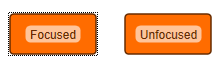
Focus
Similar to selection, there is also the concept of a focused item. This item, usually a node, is shown with a dotted border and in many cases is also selected at the same time. Like selection, this focused item is supported by both GraphEditorInputMode and GraphViewerInputMode
The focused item is represented by GraphComponent’s currentItem property and is changed by clicking on a node or creating a new node by clicking on the canvas.
The focus indicator can serve two main purposes:
-
It can be used to highlight a single item. For example, in applications where the graph can’t be edited, a single node can be selected to display further information.
-
The other purpose is selecting nodes one by one using the keyboard.
The focus indicator can be moved by holding the Ctrl key and pressing an arrow key. Pressing Ctrl+Space will then select or deselect the focused node. This works similarly to selecting files in many graphical file managers, e.g., Windows Explorer.
|
Note
|
Per default, the focus indicator is only displayed when the focus was changed via keyboard. This behavior can be changed on the GraphComponent.focusIndicatorManager by changing the showFocusPolicy. |
You can control what items can be focused interactively by changing the focusableItems property. To disable focusing an item completely, this property can be set to NONE.
How the focus indicator’s visualization can be customized is explained in Styling Selection, Focus, and Highlight.
Tooltips
Tooltips are small text snippets that appear when you hover the mouse pointer over a control. Usually, they provide a more detailed explanation of the control’s function. yFiles for HTML supports tooltips for all graph items using both GraphEditorInputMode and GraphViewerInputMode.
For detailed information on how to configure and set up tooltips, see Tooltips.
Context Menus
Right-clicking or long tapping on an item can display a context menu with both GraphEditorInputMode and GraphViewerInputMode. A different context menu can also be displayed when the context menu is requested on an empty canvas area.
The configuration and setup of context menus are discussed in detail in Context Menus.
Drag and Drop
GraphEditorInputMode also supports drag-and-drop gestures; more specifically, it supports the drop part of the gesture. Drag and drop enables you to create applications that use a “palette” of items, which can be dragged onto the canvas to create graph items.
You can drag elements from within the HTML document into a GraphComponent and drop them there. For nodes, labels, and ports, this is handled by GraphEditorInputMode's child input modes NodeDropInputMode, LabelDropInputMode, and PortDropInputMode, respectively. Since drag-and-drop functionality is usually different for each application (if needed at all), this mode is disabled by default.
With startDrag arbitrary HTML elements can be registered for a drag operation. By default, when the drag operation ends on a GraphComponent, a new node will be created that is a copy of the dragged node.
This feature highly depends on the application implementation and requirements, so any further configuration and customization (including how to drag and drop your own data) is discussed in detail in Drag and Drop.
Clipboard
GraphEditorInputMode supports the standard clipboard commands: Copy, Cut, and Paste. GraphViewerInputMode, on the other hand, only supports Copy (as it cannot alter the graph). These commands also have standard shortcuts:
| Command | Shortcuts |
|---|---|
Copy |
Ctrl+C, Ctrl+Ins |
Cut |
Ctrl+X, Shift ⇧+Del |
Paste |
Ctrl+V, Shift ⇧+Ins |
The Copy and Cut operations apply to the selected items. Cut can be considered a combination of Copy and Delete. This has some implications. For example, when cutting a node that has incident edges, only the selected node will end up in the clipboard. However, because cutting deletes the item from the graph, the connected edges will simply be removed.
There is another command, Duplicate, which can be considered a combined Copy-Paste command, except it doesn’t modify the clipboard. You can duplicate the selected items by pressing Ctrl+D. Because this is also a clipboard operation, the cases described above apply. For example, consider duplicating an edge with only one connected node.
GraphViewerInputMode and GraphEditorInputMode provide easy customizations for the clipboard:
- GraphViewerInputMode.allowClipboardOperations
-
Enables or disables copying items.
- GraphEditorInputMode.allowClipboardOperations
-
Enables or disables support for Cut, Copy, Paste, and Duplicate.
- GraphEditorInputMode.allowPaste
-
Enables or disables pasting items.
- GraphEditorInputMode.pasteSelectableItems
-
The types of items that should be selected after pasting.
- GraphEditorInputMode.allowDuplicate
-
Enables or disables duplicating items.
The GraphClipboard class offers further options:
- GraphClipboard.copyItems
-
The types of items that can be copied and pasted.
- GraphClipboard.pasteOffsetIncrement
-
The geometric offset between the mouse location and the location where the items should be pasted.
You can extensively customize the clipboard in nearly all aspects, which is described in Clipboard.
Undo and Redo
yFiles for HTML provides full support for undoing and redoing graph modifications. Any change made to a graph can be undone. These modifications can range from single actions, such as adding a node, to composite actions where multiple items change at once, such as moving several items. The number of undoable operations is limited only by the available memory.
Keyboard shortcuts for Undo and Redo are provided by GraphEditorInputMode. The default shortcut for Undo is Ctrl+Z, and for Redo it is Ctrl+Y.
Undo and Redo support is disabled by default. To enable it, use the undoEngineEnabled property on the graph:
graph.undoEngineEnabled = trueUndo and Redo support in GraphEditorInputMode becomes automatically available when the underlying graph supports it. You can disable this using the allowUndoOperations property.
|
Tip
|
Changes that can be undone include both interactive and programmatic changes. This is useful when you create custom interactions that modify the graph, because the user can undo these actions in the same way as interactive changes. |
You can extend Undo and Redo support to your own operations or data, and customize it extensively. Details are described in Undo and Redo.
If you are working with Folding, also see the undo section in the folding chapter.
Snapping
When creating, moving, or resizing elements, snapping can provide snap references that capture the mouse pointer when near them. This makes it easier to align items or ensure nodes share the same size.
Snapping is not enabled by default. To enable snapping, set the
enabled property
on GraphEditorInputMode’s snapContext property to true:
graphEditorInputMode.snapContext.enabled = trueSnapping is supported by the following interactions:
There are several different snap references, some of which are only active with certain interactions:
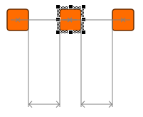
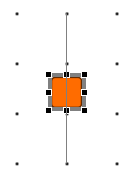
Border and center snap lines
These snap lines appear at the borders and centers of nodes. They make it easy to align the centers or a specific border of several nodes when moving or resizing them. Labels will also snap to these snap lines for label models that allow free movement.
Same size snap references
These snap references appear while resizing nodes when the width or height of the resized node matches the width or height of another node.
Same distance snap lines
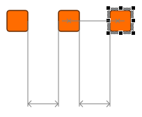
These snap lines appear when moving nodes. They indicate that the distance between the moved node and an adjacent node matches the distance between two other nodes on the same line. This makes it easier to create graphs that look regular without configuring a grid.
Grid snapping
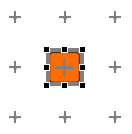
yFiles for HTML also supports a grid, which enables snapping items to points at regular intervals. Grid snapping works for moving or resizing nodes, creating edges, and adding and moving bends.
Grid snapping must be explicitly enabled by creating a suitable GridInfo object and activating grid snapping for various items on the GraphSnapContext:
const gridInfo = new GridInfo()
snapContext.nodeGridConstraintProvider = new GridConstraintProvider(
  gridInfo
)
snapContext.bendGridConstraintProvider = new GridConstraintProvider(
  gridInfo
)
snapContext.portGridConstraintProvider = new GridConstraintProvider(
  gridInfo
)Enabling grid snapping does not mean that the GraphComponent displays a grid visualization. You must enable that separately:
const renderTree = graphComponent.renderTree
renderTree.createElement(
  renderTree.backgroundGroup,
  gridInfo,
  new GridRenderer()
)Octilinear Direction
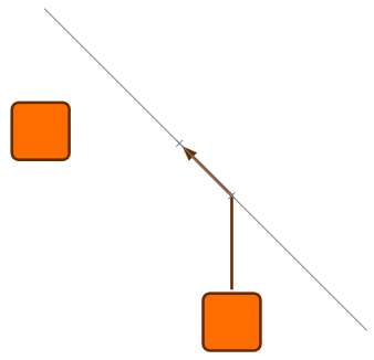
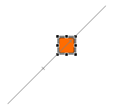
Some input gestures, like moving items or creating new edges, support a mode to constrain the direction. This mode can be enabled by pressing the Shift ⇧ key during the gesture.
When creating an edge, this constrains the current segment to be octilinear (orthogonal or diagonal).
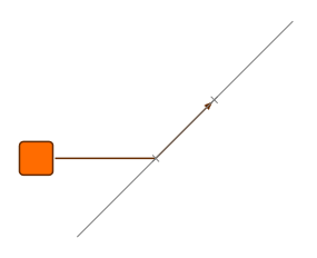
When moving items, this constrains the move gesture to octilinear lines relative to the original location.
|
Note
|
The directional constraint modes for the input gestures are active by default when Shift ⇧ is pressed. The GraphSnapContext does not need to be enabled first. |
How to configure and customize snapping is described in detail in Snapping.
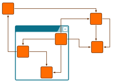
Orthogonal Edge Editing
Orthogonal edge editing is a feature in GraphEditorInputMode that constrains edge paths to only have right angles. While snapping can help to create and maintain orthogonal edge paths, doing so manually can be time-consuming and require unnecessary effort. yFiles for HTML offers integrated support for most editing gestures to keep edges orthogonal. (Note that this doesn’t mean that it’s a decision between snapping or orthogonal edge editing — both features work very well together.)
Orthogonal edge editing is enabled by default but only applies to edges whose style supports it. The
PolylineEdgeStyle supports orthogonal editing, but the feature has to be
enabled by setting its orthogonalEditing property to true:
graph.setStyle(edge, new PolylineEdgeStyle({ orthogonalEditing: true }))To enable orthogonal edge editing for all edge styles supporting orthogonal edge paths, a fallbackEdgeHelperProvider can be set on GraphEditorInputMode.orthogonalEdgeEditingContext that provides a suitable helper.
geim.orthogonalEdgeEditingContext.fallbackEdgeHelperProvider = (edge) =>
new OrthogonalEdgeHelper(edge)For more options, refer to Orthogonal Edge Editing.
|
Note
|
Orthogonal edge editing is an interactive feature that affects interactive creation and modification of graph elements. If you instead want to programmatically make all edges in a graph orthogonal, use an edge routing algorithm. Of course, the two features can both be used in the same application without a problem. |
Orthogonal edge editing modifies interactions so that edges stay orthogonal:
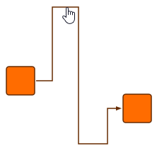
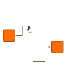
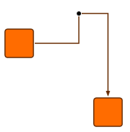
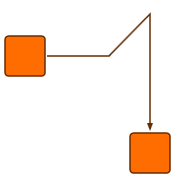
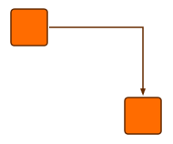
Edge creation now only creates orthogonal edges. When starting an edge creation gesture, the initial direction of the mouse movement determines the direction of the first edge segment. If the mouse pointer is not moved exactly orthogonally, a bend will also be shown so that the edge ends at the mouse pointer. Since the first segment direction might not always be correct initially, you can press Space to toggle between the two possible orientations as long as no explicit bend has been created yet.
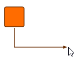
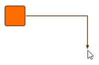
Adding bends during edge creation is still done with the same gesture. However, implicit bends are also added whenever the current edge segment would not be orthogonal (as shown in the figures above).
Creating bends works differently when using orthogonal edge editing. Normally, when creating a bend the gesture will create a bend. However, with orthogonal edge editing this would always destroy the edge’s orthogonality. Think of bend creation with orthogonal edge editing as moving edge segments.
In the case of the first or last edge segment, the segment cannot move. Instead, part of that segment is split off when dragging:
When dragging a segment so it coincides with another segment (essentially the reverse of the situation shown above), the bends that lie on straight line segments will automatically be removed. This is easier to achieve with snapping.
Deleting bends has special support to keep edges orthogonal by also removing one or two adjacent bends. This can be turned off individually with GraphEditorInputMode’s orthogonalBendRemoval property.
Moving items, most notably nodes, will also keep edges orthogonal. When nodes are moved, an incident segment and bend will move with them to keep that segment orthogonal. If there is no adjacent bend, the edge will be broken up in a similar way as when dragging the edge segment itself.

When bends are moved, their incident edge segments will stay orthogonal as well by moving adjacent bends appropriately. If an incident segment is the first or last segment, it will be broken up in a similar manner to moving that segment.
Resizing nodes acts very similar to moving nodes because the end points of incident edges change in a very similar way.