Label Styles
Similar to other graph items, the way labels are rendered is determined by their style. Depending on the style, labels can have custom colors for text and background, different fonts, and custom paddings.

Note that the position, angle, and size of a label are determined by its label model parameter. However, since the style determines how to render the label, the style can be asked for a preferred size. The size can be set as the label’s preferredSize.
const size = label.style.renderer.getPreferredSize(label, label.style)
graph.setLabelPreferredSize(label, size)This is done automatically when a label is added or a new style is set. Note that it is up to the label model parameter whether the preferred size is respected, though.
Default Label Style
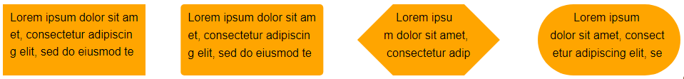
The LabelStyle is a versatile style for rendering labels. It allows you to set the text color, font, and font size. Furthermore, it supports various text alignments and wrapping options. It also supports rendering a background with different border strokes, background colors, and background shapes.
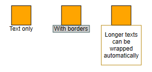
const node1 = graph.createNode([0, 0, 40, 40])
const node2 = graph.createNode([100, 0, 40, 40])
const node3 = graph.createNode([200, 0, 40, 40])

graph.addLabel(
  node1,
  'Text only',
  ExteriorNodeLabelModel.BOTTOM,
  new LabelStyle()
)

graph.addLabel(
  node2,
  'With borders',
  ExteriorNodeLabelModel.BOTTOM,
  new LabelStyle({
    backgroundStroke: 'darkslategray',
    backgroundFill: 'lightgray',
    shape: 'rectangle',
    padding: [2, 0, 2, 0]
  })
)

graph.addLabel(
  node3,
  'Longer texts can be wrapped automatically',
  ExteriorNodeLabelModel.BOTTOM,
  new LabelStyle({
    backgroundStroke: 'darkgoldenrod',
    backgroundFill: 'white',
    shape: 'rectangle',
    padding: [2, 0, 2, 0],
    verticalTextAlignment: 'center',
    horizontalTextAlignment: 'center'
  }),
  new Size(80, 80)
)Text Rendering Options
LabelStyle offers a number of properties to determine the text rendering. The most important ones are font, textSize, and textFill which define the font, its size, and its text color.
The properties horizontalTextAlignment and verticalTextAlignment define the horizontal and vertical position of the text within the label bounds.
Background Rendering Options
The label can be rendered with a background. The backgroundFill and
backgroundStroke determine the color of the background
and the color and thickness of the border, respectively.
Both values can be null.
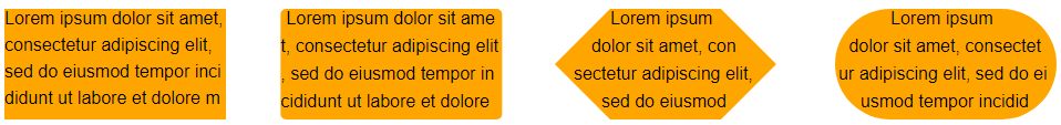
By default, the label background has a rectangular shape. You can change the shape using the shape property. Supported values are RECTANGLE, ROUND_RECTANGLE, PILL, HEXAGON, and SQUIRCLE.
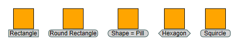
Note that the irregular shapes are sized so that their bounding box fits the overall layout of the label. As a consequence, you must define padding; otherwise, the text will overlap the borders.
CSS Classes
Defining cssClass implicitly provides the following CSS classes as well:
yfiles-label-text-
CSS class on the text container element which is either a
<text>element or an<g>element in case of right-to-left text rendering. yfiles-label-background-
CSS class on the label’s background element that is created if backgroundStroke or backgroundFill is defined.
You can find more general information about CSS item styling with yFiles for HTML in CSS Item Styles.
Padding and Size
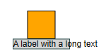
With LabelStyle it is possible to define padding. This adds space between the border and the text, which often increases readability, especially with a visible border or an irregular shape. Note how in the figure below the text overlaps with the hexagon border (middle).
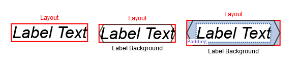
|
Note
|
If wrapping is used, the textWrappingShape and textWrappingPadding are considered. If TextWrappingShape.LABEL_SHAPE is used, the text is wrapped inside the shape, and those overlaps are avoided as well, so the textWrappingPadding is better suited to keep distance between the text and the label background border. |
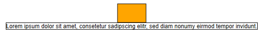
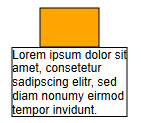
Although the label size is calculated to fit the text, it is sometimes useful to define a minimumSize or maximumSize. That way, you can avoid oddly looking short or exceedingly long labels.
For instance, by choosing maximumSize and enabling text wrapping, a long text can be automatically wrapped to fit a given width.
Text Wrapping and Clipping
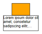
By default, the label size is calculated to fit the text. The text is rendered respecting line breaks if there are any; otherwise, it is rendered as one single line. For given sizes, wrapping defines whether the text is wrapped or not. By default, wrapping is enabled.

If the text doesn’t fit into the given layout, the wrapping determines how the text is trimmed, e.g., whether the trimming is indicated by ellipsis.
Wrapping affects all but the last line and determines whether a line may be wrapped at any character inside a word (WRAP_CHARACTER / WRAP_CHARACTER_ELLIPSIS) or just between words (WRAP_WORD / WRAP_WORD_ELLIPSIS).
Trimming only affects the last line and determines whether skipped text, that doesn’t fit into the last line, is indicated by ellipsis (TRIM_CHARACTER_ELLIPSIS / TRIM_WORD_ELLIPSIS) or not (TRIM_CHARACTER / TRIM_WORD).

TextWrapping.CLIP enforces clipping at the label bounds. Other than trimming, it might cut in the middle of a character.

The textWrappingShape determines whether wrapping should keep the text inside the rectangular label bounds or inside one of several other predefined shapes that are fit into the label bounds.
The default value TextWrappingShape.RECTANGLE ignores the shape of the background and keeps the text inside rectangular bounds.
If TextWrappingShape.LABEL_SHAPE is used, it considers the shape of the background and keeps the text inside this shape.
An additional padding between the shape and the text can be specified by LabelStyle.textWrappingPadding.
10The remaining TextWrappingShape values correspond to the ShapeNodeShape values with the same name that are used by the ShapeNodeStyle. This means that for matching label and node layouts, matching TextWrappingShape and ShapeNodeShape can be used so that the node shape can be exactly filled with text. The easiest way to use matching layouts is to use an StretchNodeLabelModel.CENTER.
The following sample code creates two nodes with different shapes with matching labels, which results in the graph below:
const nodePill = graph.createNode(
  new Rect(0, 0, 300, 200),
  new ShapeNodeStyle({
    shape: ShapeNodeShape.PILL,
    fill: Color.ORANGE,
    stroke: Stroke.BLACK
  })
)
graph.addLabel(
  nodePill,
  longText,
  StretchNodeLabelModel.CENTER,
  new LabelStyle({
    font,
    wrapping: 'wrap-character',
    shape: LabelShape.PILL
  })
)

const nodeHexagon = graph.createNode(
  new Rect(400, 0, 300, 200),
  new ShapeNodeStyle({
    shape: ShapeNodeShape.HEXAGON,
    fill: Color.ORANGE,
    stroke: Stroke.BLACK
  })
)
graph.addLabel(
  nodeHexagon,
  longText,
  StretchNodeLabelModel.CENTER,
  new LabelStyle({
    font,
    wrapping: 'wrap-character',
    shape: LabelShape.HEXAGON
  })
)

graph.createEdge(nodePill, nodeHexagon)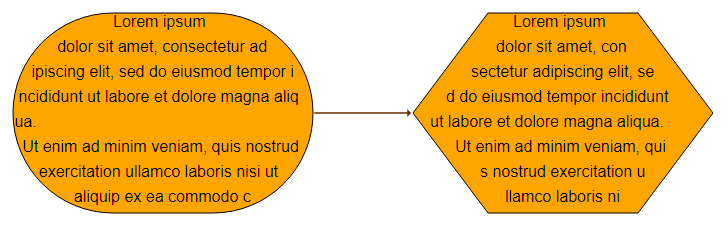
Text Flipping
Labels can be freely rotated, e.g., edge labels which are rendered along the edge. For rotated labels, it might happen that the text is upside-down, making it hard to read. If autoFlip is enabled, the label will be turned by 180 degrees in these case, making it readable again.
false
trueIconLabelStyle
The IconLabelStyle can decorate a label with an icon from a href. The actual label is rendered using a wrappedStyle.
The property href determines the URL of the icon to render, while the icon size is defined in iconSize. Note that iconSize always has to be set to the icon’s size; otherwise, the icon will not be rendered.
// add a label with an empty text and
// an IconLabelStyle with IconPlacement = InteriorNodeLabelModel.CENTER
const iconStyleCenter = new IconLabelStyle({
  href: 'icon.svg',
  iconSize: new Size(16, 16),
  iconPlacement: InteriorNodeLabelModel.CENTER
})
graph.addLabel(
  node,
  ' ',
  ExteriorNodeLabelModel.BOTTOM,
  iconStyleCenter
)const iconStyleWest = new IconLabelStyle({
href: 'icon.svg',
iconSize: new Size(16, 16),
iconPlacement: ExteriorNodeLabelModel.LEFT
})
graph.addLabel(
node,
'Label Text',
ExteriorNodeLabelModel.BOTTOM,
iconStyleWest
)The IconLabelStyle delegates the rendering of the label text and background to a wrapped label style. By default, the wrapped style is a LabelStyle with its default settings, as shown in the middle example in the above image. The rightmost example wraps a LabelStyle with a black border and gray background.
const iconStyle = new IconLabelStyle({
  href: 'icon.svg',
  iconSize: new Size(16, 16),
  wrappedStyle: new LabelStyle({
    backgroundFill: '#eee',
    backgroundStroke: 'black',
    padding: new Insets(19, 5, 5, 5)
  }),
  iconPlacement: new InteriorNodeLabelModel({
    padding: 3
  }).createParameter('left')
})
graph.addLabel(
  node,
  'Label Text',
  ExteriorNodeLabelModel.BOTTOM,
  iconStyle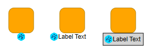
)The position of the icon relative to the label text is determined by property iconPlacement, which takes an ILabelModelParameter. The position of the icon relative to the label bounds is determined in the same way the label model determines the label position relative to the label’s owner node’s bounds. Therefore, the label model has to be suitable for nodes. InteriorNodeLabelModel and ExteriorNodeLabelModel cover the most common positions.
With ExteriorNodeLabelModel (left in the image above), the icon is placed outside the label bounds and is not considered for the label placement. See the differences between the left and the middle example in the image above.
const exteriorStyle = new IconLabelStyle({
  href: 'icon.svg',
  iconSize: new Size(16, 16),
  iconPlacement: ExteriorNodeLabelModel.LEFT,
  wrappedStyle: new LabelStyle({ backgroundStroke: Stroke.LIGHT_GRAY })
})
graph.addLabel(
  node,
  'Label Text',
  ExteriorNodeLabelModel.BOTTOM,
  exteriorStyle
)Note that InteriorNodeLabelModel places the icon inside the label bounds. To avoid the icon overlapping the label text, you have to define padding. wrappedStylePadding lets the wrappedStyle respect this padding, as seen in the middle example of the image above: the overall label with the icon is centered below the node. The rendering of the wrappedStyle, illustrated by a light gray border, is placed to the right of the icon.
const interiorStyle = new IconLabelStyle({
  href: 'icon.svg',
  iconSize: new Size(16, 16),
  iconPlacement: InteriorNodeLabelModel.LEFT,
  wrappedStylePadding: new Insets(0, 0, 0, 20),
  wrappedStyle: new LabelStyle({ backgroundStroke: Stroke.LIGHT_GRAY })
})
graph.addLabel(
  node,
  'Label Text',
  ExteriorNodeLabelModel.BOTTOM,
  interiorStyle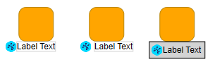
)Alternatively, the padding can be defined on the wrapped style (see right example in the image above). That way, the wrappedStyle can render its border around the icon.
const iconStyle = new IconLabelStyle({
  href: 'icon.svg',
  iconSize: new Size(16, 16),
  wrappedStyle: new LabelStyle({
    backgroundFill: '#eee',
    backgroundStroke: 'black',
    padding: new Insets(19, 5, 5, 5)
  }),
  iconPlacement: new InteriorNodeLabelModel({
    padding: 3
  }).createParameter('left')
})
graph.addLabel(
  node,
  'Label Text',
  ExteriorNodeLabelModel.BOTTOM,
  iconStyle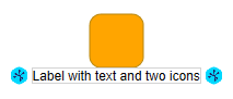
)For multiple icons in one label, an IconLabelStyle can be nested into another with wrappedStyle.
const iconStyleNested = new IconLabelStyle({
  href: 'icon.svg',
  iconSize: new Size(16, 16),
  iconPlacement: InteriorNodeLabelModel.LEFT,
  wrappedStylePadding: new Insets(0, 0, 0, 20),
  wrappedStyle: new IconLabelStyle({
    href: 'icon.svg',
    iconSize: new Size(16, 16),
    iconPlacement: InteriorNodeLabelModel.RIGHT,
    wrappedStylePadding: new Insets(0, 20, 0, 0),
    wrappedStyle: new LabelStyle({
      backgroundStroke: Stroke.LIGHT_GRAY
    })
  })
})
graph.addLabel(
  node,
  'Label with text and two icons',
  ExteriorNodeLabelModel.BOTTOM,
  iconStyleNested
)
Using a node style as label background
yFiles for HTML provides a large number of styles for rendering nodes. The NodeStyleLabelStyleAdapter class enables the use of these styles to visualize the background of a label. The label text is visualized using a label style, which can be accessed using the labelStyle property of the NodeStyleLabelStyleAdapter class.
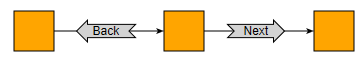
graph.addLabel({
  owner: edge1,
  text: 'Back',
  style: new NodeStyleLabelStyleAdapter({
    labelStylePadding: new Insets(4, 16, 4, 16),
    nodeStyle: new ArrowNodeStyle({
      fill: 'lightgray',
      shape: 'notched-arrow',
      shaftRatio: 0.6,
      direction: 'left'
    })
  })
})

graph.addLabel({
  owner: edge2,
  text: 'Next',
  style: new NodeStyleLabelStyleAdapter({
    labelStylePadding: new Insets(4, 16, 4, 16),
    nodeStyle: new ArrowNodeStyle({
      fill: 'lightgray',
      shape: 'notched-arrow',
      shaftRatio: 0.6,
      direction: 'right'
    })
  })
})Custom Styles
yFiles for HTML offers an abstract style implementation, the LabelStyleBase<TVisual>. Creating custom styles using this class as a base class is discussed in detail in Customizing Styles.
Invisible Labels
The ILabelStyle.VOID_LABEL_STYLE can be used to make a label invisible while still maintaining the label’s presence in the graph. Additionally, the label will not respond to user interactions, such as mouse clicks.
graph.setStyle(invisibleLabel, ILabelStyle.VOID_LABEL_STYLE)