Themes
In yFiles for HTML, CSS properties are used to define the overall look and feel of the interaction visualizations.
The themes use the following three custom CSS properties to define the main colors used in different combinations by the visualizations: --yfiles-theme-primary, --yfiles-theme-secondary, and --yfiles-theme-background.
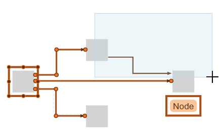
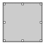
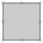
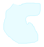
In the following figure, the primary color (orange) and the background color (dark orange) are used in different combinations for node, edge, and label selection, as well as for the handles. The secondary color (light blue) is used for the marquee rectangle.
The --yfiles-theme-variant property determines when and how those colors are used, and also defines the general visualization style. The following theme variants are available:
| Theme Variant | Description |
|---|---|
|
The simple round variant uses a more simplistic styling with round shapes and hairline indicators. |
|
The round hatched variant uses a simplistic styling with round shapes and a hatched selection indicator. |
|
The simple square variant uses a more simplistic styling with rectangular shapes and hairline indicators. |
|
The square hatched variant uses a simplistic styling with rectangular shapes and a hatched selection indicator. |
The theme’s --yfiles-theme-scale property is independent of the variant and is used as a factor to scale the size of IHandles and IPortCandidates.
The theme’s --yfiles-theme-handle-offset property adjusts the reshape handle position independently of the variant. A value of zero centers the handles on the outline, while a positive value moves them outwards, and a negative value moves them inwards.
Using a Custom Theme
You can easily use a custom theme by setting the appropriate CSS properties.
// set a new Theme using the round variant,and orange and blue colors
graphComponent.htmlElement.style.setProperty(
  '--yfiles-theme-variant',
  'round'
)
graphComponent.htmlElement.style.setProperty(
  '--yfiles-theme-primary',
  '#ff6c00'
)
graphComponent.htmlElement.style.setProperty(
  '--yfiles-theme-secondary',
  '#b5dcee'
)
graphComponent.htmlElement.style.setProperty(
  '--yfiles-theme-background',
  '#662b00'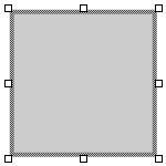
)Setting this custom theme results in the following visualization:
|
Note
|
You should set a custom theme before using the GraphComponent (for example, immediately after instantiating it). |
Selection
Table Theme Variants of selection shows how selected items are visualized, depending on the --yfiles-theme-variant. The example figures use an orange primary color, a light blue secondary color, and a dark orange background color.
Selected Item |
|
|
|
INode |
A rectangle with a stroke using the |
A rectangle with a hatched indicator using the |
|
|
|
||
IEdge |
Edge path with a stroke using the |
Edge path with a hatched indicator using the |
|
|
|
||
IBends |
Circle filled with |
Diamond filled with |
Diamond filled with |
|
|
|
|
ILabel |
A rectangle with a stroke using the |
A rectangle with a hatched indicator using the |
|
|
|
||
IPort |
A circle filled with the |
||
|
|||
IStripe |
A rectangle with a semi-transparent fill using the |
||
|
|||


Focus
The focus visualizations for nodes and edges in the currentItem use a dashed stroke with the --yfiles-theme-primary color.
In the example figures below, the primary color is orange:


Highlight
Table Theme Variants of highlight shows the visualization used for highlighted items, depending on the --yfiles-theme-variant. In the example figures, an orange primary color, a light blue secondary color, and a dark blue background color are used.
Highlighted Item |
|
|
INode |
A rectangle with a stroke using the |
A rectangle with a hatched indicator using the |
|
|
|
IEdge |
Edge path with a stroke using the |
Edge path with a dotted hatched indicator using the |
|
|
|
ILabel |
A rectangle with a stroke using the |
A rectangle with a hatched indicator using the |
|
|
|
IStripe |
A rectangle with a stroke using the |
A rectangle with a hatched indicator using the |
|
|


Lasso and Marquee
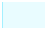
The visualizations of the current selection region for the LassoSelectionInputMode and MarqueeSelectionInputMode use an outline and a semi-transparent fill. The outline uses the color defined by the CSS variable --yfiles-theme-secondary, and the fill uses a semi-transparent version of the same color.
A light blue primary color is used in the example figures below:
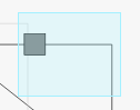
Overview
The visualizations of the viewport of the GraphOverviewComponent use an outline in --yfiles-theme-secondary and a half-transparent fill using the --yfiles-theme-secondary color.
A light blue primary color is used in the example figure below:
Handles
Table Theme Variants of handles shows the handle visualization used for each HandleType based on the --yfiles-theme-variant. The example figures use an orange primary color, light blue secondary color, and dark blue background color, with a scale of 4.
|
|
|
A circle filled with the |
A square filled with the |
|
|
|
|
A square filled with the |
A circle filled with the |
|
|
|
|
A square filled with the |
A circle filled with the |
|
|
|
|
RESIZE, RESIZE_TOP_LEFT, RESIZE_TOP, RESIZE_TOP_RIGHT, RESIZE_LEFT, RESIZE_RIGHT, RESIZE_BOTTOM_LEFT, RESIZE_BOTTOM, RESIZE_BOTTOM_RIGHT |
A circle filled with the |
A square filled with the |
|
|
|
A circle filled with the |
||
|
||
A square filled with the |
||
|
||
A double-circle filled with the |
||
|
||
A double-square filled with the |
||
|
||
A double-circle filled with the |
||
|
||
A double-square filled with the |
||
|
||
No visualization |
||
Label Candidates
When dragging an ILabel to a different location provided by its ILabelModel using the MoveInputMode, the possible label location candidates are visualized. For the candidate that would currently be chosen, the visualization depends on the chosen visualization of the LabelPositionHandler in use. The default is PLACEHOLDER, which uses a preview of the label style. When GHOST is set, the theme colors come into play.
Table Theme Variants of Label Candidates shows how label candidates are visualized depending on the --yfiles-theme-variant. The example figures use an orange primary color, light blue secondary color, and dark blue background color.
Label Candidate |
|
|
Non-highlighted Candidate |
A rectangle with rounded corners and a stroke using the |
A rectangle with a stroke using the |
|
|
|
Highlighted GHOST Candidate |
A rectangle with rounded corners and a stroke using the |
A rectangle with a stroke using the |
|
|


Port Candidates
When you create new edges or reconnect existing ones, the valid and invalid IPortCandidate are visualized, and the candidate that would currently be chosen is highlighted.
Table Theme Variants of Port Candidates shows how port candidates are visualized depending on the --yfiles-theme-variant. Highlighted port candidates use the same visualization as non-highlighted candidates but are increased in size.
The example figures use an orange primary color, a light blue secondary color, and a dark blue background color.
Port Candidate Validity |
|
|
VALID: Highlighted (left) and non-highlighted (right) |
A green circle with a stroke using the |
A green square with a stroke using the |
|
|
|
INVALID: Highlighted (left) and non-highlighted (right) |
A gray circle with a stroke using the |
A gray square with a stroke using the |
|
|

