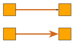
Customizing the Standard Arrows
yFiles for HTML includes several predefined ArrowTypes (see also Decorations: Arrows). You can configure all standard arrow types with a custom size and color by creating a new instance of the Arrow class.
const edge = graph.createEdge(
  node1,
  node2,
  new PolylineEdgeStyle({
    stroke: '8px solid red',
    targetArrow: new Arrow({
      fill: 'red',
      lengthScale: 4,
      widthScale: 4,
      type: 'stealth'
    })
  })
)Creating a Custom Arrow
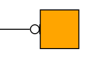
For a completely new visualization, you need to create a custom IArrow implementation. This section demonstrates step-by-step how to implement an arrow as a hollow circle and a line with a little distance to the node.
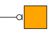
The first step is to create a class that implements IArrow. This interface exposes the following members:
- length and cropLength
-
The length of the arrow and the distance to the node-edge intersection. We will discuss these in detail later. For now, let them return
0. - getVisualCreator
-
Returns an implementation of IVisualCreator. We let our custom arrow class implement IVisualCreator and simply return
this. - getBoundsProvider
-
Returns an implementation of IBoundsProvider. We let our custom arrow class implement IBoundsProvider and simply return
this.
class MyClickListener extends BaseClass(IClickListener, IHitTestable) {
  private node: INode

  constructor(node: INode) {
    super()
    this.node = node
  }

  getHitTestable(): IHitTestable {
    return this
  }

  // toggles activity of the node style
  onClicked(context: IInputModeContext, location: Point): void {
    const style = this.node.style as ToggleNodeStyle
    style.active = !style.active
    // invalidate, so that the visual is updated
    context.canvasComponent.invalidate()
  }

  // reduce the hit area of the node by 5
  isHit(context: IInputModeContext, location: Point): boolean {
    return this.node.layout.toRect().getReduced(5).contains(location)
  }
}

class ToggleNodeStyle extends NodeStyleBase {
  private _active: boolean = false

  get active(): boolean {
    return this._active
  }

  set active(value: boolean) {
    this._active = value
  }

  protected lookup(node: INode, type: Constructor) {
    if (type === IClickListener) {
      return new MyClickListener(node)
    } else {
      return super.lookup(node, type)
    }
  }

  protected createVisual(
    context: IRenderContext,
    node: INode
  ): SvgVisual | null {
    const rect = window.document.createElementNS(
      'http://www.w3.org/2000/svg',
      'rect'
    )
    const fill = this.active ? 'green' : 'gray'
    console.log(fill)
    rect.setAttribute('fill', fill)

    const layout = node.layout
    rect.setAttribute('x', layout.x.toString())
    rect.setAttribute('y', layout.y.toString())
    rect.setAttribute('width', layout.width.toString())
    rect.setAttribute('height', layout.height.toString())

    return new SvgVisual(rect)
  }
}

class CustomArrow extends BaseClass(IArrow, IVisualCreator, IBoundsProvider) {
  get cropAtPort(): boolean {
    return false
  }

  get length(): number {
    return 0
  }

  get cropLength(): number {
    return 0
  }

  getBoundsProvider(
    edge: IEdge,
    atSource: boolean,
    anchor: Point,
    direction: Point
  ): IBoundsProvider {
    return this
  }

  getVisualCreator(
    edge: IEdge,
    atSource: boolean,
    anchor: Point,
    direction: Point
  ): IVisualCreator {
    return this
  }

  createVisual(context: IRenderContext): Visual | null {
    return null
  }

  updateVisual(context: IRenderContext, oldVisual: Visual): Visual | null {
    return this.createVisual(context)
  }

  getBounds(context: ICanvasContext): Rect {
    return Rect.EMPTY
  }
}Customizing the visualization
To get the visualization, we have to implement createVisual.
First, we will create the ellipse and the line so that the anchor point (the intersection between the edge and the node border)
lies at 0,0 and the visualization extends into negative x coordinates. On this shape, we apply a transform that
places and rotates the drawing correctly. To do so, we need to
persist the direction vector and the anchor point in getVisualCreator:
getVisualCreator(
  edge: IEdge,
  atSource: boolean,
  anchor: Point,
  direction: Point
): IVisualCreator {
  // the anchor and direction are needed in createVisual - persist them
  this.anchor = anchor
  this.direction = direction
  return this
}

anchor = Point.ORIGIN
direction = Point.ORIGIN

createVisual(context: IRenderContext): SvgVisual {
  const ellipse = document.createElementNS(
    'http://www.w3.org/2000/svg',
    'ellipse'
  )
  ellipse.setAttribute('fill', 'none')
  ellipse.setAttribute('stroke', 'black')
  ellipse.cx.baseVal.value = -5
  ellipse.cy.baseVal.value = 0
  ellipse.rx.baseVal.value = 5
  ellipse.ry.baseVal.value = 5

  const line = document.createElementNS(
    'http://www.w3.org/2000/svg',
    'line'
  )
  line.setAttribute('stroke', 'black')
  line.x1.baseVal.value = 0
  line.y1.baseVal.value = -5
  line.x2.baseVal.value = 0
  line.y2.baseVal.value = 5

  const group = new SvgVisualGroup()
  group.add(new SvgVisual(ellipse))
  group.add(new SvgVisual(line))

  // Rotate the arrow and move it to correct position
  group.transform = new Matrix(
    this.direction.x,
    -this.direction.y,
    this.direction.y,
    this.direction.x,
    this.anchor.x,
    this.anchor.y
  )

  return group
}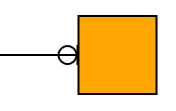
This is almost what we want, but some details are missing: the edge extends into the head, and we also want a little space between the arrow head and the node.
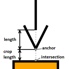
Adjusting Length and CropLength
The distance between the node-edge intersection and the tip of the arrow (the anchor point) is defined by the property cropLength. The distance between the tip and the point where the actual edge rendering starts is defined by the property length.
First, we make the edge rendering stop at the arrow. Since our head’s size is 10,10,
we change the length implementation to return 10, too.
get length(): number {
  return 10
}
To introduce a distance between the node-edge intersection and the anchor point of the arrow,
we implement cropLength to return a value > 0.
We want the gap to be visible but not too large, so let us set it to 3:
get cropLength(): number {
  return 3
}Adjusting the Bounds and Optimizations
Like custom styles, arrows can provide bounds. Our custom style implementation makes use of Matrix's calculateTransformedBounds method to return a bounding box around the rotated and translated size rectangle.
getBounds(context: ICanvasContext): Rect {
  // apply a transform on the untransformed bounds
  const matrix = new Matrix(
    this.direction.x,
    -this.direction.y,
    this.direction.y,
    this.direction.x,
    this.anchor.x,
    this.anchor.y
  )
  return matrix.calculateTransformedBounds(new Rect(-10, -5, 10, 10))
}Also, for an IVisualCreator implementation, it is good practice to implement updateVisual as shown in section Efficient Style Implementation. Our custom implementation is simple and only requires updating the transform:
updateVisual(context: IRenderContext, oldVisual: SvgVisual): SvgVisual {
  if (oldVisual instanceof SvgVisualGroup) {
    // update the transform
    oldVisual.transform = new Matrix(
      this.direction.x,
      -this.direction.y,
      this.direction.y,
      this.direction.x,
      this.anchor.x,
      this.anchor.y
    )
    return oldVisual
  }
  return this.createVisual(context)
}