Folding
|
Note
|
To fully understand this chapter, you should be familiar with the concept of grouping or group nodes as introduced in the graph model chapter. |
Folding extends the grouping concept by adding the functionality to collapse (close) and expand (open) group nodes. Collapsing a group node hides its content, and the group node becomes a normal node, i.e., a non-group or leaf node. Collapsed group nodes are referred to as folder nodes or folders. Additionally, the yFiles for HTML folding support allows browsing into group or folder nodes, i.e., displaying their contents as a separate graph.


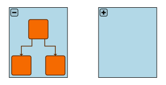
The figure above illustrates this concept: Diagram (1) shows an expanded group node (labeled “Group”) with two child nodes, nodes 3 and 4. In diagram (2), the group is collapsed, and the child nodes are hidden. The folder can have a different color, a different size, and even a different label (“Folder”) to emphasize its different state. Since the child nodes are hidden, the edges from the outer nodes to nodes 3 and 4 now connect to the folder node.
Diagram (3) shows the content of the group as a separate graph. Note that the connections from these nodes to the outer nodes are not part of this graph.
|
Note
|
Edge-to-edge connections are not supported in a folding-enabled graph. In particular, if such connections are present in the master graph, they will be preserved, but they are not shown in any folding views. |
|
Note
|
In some use cases, it is useful to combine Folding with Filtering: Hiding Graph Elements. In these cases, the order of initialization is important. Make sure to read the knowledge base article about Using Filtering and Folding Together. |
The following sections explain the basics of working with folding, introduce the predefined styles for collapsible groups, and describe how to enable user interaction. The remainder of this chapter explains specific aspects and underlying concepts of folding in more detail.
Working with Folding
To properly hide children when collapsing and restore the contents when expanding, folding uses two graph instances. The master graph is the complete unfolded graph: it contains all nodes, all groups, all edges, and all their labels and ports. The graph in the component that supports collapsing and expanding is a (modified) copy of the master graph and is called the view graph.
|
Important
|
Note that items in the view graph are copies of items in the master graph. The FoldingManager synchronizes these items. However, reference comparisons between master graph items and view graph items will fail. |
|
Important
|
When a group node is collapsed, all its child nodes are removed from the view graph, but the master graph remains unchanged. When the group node is expanded again, new child nodes are added to the view graph, so any references to the 'old' child nodes are invalid. See Working with Master and View for more details. |
To ensure that the state of both graphs is correctly synchronized, yFiles provides the types FoldingManager and IFoldingView. An FoldingManager stores the master graph and serves as a factory for the folding views. An IFoldingView stores the view graph and manages the mapping from elements of the master graph to elements in the view graph and vice versa.
See Advanced Insights on Folding for more details.
Enabling Folding
To enable folding, create a new instance of FoldingManager. If you have an initial graph, set it as the master graph of your manager. Then, create a folding view with the manager. Each folding view contains one view graph, and that graph supports folding. Finally, set the view graph to your graph component.
The following example summarizes these steps.
// first create the folding manager
const foldingManager = new FoldingManager()
// create the folding view with the manager
const view = foldingManager.createFoldingView()
// each view contains a folding-enabled graph, the view graph
const viewGraph = view.graph
// the view graph is the graph to display
graphComponent.graph = viewGraphOnce enabled, you can get the view graph of a folding view and vice versa with these properties:
- IGraph.foldingView: IFoldingView
-
Gets the corresponding IFoldingView instance if the graph is a view graph. Returns
nullotherwise. - IFoldingView.graph: IGraph
-
Gets the view graph of this folding view.
The folding manager and master graph can be accessed via the folding view: IFoldingView.manager: FoldingManager:: Gets the corresponding FoldingManager instance that created this IFoldingView.
- FoldingManager.masterGraph: IGraph
-
Gets the master graph of this folding manager.
const viewGraph = graphComponent.graph

// get the folding view from the graph
const view = viewGraph.foldingView!
// note: view.graph === viewGraph

// get the manager from the view graph
const manager = view.manager

// get the master graph from the manager
const masterGraph = manager.masterGraph|
Tip
|
FoldingManager.createFoldingView(root: INode, isExpanded: Predicate<INode>) takes an optional |
Collapsing and Expanding Groups
IFoldingView provides the methods for expanding and collapsing group nodes:
- collapse(groupNode: INode): void
-
Collapses the given group node. This removes its children from the view graph and changes the visual appearance to the folder state. The given group node may be a master group node or a view group node.
This method does nothing if the node is not a group or if the node is already collapsed.
- expand(groupNode: INode): void
-
Opens the given folder node. This re-adds its children to the view graph and changes the visual appearance to the group state. The given node may be a master group node or a view folder node.
This method does nothing if the node is not a folder or if the node is already expanded.

Node States
In the master graph, each node is either a group node or a non-group node.
In the view graph, only expanded group nodes are called group nodes, while collapsed ones are called folder nodes.
The following methods are used to check the state of a node:
- IGraph.isGroupNode(node: INode): boolean
-
Determines whether a node is a group node or a non-group node (that is, a normal node in the master graph or a normal node or folder node in the view graph).
- IFoldingView.isExpanded(groupNode: INode): boolean
-
Determines whether the provided node is currently expanded.
// get the folding view to manage expanding and collapsing
const view = graph.foldingView!

// group is initially expanded
view.isExpanded(group) // true

// collapse group
view.collapse(group)
view.isExpanded(group) // false
console.log(graph.isGroupNode(group)) // false
console.log(graph.nodes.size) // 3 (node 1, node 2, group)
console.log(graph.edges.size) // 3 (node 1 -> group, node 1 -> node 2, node2 -> group)

// expand group again
view.expand(group)
view.isExpanded(group) // true
console.log(graph.isGroupNode(group)) // true
console.log(graph.nodes.size) // 5 (all nodes)
console.log(graph.edges.size) // 4 (all edges)|
Note
|
A folder node can have a different layout, visual appearance, and even different labels than its (expanded) group node. Therefore, changing any of these properties does not affect its expanded state. Instead, when the collapsed group is expanded again, it will have its original layout, style, and labels. The same applies to the incident edges of a folder node. |
In addition, you can create folder nodes that is, group nodes that are initially collapsed with the createFolderNode method of IFoldingView:
const graph = view.graph

// createFolderNode creates a normal node on the view graph
const folder = view.createFolderNode()
console.log(graph.isGroupNode(folder)) // false

// but its master element is a group on the master graph
const master = view.getMasterItem(folder)
console.log(view.manager.masterGraph.isGroupNode(master)) // true

// the folder can be expanded
view.expand(folder)
console.log(graph.isGroupNode(folder)) // trueStyles for Folding
yFiles for HTML offers the GroupNodeStyle for the visual representation of group and folder nodes. It supports drawing a handle that can then be used to toggle the expansion state and provides extensive options to configure its visual appearance.

There is also the CollapsibleNodeStyleDecorator, which is a special node style for decorating any other node style with a collapse/expand handle.
The Groups and Folders section describes in detail the use of the GroupNodeStyle and the CollapsibleNodeStyleDecorator.
User Interaction
In addition to the user interaction supported for grouping, you can press Alt+← to collapse a selected group node and Alt+→ to expand it. Users can toggle between the collapsed and expanded state using either Alt+Shift ⇧{left}] or kbd:[AltShift ⇧+→. This behavior can be configured using the child input mode NavigationInputMode of both GraphEditorInputMode and GraphViewerInputMode.
- NavigationInputMode.allowCollapseGroup
-
Enables or disables the collapse group shortcut Alt+←.
- NavigationInputMode.allowExpandGroup
-
Enables or disables the expand group shortcut Alt+→.
Entering or exiting a group node as described in Displaying a Group’s Contents can also be triggered via the keyboard. Press Alt+↓ to enter a selected group node, and press Alt+↑ to exit the current root node.
- NavigationInputMode.allowEnterGroup
-
Enables or disables the enter group shortcut Alt+↓.
- NavigationInputMode.allowExitGroup
-
Enables or disables the exit group shortcut Alt+↑.
|
Tip
|
By default, these actions are enabled on GraphEditorInputMode and disabled on GraphViewerInputMode, as they are considered graph modifications. If your use case requires these actions, enabling them for GraphViewerInputMode is perfectly acceptable. |
|
Tip
|
When collapsing a previously expanded group node, the default behavior is to restore its original position before expansion. However, you can customize this behavior using the autoGroupNodeAlignmentPolicy property. It allows you to specify a fixed point for a group node when toggling its expanded state. This is particularly useful if a toggle button is positioned within the group node, such as in the upper-right corner. Fixing that corner ensures the button remains in the same location whether the group node is expanded or collapsed, so that the user does not need to readjust their mouse position. |
Undo
To support undo with folding enabled, a few things have to be done.
-
The undo engine must be enabled on the master graph.
-
By default, expand and collapse operations are not undoable. To enable undoing these operations, set enqueueNavigationalUndoUnits to
true. Keep in mind that there is a single undo engine for the master graph and all view graphs. If there are multiple views, undoing an expand/collapse operation will only impact the view in which it occurred. Undoing it in another view may lead to unexpected effects. As a result, it is advisable not to enqueue these units in environments with more than one view.
Advanced Insights on Folding
In this section, we provide more details for the types introduced in Working with Folding.
Recall that the FoldingManager stores the master graph and has a factory method for instances of IFoldingView. The latter stores one view graph, provides the collapse and expand methods for its graph, and manages the mapping from elements of the master graph to elements in its view graph, and vice versa.
FoldingManager keeps track of the folding views it has created and can manage an arbitrary number of folding views. Typically, however, you’ll need just one for displaying in your GraphComponent. If you have several views, each one can have different folded groups and even show a different part of the master graph.
All views are synchronized. This means that changes in a view graph are immediately propagated to the master graph and the other view graphs. Similarly, changes in the master graph are immediately propagated to all views.
A folder can have a different layout and style, and different labels and ports than its corresponding master item. These properties of a folder are stored in the FolderNodeState class and shared between all folders of the same master node for all folded views. Similar states exist for edges that are incident to a folder, and the labels and ports of folders. These states are called folding states or view states. All of them are managed by FoldingManager and described in more detail in The State of Folded Elements.
The following figure summarizes these relations of FoldingManager, IFoldingView, their graphs, and the folding states.

Displaying a Group’s Contents
IFoldingView can display the contents of a group or folder as an independent graph. This feature enables users to browse into or enter a group or folder.
- IFoldingView.localRoot: INode
-
Specifies the root of the view graph. Setting a group node from the master graph limits the view graph to the contents of that group (excluding the group itself). Setting it to
nulldisplays the complete view graph.
|
Note
|
This property is named with regards to the grouping hierarchy in which each group is the root of its content. |


// get the folding view to manage expanding and collapsing
const view = graph.foldingView!

// show only the contents of groupNode
// as if they were in a separate graph
view.localRoot = group

graph.contains(group) // false
console.log(graph.nodes.size) // 2 (node 3, node 4)
console.log(graph.edges.size) // 1 (node 3 -> node 4)

// show the entire graph
// i.e. the root of the master graph is the root of this view graph
view.localRoot = null

graph.contains(group) // true
console.log(graph.nodes.size) // 5 (all nodes)
console.log(graph.edges.size) // 4 (all edges)If the current root node is removed from the master graph, the
folding view’s invalid property becomes true, and the view can no
longer be edited. By default, the autoSwitchToAncestor
property automatically changes the local root to an ancestor of the original
root. This ancestor is then used as the view’s new root.
Working with Master and View
When using folding, it’s important to understand which graph you’re working with, either the master graph or the view graph. Some tasks can be performed on either graph, but others should be done on only one of them. In this section, we’ll first explain the relationship between the elements of the two graphs in more detail. Then, we’ll list common tasks and indicate which graph to use for each.
The elements in the master graph are referred to as master items or master elements, while the elements in the view graph are referred to as view items. Each view item corresponds to one master item. However, a single view edge can represent multiple master edges, depending on the options used when creating view edges.
Converting Master and View Items
IFoldingView provides the following methods to convert between master and view items.
- getMasterItem<T>(item: T): T
-
Returns the corresponding master item for a given view item. Returns
nullif a view item does not have a master item (for example, labels of folder nodes). For view edges that correspond to more than one master edge, this method returns the main master edge. - getMasterEdges(foldingEdge: IEdge): IListEnumerable<IEdge>
-
Returns all corresponding master edges for a given view edge.
- getViewItem<T>(item: T): T
-
Returns the corresponding view item for a given master item, if such a view item exists. Returns
nullif the element is not currently in the view graph (for example, a child node of a collapsed group).
The master graph models your complete business data and is not affected by collapse and expand actions performed by users. Therefore, you should use it for all tasks that concern the entire model. In contrast, the view graph is what is visible in the GraphComponent. Automatic layouts are typically applied to this graph, and code that customizes user interaction and visualization initially gets view items.
|
Important
|
As mentioned in Working with Folding, we advise against keeping references to graph elements in a view graph. Collapsing and expanding group nodes may invalidate these references and result in errors such as "node does not belong to this graph" when using them later for graph operations. |
Tasks for the Master Graph
The following tasks are typically performed on the master graph:
-
If you store graph elements for later use, keep references to master items. Otherwise, some of the stored items might no longer be part of the (view) graph if a user collapses more groups:
    storeReference(viewNode: INode): void {
      const foldingView = this.graphComponent.graph.foldingView!
      const masterNode = foldingView.getMasterItem(viewNode)!
      this.masterNodeReference = masterNode
    }

    getReferencedNode(): any {
      const foldingView = this.graphComponent.graph.foldingView!
      const viewNode = foldingView.getViewItem(this.masterNodeReference)
      return viewNode
    }
-
Enable support for undo and redo operations on the master graph. In addition, data structures that are used by undo customization should work with master items.
-
Set the style that displays the collapse/expand handle for the master nodes.
-
The undo engine has to be enabled on the master graph; see also Undo.
Tasks for the View Graph
The following tasks are typically performed on the view graph.
-
User interaction events are handled in the view. However, if you store graph elements in your event listeners, convert the provided view items to their corresponding master graph items before storing them.
-
Working with the selection state is primarily done on the view.
-
Automatic layouts are applied to the view graph.
The State of Folded Elements
A folder can have a different layout, style, and tag, and different labels and ports than its corresponding master item. These properties of a folder are stored in the FolderNodeState class.
Similarly, (view) edges that connect to folders can have different source and target ports and bends, a different style and tag, and different labels and ports than any of its corresponding master edge(s). These properties are stored in the FoldingEdgeState class.
In addition, all ports and labels of folders, and all bends, ports, and labels of edges of folders have similar state classes: FoldingPortState, FoldingLabelState, and FoldingBendState. Note that these elements have no master item. They only exist in the folder node states and the folding edge states.
All these states are managed by the FoldingManager. You can get the node and edge states from it with the following methods. The states of labels, ports, and bends are available on the respective node state or edge state.
- getFolderNodeState(masterNode: INode): FolderNodeState
-
Returns the state of the folder(s) that corresponds to the given master node.
- getFoldingEdgeState(id: FoldingEdgeStateId): FoldingEdgeState
-
Returns the state of the edge(s) that corresponds to the given edge ID. This ID depends on the master edge and its source and target nodes.
|
Note
|
The states are shared between all views of the same master. This is described in more detail in the following section Shared Folding States of Multiple Views. |
Properties like the style can be set directly to the folding states. Setting a property will be immediately reflected in all managed views which show the node in a collapsed state. Also, when a group node is collapsed, its folder node’s properties will be set according to the folding state. The following example shows how to get the folding state for a node and set a new style to that state:
// 'graph' is the folding enabled view graph
// 'groupNode' is the group node to set the folder style to
// 'groupNode' is contained in 'graph'

// get the folding view for the graph
const view = graph.foldingView!
// the manager which manages the views
const manager = view.manager
// get the view state from the manager using the master node of 'groupNode'
const state = manager.getFolderNodeState(view.getMasterItem(groupNode)!)
const folderStyle = new GroupNodeStyle()
folderStyle.contentAreaFill = Color.LIGHT_GRAY
folderStyle.tabFill = Color.GRAY
state.style = folderStyleNote that items that are currently visible in the view graph can be modified using the usual IGraph
methods. If groupNode in the above example is currently collapsed in graph, the style can be set
using setStyle as well:
// 'graph' is the folding enabled view graph
// 'groupNode' is the group node to set the folder style to
// 'groupNode' is contained in 'graph' and collapsed
graph.setStyle(
  groupNode,
  new GroupNodeStyle({
    contentAreaFill: Color.LIGHT_GRAY,
    tabFill: Color.GRAY
  })
)The folding states are created or updated by converters provided by the FoldingManager whenever a group is collapsed. This is described in detail for folders and their edges in the following sections.
Maintaining the Folder Node State
The instance of IFolderNodeConverter that is provided by the FoldingManager.folderNodeConverter property determines the properties of the folder node state when a group is collapsed.
Custom configurations can be applied for the initial collapse, compared to how subsequent expansions or collapses are managed. By default, during the first collapse of a group, its appearance is replicated from the group, excluding labels, which are ignored by default. On subsequent operations, only the tags are synchronized.
The initialization and updating of states are managed via the following three methods within the IFolderNodeConverter interface:
- initializeFolderNodeState(state: FolderNodeState, foldingView: IFoldingView, viewNode: INode, masterNode: INode): void
-
Called when a group node is collapsed for the first time, i.e., when no FolderNodeState exists yet.
- updateFolderNodeState(state: FolderNodeState, foldingView: IFoldingView, viewNode: INode, masterNode: INode): void
-
Called if a FolderNodeState already exists when a group node is collapsed. Used to synchronize the folding state of a folder with its potentially changed master node. Might do nothing if synchronization is not required.
- updateGroupNodeState(state: FolderNodeState, foldingView: IFoldingView, viewNode: INode, masterNode: INode): void
-
Called when a folder node is expanded. Used to synchronize the master node of a folder with changes on the folder. Might do nothing if synchronization is not required.
The default implementation of IFolderNodeConverter is the FolderNodeConverter. It relies on FolderNodeDefaults for configuration options and methods related to initialization and updates. By default, it copies the properties from the original group node to the state, excluding labels.
If you need to customize the behavior, FolderNodeDefaults offers numerous settings and callback methods for configuration.
manager.folderNodeConverter = new FolderNodeConverter({
  folderNodeDefaults: {
    // set a gray rectangle to initialize a freshly collapsed group node with
    style: new ShapeNodeStyle({ fill: 'gray' }),
    // use the same instance for all folders
    shareStyleInstance: true,
    // configure label handling: copy the labels
    copyLabels: true,
    // configure the details of label synchronization
    labels: {
      // initialize labels on a freshly collapsed group node with a default style
      style: new LabelStyle(),
      // share the same style instance
      shareStyleInstance: true,
      // copy all properties from the group node labels to the folder node labels
      initializeOptions: FoldingSynchronizationOptions.ALL,
      // upon subsequent collapse and expand: only synchronize the text
      updateFoldingOptions: FoldingSynchronizationOptions.LABEL_TEXT,
      updateMasterOptions: FoldingSynchronizationOptions.LABEL_TEXT,
      // adjust the preferred size to the new text
      autoAdjustPreferredSize: true
    }
  }
})To copy Labels between states, you can set copyLabels to true.
The example below demonstrates how to enable label synchronization for ports on folder nodes.
manager.folderNodeConverter = new FolderNodeConverter({
  folderNodeDefaults: {
    // configure the port handling
    ports: {
      // synchronize the labels
      copyLabels: true,
      labels: {
        // initialize: copy all label properties (the default)
        // but update only the text after initialization
        updateFoldingOptions: FoldingSynchronizationOptions.LABEL_TEXT,
        updateMasterOptions: FoldingSynchronizationOptions.LABEL_TEXT
      },
      // copy all port properties upon initialization (the default)
      // but update only the layout afterward
      updateFoldingOptions: FoldingSynchronizationOptions.LAYOUT,
      updateMasterOptions: FoldingSynchronizationOptions.LAYOUT
    }
  }
})Maintaining the Folding Edge State
Similar to folder nodes, the instance of IFoldingEdgeConverter that is provided by the FoldingManager.foldingEdgeConverter property determines the properties of the folding edge state when a group is collapsed.
In addition, that converter determines how many folding edges should be created. yFiles for HTML offers the following converters:
| Converter | Description | Example | Expanded Group |
|---|---|---|---|
Creates one folding edge for each master edge that connects to the contents of the collapsed group. |
|
|
|
Creates at most one folding edge (or two folding edges if edge direction is not ignored) between each pair of source and target node. Conceptually, this implementation merges folding edges that connect the same source and target node in the folding view into one folding edge (or two folding edges if edge direction is not ignored). |
|
||
Creates no folding edges. |
|


By default the FoldingEdgeConverter is used.
Both FoldingEdgeConverter and MergingFoldingEdgeConverter rely on FolderNodeDefaults for configuration options and methods related to initialization and updates.
manager.foldingEdgeConverter = new FoldingEdgeConverter({
  foldingEdgeDefaults: {
    // initialize the new edges with a gray style
    style: new PolylineEdgeStyle({
      stroke: 'gray'
    }),
    // copy the labels
    copyLabels: true,
    labels: {
      // initialize the labels with a new style
      style: new LabelStyle(),
      shareStyleInstance: true,
      // initialize all label properties (the default)
      // but synchronize only the text after initialization
      updateFoldingOptions: FoldingSynchronizationOptions.LABEL_TEXT,
      updateMasterOptions: FoldingSynchronizationOptions.LABEL_TEXT,
      autoAdjustPreferredSize: true
    }
  }
})manager.foldingEdgeConverter = new MergingFoldingEdgeConverter({
ignoreEdgeDirection: true,
foldingEdgeDefaults: {
copyLabels: true,
style: new PolylineEdgeStyle({ stroke: 'gray' })
}
})The source and target ports of a folding edge can differ from those of its master edge by default, even if they are connected to ports existing on the master graph. You can customize this behavior using reuseFolderNodePorts and reuseMasterPorts. You can configure port state synchronization with sourcePort and targetPort within FoldingEdgeDefaults.
manager.foldingEdgeConverter = new MergingFoldingEdgeConverter({
  foldingEdgeDefaults: {
    // configure the port handling for the source port
    sourcePort: {
      // synchronize the labels
      copyLabels: true,
      labels: {
        // initialize: copy all label properties (the default)
        // but update only the text after initialization
        updateFoldingOptions: FoldingSynchronizationOptions.LABEL_TEXT,
        updateMasterOptions: FoldingSynchronizationOptions.LABEL_TEXT
      },
      // copy all port properties upon initialization (the default)
      // but update only the layout afterward
      updateFoldingOptions: FoldingSynchronizationOptions.LAYOUT,
      updateMasterOptions: FoldingSynchronizationOptions.LAYOUT
    },
    targetPort: new FoldingPortDefaults({
      // do the same for the target port...
    })
  }
})Example: Displaying the Number of Merged Edges
As mentioned above, MergingFoldingEdgeConverter can improve the clarity of a graph by merging parallel edges between folder nodes into a single edge. However, you might want to indicate the number of edges or provide information about which edges are represented. The following example code shows a MergingFoldingEdgeConverter implementation that adds a label with the number of merged edges to the view edge.
class LabelingFoldingConverter extends MergingFoldingEdgeConverter {
  initializeFoldingEdgeState(
    state: FoldingEdgeState,
    foldingView: IFoldingView,
    foldingEdge: IEdge,
    masterEdges: IListEnumerable<IEdge>
  ) {
    super.initializeFoldingEdgeState(
      state,
      foldingView,
      foldingEdge,
      masterEdges
    )
    state.addLabel(`${masterEdges.size} Merged Edges`)
  }

  updateFoldingEdgeState(
    state: FoldingEdgeState,
    foldingView: IFoldingView,
    foldingEdge: IEdge,
    masterEdges: IListEnumerable<IEdge>
  ) {
    super.updateFoldingEdgeState(state, foldingView, foldingEdge, masterEdges)
    state.labels.get(0).text = `${masterEdges.size} Merged Edges`
}manager.foldingEdgeConverter = new LabelingFoldingConverter()Note that a synchronization from view to master using updateMasterEdges is not necessary and, therefore, not overridden here. For optimization, you can change the updateFoldingEdgeState method so that the label text is only set if it has changed.
Shared Folding States of Multiple Views
If you have multiple folding views for the same master graph, their folding states are shared. This means that view items in different views that share the same states will have the same layout, geometry, style, and other properties.
In particular, the same FolderNodeState is shared by all folders of the same master group across all folded views.
For edges, the FoldingEdgeStateId is determined by the master edge, the source and target nodes, and the collapse/expand state of these nodes. In other words, two view edges of the same master edge will have the same ID if their source and target nodes have the same collapse/expand state.
- FoldingEdgeStateId.constructor(IEdge, INode, boolean, INode, boolean)
-
Creates a new edge ID defined by the master edge, the source and target node, and the collapse/expand state of these nodes.
- FoldingEdgeStateId.constructor(IFoldingView, IEdge)
-
Creates a new edge ID defined by a view edge and the folding view that created this view edge.
Since the states of labels, ports, and bends are part of the node and edge state, their states are the same if their owners share the same state.