Styling Selection, Focus, and Highlight
This section describes how to use element styles to visualize the indicators for selected elements, the focused item, and for custom highlighting. These indicators are introduced in section Selection, Focus, and Highlight.
Custom Item Indication explains the technical details and classes responsible for the visualization and shows how to customize indications further.
Using Different Theme Colors for the Indicators
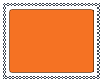
The default visualization templates of the selection, focus and highlight use the CSS classes --yfiles-theme-primary, --yfiles-theme-secondary, and/or --yfiles-theme-background to define their colors.
Using the CSS classes with different colors has a quick Selection, Focus and Highlight:
--yfiles-theme-primary and dark-blue --yfiles-theme-backgroundUsing CSS Styling for the Indicators
All default visualization templates of the selection, focus and highlight have the following CSS classes:
-
yfiles-selection-template -
yfiles-focus-template -
yfiles-highlight-template
Additionally, item specific classes are assigned as well:
| Indicator Type | Item CSS class |
|---|---|
Selection |
|
Highlight |
|
Focus |
|
The selection indicator also visualizes bends with a separate template that provides
the yfiles-bend-template CSS class. By default, highlight and focus indicators do not
visualize bends.
The Selection, Focus, and Highlight Template
The default selection, focus, and highlight visuals consist of a single SVG rect element
with a hatched or solid stroke (see Selection, Focus, and Highlight) that can be changed with
the above CSS classes.
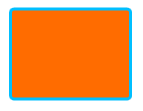
The following example shows how to use the CSS classes to create a gray node selection with no focus indicator and a gray highlight:
.yfiles-node-selection-template {
  stroke: lightgray;
}
.yfiles-node-focus-template {
  opacity: 0;
}
.yfiles-node-highlight-template {
  stroke: lightgray;
}Styling of Selection, Focus and Highlight
An easy way to use a custom styling is to set item styles to the style properties for nodes, edges, labels and ports of the corresponding style indicator renderer and decorate the item lookup with it.
The following code sets a blue round rectangle as the node selection style:
const selectionNodeStyle = new RectangleNodeStyle({
  fill: 'transparent',
  stroke: '3px deepskyblue',
  cornerStyle: 'round',
  cornerSize: 3.5
})
graphComponent.graph.decorator.nodes.selectionRenderer.addConstant(
  new NodeStyleIndicatorRenderer({
    nodeStyle: selectionNodeStyle,
    margins: Insets.EMPTY
  })
)
The same pattern can be used to customize the selection indicators for all nodes, edges, and labels:
function customizeSelection(graphComponent: GraphComponent): void {
  const selectionNodeStyle = new ShapeNodeStyle({ fill: 'green' })
  const selectionEdgeStyle = new PolylineEdgeStyle({
    stroke: '2px solid green'
  })
  const selectionLabelStyle = new LabelStyle({ textFill: 'green' })

  const graphDecorator = graphComponent.graph.decorator
  const nodeStyleIndicatorRenderer = new NodeStyleIndicatorRenderer({
    nodeStyle: selectionNodeStyle
  })
  graphDecorator.nodes.selectionRenderer.addConstant(
    nodeStyleIndicatorRenderer
  )
  const edgeStyleIndicatorRenderer = new EdgeStyleIndicatorRenderer({
    edgeStyle: selectionEdgeStyle
  })
  graphDecorator.edges.selectionRenderer.addConstant(
    edgeStyleIndicatorRenderer
  )
  const labelStyleIndicatorRenderer = new LabelStyleIndicatorRenderer({
    labelStyle: selectionLabelStyle,
    margins: Insets.EMPTY
  })
  graphDecorator.labels.selectionRenderer.addConstant(
    labelStyleIndicatorRenderer
  )
}
|
Tip
|
Since all indicators are rendered in front of the graph elements by default, setting styles with an opaque fill will hide the original element. If that is not desired, either use a style that just draws the border or change the default z-order of the rendering. If you want to use geometric shapes as indicators, the ShapeNodeStyle is a good choice. For labels, combine it with the NodeStyleLabelStyleAdapter and for ports use ShapePortStyle. |
The Selection Styling demo shows customized selection painting of nodes, edges and labels by decorating these items with a corresponding style.
Zoom-invariant rendering
By default, the selection indication is rendered zoom-invariant. The zoomPolicy properties available on NodeStyleIndicatorRenderer, EdgeStyleIndicatorRenderer, LabelStyleIndicatorRenderer, and PortStyleIndicatorRenderer support the following settings:
- VIEW_COORDINATES
-
The decoration is rendered zoom-invariant, so, for example, the border thickness remains constant regardless of the zoom level.
- WORLD_COORDINATES
-
The decoration is rendered in world coordinates and is affected by the zoom level, just like normal item styles.
- MIXED
-
Uses WORLD_COORDINATES rendering for zoom levels ≥ 1 and VIEW_COORDINATES rendering for zoom levels < 1.
- NO_DOWNSCALING
-
Uses WORLD_COORDINATES rendering for zoom levels ≥ 1 and VIEW_COORDINATES rendering for zoom levels < 1, but in the latter case, the visual does not scale down below its initial size.
In addition to the zoomPolicy, NodeStyleIndicatorRenderer and LabelStyleIndicatorRenderer provide margins properties that specify additional margins around the node or label layout. The bounds rendered by the style are the original node or label layout enlarged by these margins.
const decorationRenderer = new NodeStyleIndicatorRenderer({
  nodeStyle: selectionNodeStyle,
  margins: new Insets(5)
})

graph.decorator.nodes.selectionRenderer.addConstant(decorationRenderer)