Custom Item Indication
The basics about selection, focus and highlight indicators have been introduced in section Selection, Focus, and Highlight and simple customizations using element styles was explained in section Styling Selection, Focus, and Highlight.
Going more in depth, this chapter first handles the technical details behind and the classes involved in item indication namely Model Manager and Decoration Renderer.
Further sections describe advanced customizations and usage of the features. These cover implementing a Custom Decoration Renderer for node highlights and how Additional Indicators can be added using the Model Manager mechanism.
Finally, we demonstrate Building Indicators into Styles instead of using the default selection visualization mechanism to have full control over and maximal integration into the graph item styles.
Model Manager
Each type of indicator has its own model manager that is defined on GraphComponent: The selectionIndicatorManager, focusIndicatorManager, and highlightIndicatorManager. These are small entities that manage a model (the selection, the focused item or the highlighted items) by creating and updating the visual appearances (IRenderTreeElement) for it. Each manager places its IRenderTreeElements into its own IRenderTreeGroup in the GraphComponent (mentioned in #view-main_canvas_object_groups). The model managers are properties on the GraphComponent and of course, your own implementation can be set for them.
Which items a manager should decorate is provided by its underlying model.
-
SelectionIndicatorManager<T> operates on the GraphComponent’s SelectionModel and decorates the items on which the selection is set to
true. -
FocusIndicatorManager<T> operates on the GraphComponent’s currentItem and decorates it.
-
HighlightIndicatorManager<T> operates on the GraphComponent’s highlights collection where the items to decorate must be manually added and removed.
The decoration itself is performed by creating an IRenderTreeElement via an IObjectRenderer<TRenderTag>. The result is inserted in one of the above-mentioned manager specific IRenderTreeGroups on the GraphComponent. To do this, the manager queries the IObjectRenderer<TRenderTag> from the item to decorate using lookup. This means that you can insert your own implementation of IObjectRenderer<TRenderTag> for a given item by simply decorating its lookup.
There are some properties on the model managers for general configuration.
- FocusIndicatorManager<T>.focusedItem
-
Sets the item that should be decorated with the focus indication. This is normally done automatically by GraphComponent and GraphEditorInputMode, as well when using the SET_CURRENT_ITEM command.
- FocusIndicatorManager<T>.showFocusPolicy
-
Determines when to show the focus indication of an item.
- FocusIndicatorManager<T>.usingKeyboard
-
When showFocusPolicy is set to WHEN_USING_KEYBOARD, this property controls whether to show the focus indicator. This property is automatically set when the focus was changed using a keyboard command.
- SelectionIndicatorManager<T>.domain
-
Changes the underlying model for the selection.
Additionally, each manager has the getRenderer and getRenderTreeGroup methods. You can override them for more control over the visualization. Instead of decorating the lookup, you can use the former method to return a IObjectRenderer<TRenderTag> for a given item. The IObjectRenderer<TRenderTag> will then be used to retrieve the IRenderTreeElement for the item. The latter method can be used to specify into which IRenderTreeGroup the visualization for the indicator of that item should be put (instead of using always the same IRenderTreeGroup).
For the following example we use a solid green rectangle for selection indication of 'normal' nodes and a group node style with transparent green content area for group nodes:
graphComponent.graph.decorator.nodes.selectionRenderer.addFactory(
  (node) => {
    const selectionNodeStyle = graphComponent.graph.isGroupNode(node)
      ? new GroupNodeStyle({
          contentAreaFill: 'rgba(50, 200, 100, 0.5)',
          renderTransparentContentArea: true
        })
      : new ShapeNodeStyle({ fill: 'green' })
    const nodeSelectionDecorator = new NodeStyleIndicatorRenderer({
      nodeStyle: selectionNodeStyle,
      zoomPolicy: StyleIndicatorZoomPolicy.WORLD_COORDINATES,
      margins: Insets.EMPTY
    })
    return nodeSelectionDecorator
  }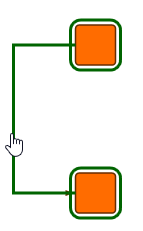
)A customized SelectionIndicatorManager<T> renders the green node decorations just above the nodes themselves. We set it as selectionIndicatorManager:
/**
 * A SelectionIndicatorManager that places the selection indicator of an item
 * just above the items visualization.
 */
class MySelectionIndicatorManager extends SelectionIndicatorManager<IModelItem> {
  /**
   * @param item - The item to find a render tree group for.
   */
  getRenderTreeGroup(item: IModelItem): IRenderTreeGroup | null {
    // instead of using one selection group, the selection indicator for an item
    // shall be put into the same render tree group as the item's visualization
    const rte = this.getRenderTreeElement(item)
    return rte !== null ? rte.parent : super.getRenderTreeGroup(item)
  }

  /**
   * @param item - The item to add.
   */
  addItem(item: IModelItem): IRenderTreeElement | null {
    const selectionRenderTreeElement = super.addItem(item)
    const itemRenderTreeElement = this.getRenderTreeElement(item)
    // super.addItem(item) has added the selectionRenderTreeElement in the front of
    // the render tree group of the itemRenderTreeElement
    // but it should be moved just above the itemRenderTreeElement
    if (
      selectionRenderTreeElement !== null &&
      itemRenderTreeElement !== null
    ) {
      selectionRenderTreeElement.above(itemRenderTreeElement)
    }
    return selectionRenderTreeElement
  }

  private getRenderTreeElement(
    item: IModelItem
  ): IRenderTreeElement | null {
    // return the render tree element visualizing the item
    return (
      this.canvasComponent as GraphComponent
    ).graphModelManager.getRenderTreeElement(item)
  }
}// setting the selectionIndicatorManager property installs the manager on the GraphComponent
graphComponent.selectionIndicatorManager =
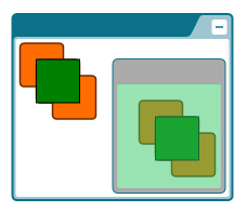
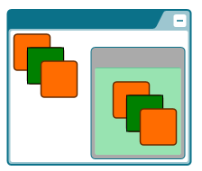
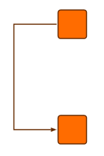
new MySelectionIndicatorManager()The following figures show the difference between the default behavior and the custom manager (in both cases using the green node selection decoration):
Application Resources
The aforementioned model managers use the IObjectRenderer<TRenderTag> interface to build the visualization of the selection, focus, or highlight indication for a specific item. There are three sub-interfaces of IObjectRenderer<TRenderTag> that are used in yFiles for HTML by default: ISelectionRenderer<TRenderTag> for creating the selection indicator for the item for which it is queried, IFocusRenderer<TRenderTag> for the focus indicator, and IHighlightRenderer<TRenderTag> for the highlight indicator.
These renderers actually create the visual representation of the selection, focus, or highlight for a given item.
For each type of graph element (except for bends) there are default indicator renderers which provide different CSS classes to change basic properties of the visualization. The CSS styling of selection, focus and highlight indicators is explained in detail in Using CSS Styling for the Indicators.
Alternatively, item styles can be used to render a decoration with the help of the NodeStyleIndicatorRenderer, EdgeStyleIndicatorRenderer, LabelStyleIndicatorRenderer, and PortStyleIndicatorRenderer. See also Styling of Selection, Focus and Highlight.
When further customization is required, a custom IObjectRenderer<TRenderTag> can be implemented and specified in the lookup of the INode, IEdge, ILabel, or IPort.
|
Note
|
Bends do not have distinct decoration renderer because they are not selectable or focusable by default. Their indicators are drawn as part of the edge visualization and can be customized using a custom IObjectRenderer<TRenderTag> for the edge selection, focus or highlight. |
Instead of modifying the selection indication for all nodes, you can only change the selection indication for certain nodes. In the next example we specify a custom ISelectionRenderer<TRenderTag> for nodes that have at least one label. For all other nodes the default ISelectionRenderer<TRenderTag> is used.
graphComponent.graph.decorator.nodes.selectionRenderer.addFactory(
  (node) => node.labels.size > 0,
  (node) =>
    new NodeStyleIndicatorRenderer({
      nodeStyle: new ShapeNodeStyle({
        stroke: '5px solid blue',
        fill: 'none'
      }),
      margins: Insets.EMPTY
    })
)
|
Note
|
Since the indicator renderers are always created anew when being queried from an item via lookup, simply getting them from the lookup and adjusting properties on the returned instance will not work. Instead, you have to decorate the lookup in such a way that the configured instance is returned; either by adjusting the instance that is returned from the inner lookup or returning a configured object directly (via creation with new and adjusting the new object). |
Custom Decoration Renderer
ISelectionRenderer<TRenderTag>, IFocusRenderer<TRenderTag>, and IHighlightRenderer<TRenderTag> all extend the same interface IObjectRenderer<TRenderTag>. This renderer should yield an IVisualCreator for the visualization as well as IHitTestable, IVisibilityTestable, and IBoundsProvider for the logical bounds of the visualization as described in the section Visualizing Arbitrary Objects.
You can then use your custom renderer for the selection, focus, or highlighting for decoration on the item’s lookup and it will use your implementation when decorating this item.
Example
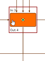
The following example customizes the highlighting of nodes. Nodes are highlighted during reparenting and interactive edge editing when the mouse hovers over a potential target group node respectively target node of the new edges.
The custom highlight includes labels that show the inDegree and outDegree of the node as well as a red box around the node and labels:
class MyHighlightRenderer extends BaseClass(
  ObjectRendererBase<INode, SvgVisualGroup>,
  IHighlightRenderer
) {
  protected createVisual(
    context: IRenderContext,
    node: INode
  ): SvgVisualGroup {
    const bounds = this.getBounds(context, node)
    const visualGroup = new SvgVisualGroup()

    // add a rectangle with a red border
    const rect = document.createElementNS(
      'http://www.w3.org/2000/svg',
      'rect'
    )
    rect.setAttribute('stroke', 'darkred')
    rect.setAttribute('stroke-width', '2')
    rect.setAttribute('fill', 'none')
    rect.width.baseVal.value = bounds.width
    rect.height.baseVal.value = bounds.height
    SvgVisual.setTranslate(rect, bounds.x, bounds.y)
    visualGroup.add(new SvgVisual(rect))

    // add labels above and below the node indicating its in- and out-degree
    const graph = (context.canvasComponent as GraphComponent).graph
    const labelIn = document.createElementNS(
      'http://www.w3.org/2000/svg',
      'text'
    )
    labelIn.textContent = `In: ${graph.inDegree(node)}`
    SvgVisual.setTranslate(labelIn, bounds.x + 2, bounds.y + 12)
    visualGroup.add(new SvgVisual(labelIn))

    const labelOut = document.createElementNS(
      'http://www.w3.org/2000/svg',
      'text'
    )
    labelOut.textContent = `Out: ${graph.outDegree(node)}`
    SvgVisual.setTranslate(labelOut, bounds.x + 2, bounds.maxY - 2)
    visualGroup.add(new SvgVisual(labelOut))

    return visualGroup
  }

  protected updateVisual(
    context: IRenderContext,
    oldVisual: SvgVisualGroup,
    node: INode
  ): SvgVisualGroup {
    // Call createVisual for sake of simplicity. For performance reasons,
    // you should always update the existing visual in a real application.
    return this.createVisual(context, node)
  }

  protected getBounds(context: ICanvasContext, node: INode): Rect {
    // extend the node bounds to keep a small margin and space for the labels
    return node.layout.toRect().getEnlarged(new Insets(5, 25, 5, 25))
  }

  protected isVisible(
    context: ICanvasContext,
    rectangle: Rect,
    node: INode
  ): boolean {
    return this.getBounds(context, node).intersects(rectangle)
  }
}This class can be registered via lookup decoration:
graphComponent.graph.decorator.nodes.highlightRenderer.addConstant(
  new MyHighlightRenderer()
)Adding an Additional Indicator
If you want to add an indicator for your objects that is neither a selection, nor a focus indication, nor a general highlighting, you can use the model manager concept to implement your own indicator for items.
ModelManager<T> has four abstract methods:
- onEnabled and onDisabled
-
These methods are called when the manager is being enabled or disabled and are commonly used to set up the manager and clean up resources.
- getRenderTreeGroup
-
Returns the IRenderTreeGroup in which the indicators for the items should reside in. This can be a predefined IRenderTreeGroup (obtainable from GraphComponent) or a new one (creatable by createGroup on the CanvasComponent.renderTree with the parent group)
- getRenderer
-
Retrieves the IObjectRenderer<TRenderTag> instance that creates the renderer for the given item. In the yFiles for HTML model managers, this uses the lookup of the item to query the implementations, however this can be implemented as needed.
When an item is added to a model manager via addItem, the other methods are used to install an IRenderTreeElement into the IRenderTreeGroup that decorates the item. You can wire up some user interaction to the addItem and removeItem methods to manage decoration for certain gestures, for example. This concept can be extended as needed to bind the manager to more complex models.
Example
The following example uses a customized HighlightIndicatorManager<T> to add highlights to edges the mouse hovers over as well as their source and target nodes.
function initializeHoverEffects(
  graphComponent: GraphComponent,
  hoverInputMode: ItemHoverInputMode,
  nodeStyleHighlight: INodeStyle,
  edgeStyleHighlight: IEdgeStyle
): void {
  const hoverIndicatorManager = new MyHoverIndicatorManager(
    nodeStyleHighlight,
    edgeStyleHighlight
  )

  // configure hover input mode to highlight the hovered edge, its source and target node
  hoverInputMode.hoverItems = GraphItemTypes.EDGE
  hoverInputMode.addEventListener('hovered-item-changed', (evt, sender) => {
    hoverIndicatorManager.items.clear()
    const newItem = evt.item as IEdge
    if (newItem != null) {
      hoverIndicatorManager.items.add(newItem)
      hoverIndicatorManager.items.add(newItem.sourceNode)
      hoverIndicatorManager.items.add(newItem.targetNode)
    }
  })

  hoverIndicatorManager.install(graphComponent)
}

class MyHoverIndicatorManager extends BaseClass(
  HighlightIndicatorManager<IModelItem>
) {
  private readonly nodeStyleRenderer: NodeStyleIndicatorRenderer
  private readonly edgeStyleRenderer: EdgeStyleIndicatorRenderer

  constructor(
    nodeStyleHighlight: INodeStyle,
    edgeStyleHighlight: IEdgeStyle
  ) {
    super()
    this.nodeStyleRenderer = new NodeStyleIndicatorRenderer({
      nodeStyle: nodeStyleHighlight
    })
    this.edgeStyleRenderer = new EdgeStyleIndicatorRenderer({
      edgeStyle: edgeStyleHighlight
    })
  }

  protected getRenderer(
    item: IModelItem
  ): IObjectRenderer<IModelItem> | null {
    return item instanceof INode
      ? this.nodeStyleRenderer
      : item instanceof IEdge
        ? this.edgeStyleRenderer
        : null
  }
}Building Indicators into your Styles
Instead of working with the IObjectRenderer<TRenderTag>, the indications for selection, focus or highlight can also be handled by the item styles.
The following node style renders the background and border with different colors depending on the selection state:
class CircleNodeStyle extends NodeStyleBase {
  createVisual(context: IRenderContext, node: INode): Visual | null {
    const isSelected = CircleNodeStyle.$isSelected(context, node)
    const circle = document.createElementNS(
      'http://www.w3.org/2000/svg',
      'ellipse'
    )
    circle.setAttribute('stroke', isSelected ? 'darkgreen' : 'firebrick')
    circle.setAttribute('fill', isSelected ? 'forestgreen' : 'darkorange')
    const layout = node.layout
    circle.cx.baseVal.value = layout.center.x
    circle.cy.baseVal.value = layout.center.y
    const size = Math.min(node.layout.width, node.layout.height)
    circle.rx.baseVal.value = size / 2
    circle.ry.baseVal.value = size / 2
    return new SvgVisual(circle)
  }

  private static $isSelected(
    context: IRenderContext,
    node: INode
  ): boolean {
    return (
      context.canvasComponent instanceof GraphComponent &&
      context.canvasComponent.selection.includes(node)
    )
  }
}


For a selected node, the circular style is rendered in selection state and the default selection indication is added as well. The default selection can easily be disabled, either for all items:
graphComponent.selectionIndicatorManager.enabled = falseOr only for nodes via GraphDecorator:
graphComponent.graph.decorator.nodes.selectionRenderer.hide()In a similar way, the style can consider the focus or hover state of a node:
class CircleNodeStyle2 extends NodeStyleBase {
  createVisual(context: IRenderContext, node: INode): Visual | null {
    const isSelected = CircleNodeStyle2.$isSelected(context, node)
    const isFocused = CircleNodeStyle2.$isFocused(context, node)
    const isHighlighted = CircleNodeStyle2.$isHighlighted(context, node)
    const circle = document.createElementNS(
      'http://www.w3.org/2000/svg',
      'ellipse'
    )
    circle.setAttribute('stroke', isSelected ? 'darkgreen' : 'firebrick')
    circle.setAttribute('stroke-width', isHighlighted ? '4' : '2')
    circle.setAttribute('fill', isFocused ? 'forestgreen' : 'darkorange')
    const layout = node.layout
    circle.cx.baseVal.value = layout.center.x
    circle.cy.baseVal.value = layout.center.y
    const size = Math.min(node.layout.width, node.layout.height)
    circle.rx.baseVal.value = size / 2
    circle.ry.baseVal.value = size / 2
    return new SvgVisual(circle)
  }

  private static $isSelected(
    context: IRenderContext,
    node: INode
  ): boolean {
    return (
      context.canvasComponent instanceof GraphComponent &&
      context.canvasComponent.selection.includes(node)
    )
  }

  private static $isFocused(context: IRenderContext, node: INode): boolean {
    return (
      context.canvasComponent instanceof GraphComponent &&
      context.canvasComponent.currentItem === node
    )
  }

  private static $isHighlighted(
    context: IRenderContext,
    node: INode
  ): boolean {
    return (
      context.canvasComponent instanceof GraphComponent &&
      context.canvasComponent.highlightIndicatorManager.items !== null &&
      context.canvasComponent.highlightIndicatorManager.items.includes(node)
    )
  }
}
