Customizing the Graph Outline
By default, nodes and edges are visualized in the GraphOverviewComponent as simple rectangles and lines, as described in the Graph Outline chapter. You might want to change these visualizations if you want them to look different, or to visually hide some items that are less important for an overview.
GraphOverviewComponent uses the GraphOverviewRenderer set to its GraphOverviewComponent.graphOverviewRenderer to visualize its nodes and edges.
Customizations of the outline can include adjusting the GraphOverviewRenderer, using a second GraphComponent, or adjusting the viewport rectangle decoration.
GraphOverviewRenderer
The GraphOverviewRenderer iterates over the nodes and edges:
-
For each non-group node paintNode is called to render the node in the overview.
-
For each group node paintGroupNode is called to render the group node in the overview.
-
For each edge paintEdge is called to render the edge in the overview.
The Overview Component demo shows how to customize the visualizations of nodes and edges by overriding these methods. Additionally, the demo shows how to implement a custom IObjectRenderer<TRenderTag> that uses node and edge styles to create the overview visualization.
Second GraphComponent
When the outline of the graph should look exactly like the original view, the easiest way is to just use a second GraphComponent instead of a GraphOverviewComponent:
const graphOverviewComponent = new GraphComponent({
selector: '#overviewComponent',
graph: graphComponent.graph,
inputMode: new OverviewInputMode({
canvasComponent: graphComponent
})
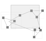
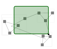
})Viewport Rectangle
One visual decoration of the graph outline is not rendered by the GraphOverviewRenderer but is added by the OverviewInputMode: a rectangle indicating the current viewport of the OverviewInputMode.canvasComponent.
To customize the rectangle, you can set the viewportRectangleRenderer property:
function setViewportRectangleRenderer(
  overviewComponent: GraphOverviewComponent
): void {
  overviewComponent.overviewInputMode!.viewportRectangleRenderer =
    new ViewportRectangleRenderer()
}

class ViewportRectangleRenderer extends ObjectRendererBase<
  IRectangle,
  SvgVisualGroup
> {
  protected createVisual(
    context: IRenderContext,
    renderTag: IRectangle
  ): SvgVisualGroup {
    const rect = document.createElementNS(
      'http://www.w3.org/2000/svg',
      'rect'
    )
    rect.rx.baseVal.value = 5
    rect.ry.baseVal.value = 5
    rect.setAttribute('stroke', 'darkgreen')
    rect.setAttribute('fill', '#006400')
    rect.setAttribute('fill-opacity', '0.25')

    const container = new SvgVisualGroup()
    container.add(new SvgVisual(rect))
    this.setGeometry(context, renderTag, container, rect)
    return container
  }

  protected updateVisual(
    context: IRenderContext,
    oldVisual: SvgVisualGroup,
    renderTag: IRectangle
  ): SvgVisualGroup {
    const rect = oldVisual.children.get(0).svgElement as SVGRectElement
    this.setGeometry(context, renderTag, oldVisual, rect)
    return oldVisual
  }

  private setGeometry(
    context: IRenderContext,
    renderTag: IRectangle,
    container: SvgVisualGroup,
    rect: SVGRectElement
  ): void {
    const viewTopLeft = context.worldToViewCoordinates(renderTag.topLeft)
    const viewBottomRight = context.worldToViewCoordinates(
      renderTag.bottomRight
    )
    rect.width.baseVal.value = viewBottomRight.x - viewTopLeft.x
    rect.height.baseVal.value = viewBottomRight.y - viewTopLeft.y
    SvgVisual.setTranslate(rect, viewTopLeft.x, viewTopLeft.y)

    container.transform = context.viewTransform
  }
}