Tables
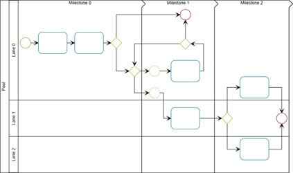
Many application areas require data to be presented where the nodes of a diagram are organized in a tabular way. This means each node is associated with a specific row and column in the grid-like structure of a table. Swimlane layouts are a common example of this type of presentation.
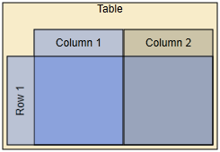
The following figure shows examples of tabular presentations of diagrams:

The yFiles for HTML diagramming library provides comprehensive support for tabular data presentation, which builds on the general concept of grouped graphs. The functionality covers both the appearance ("look") and the interactive behavior ("feel"). This means table structures with rows and columns can be rendered and interactively edited. Rows and columns can be:
-
added,
-
removed,
-
resized, and also
-
reordered.
Furthermore, the hierarchical layout style, more precisely class HierarchicalLayout, provides advanced support for automatic tabular layout.
Concepts
Presenting a diagram in a tabular way requires an additional element: a table structure to encompass the diagram’s nodes. This table structure is backed by a group node, and the diagram’s content nodes must be set up as child nodes of this group node.
Using a group node to hold the content nodes provides all the advantages of the grouping concept as described in Grouping Nodes. For example, when the group node is moved, the child nodes move accordingly, maintaining the visual relationship that they are contained within the table group node.
The table structure, which typically displays rows and columns within which the content nodes reside, is defined by the table model.
The group node that is “behind” the table structure uses a special node style implementation to control the rendering. Visualizing individual rows and columns can be achieved by using special style implementations.
User interaction with the table structure is supported by a specialized input mode, which provides support for resizing rows and columns, re-parenting them, or editing their labels.
It is crucial to understand that the content nodes of a diagram and the table structure are only loosely coupled. The association of a content node to a row and a column is based on geometry: the node’s center coordinates determine the row and column it belongs to.
This means that moving a content node does not change the representation of the table.
Table Model
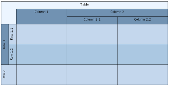
The table model defines the structure for rendering a table. It specifies the rows and columns of a table, their sizes, and their nesting structure. Rows and columns can have child rows or columns to create nested table structures.
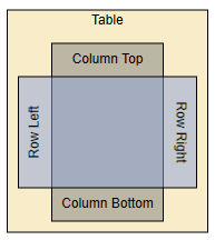
Table structure with nested rows and columns shows a table structure with nested rows and columns. The table has two top-level rows, one of which has two child rows. Similarly, there are two top-level columns, one of which has two child columns.
Note that there are no content nodes in this example.
The table model is defined by the types listed in Table model types.
Type name |
Description |
Provides access to the root elements of the row and column hierarchies of a table model. The Table class is the default implementation. |
|
Models common aspects of rows and columns in a table model. This includes the layout, paddings, and minimum sizes, and also support for labels. |
|
Models a row in a table model. Note that IStripe is the super interface. |
|
Models a column in a table model. Note that IStripe is the super interface. |
The ITable implementation provides the root elements of the row and column hierarchies of a table model. These root elements allow you to add top-level rows and columns. You can then add child rows and columns to these top-level elements to create a nested structure.
The area of a row or column is determined by its height or width, and its position in the order of rows or columns. A row spans all columns of the table structure, and its width is the sum of the widths of all columns. Similarly, a column spans all rows, and its height is the sum of the heights of all rows.
While the width of a row and the height of a column are determined implicitly, you can set the height of a row and the width of a column. However, the size is limited by the row’s or column’s minimum size. A row or column cannot be smaller than its minimum size.
- setSize(stripe: IStripe, size: number): void
-
Sets the preferred size for a given IStripe, the height of a row or the width of a column.
Also, if the row or column contains any nested child rows or columns, setting the size has no effect, since the size is constrained to the sum of the sizes of the nested rows or columns.
For the same reason, the actual bounds, or layout, of a row or column cannot be set explicitly. Instead, they are determined by the table structure. The bounds are calculated through the row’s or column’s layout property whenever necessary.
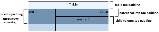
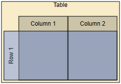
From a geometric point of view, a table consists of its content area, determined by the geometry of its rows and columns, and the surrounding border area. The border area is determined by the table padding, and can be used to display a table description.
- padding
-
Sets the table’s padding, which defines a border around the rows and columns of a table structure.
Similarly, rows and columns also have a content area and a border area. The content area contains the content nodes of the row or column, and the content area of nested rows or columns.
The border area, determined by the row or column padding, represents extra space outside of a row’s or column’s content area, as well as padding inside the content area.
- setStripePadding(stripe: IStripe, padding: Insets): void
-
Sets padding for a given IStripe, a row or column. The padding represents extra space to the left and right of a row’s content area, and at the top and bottom of a column’s content area.
The top and bottom values (row) and the left and right values (column) represent padding space inside the content area.
In a parent row or column with nested child rows or columns, the content area of the child rows or columns lies completely within the content area of the parent row or column.
The border area of the parent row or column is to the left and right of its nested child rows (at the top and bottom of its nested child columns).
The total padding and the actual size of a parent row or column where nested child rows or columns affect the parent row’s or column’s preferred padding and size can be queried using the following methods:
- totalPadding: Insets
- actualSize: number
-
Convenience (read-only) properties for interface IStripe to get the total padding and the actual size of a row or column.
Unless explicitly set, paddings for new rows and columns are adopted from the default values as specified by the rowDefaults/columnDefaults provided by the ITable instance:
- rowDefaults
- columnDefaults
-
Properties to manage the IStripeDefaults instances that hold default values for the rows and columns of a table structure. Among other things, the default values also include the default padding that is used for newly created rows and columns.
Working with the Table Model
Creating a table model that uses the default ITable implementation class Table is done as follows:
// Creating a new table model using the default ITable implementation.
const table = new Table()To actually render a table model, two more things are needed: a group node, to which the table model must be bound, and an appropriate node style implementation that can handle table models and is set as the group node’s style.
Binding the table model to a group node means making the table model available in the group node’s look-up, so that it can be queried using the look-up mechanism:
const table = groupNode.lookup(ITable)For instance, this is important for properly handling user interaction with a table structure.
Using the TableNodeStyle, the predefined node style which supports tables, as the node style for a group node conveniently binds a table model to the group node as a side effect:
const graph = getMyGraph()
const table = getMyTable()

const tableStyle = new TableNodeStyle(table)

// Create a top-level group node and bind the table to it via the TableNodeStyle
graph.createGroupNode(null, table.layout.toRect(), tableStyle)Upon initialization, a Table instance holds an empty model that has no rows or columns. Rows and columns can be created using the following Table methods:
- createChildRow(parent: IRow, height: number, minHeight: number, padding: Insets, style: IStripeStyle, tag: Object, index: number): IRow
- createChildColumn(parent: IColumn, width: number, minWidth: number, padding: Insets, style: IStripeStyle, tag: Object, index: number): IColumn
-
Creates a new row (column) as a child of the given IRow (IColumn).
A minimalistic table with 2 rows and columns illustrates a simple tabular presentation with two rows and columns together with its setup in code.

const graph = getMyGraph()

// Create a new table model and set padding on the table so that the rows and
// columns stand out.
const table = new Table()
table.padding = new Insets(10, 10, 10, 10)

const rowStyle = new ShapeNodeStyle({ fill: Color.TRANSPARENT })
table.rowDefaults.style = new NodeStyleStripeStyleAdapter(rowStyle)
const columnStyle = new ShapeNodeStyle({
  fill: new Color(139, 162, 220)
})
table.columnDefaults.style = new NodeStyleStripeStyleAdapter(
  columnStyle
)
// Using no padding prevents column/row headers.
const padding = new Insets(0)
table.columnDefaults.padding = padding
table.rowDefaults.padding = padding
table.columnDefaults.size = 30
table.rowDefaults.size = 30

// Add top-level rows and columns. The table's size is then 2x2.
table.createRow()
table.createRow()
table.createColumn()
table.createColumn()

// Using TableNodeStyle to render the table structure.
const tableStyle = new TableNodeStyle(table)
tableStyle.backgroundStyle = new ShapeNodeStyle({
  fill: new Color(248, 236, 201)
})

// Create a top-level group node and bind the table to it via the TableNodeStyle
graph.createGroupNode(null, table.layout.toRect(), tableStyle)Rows and columns can be deleted using the following method defined by the ITable interface:
- remove(stripe: IStripe): void
-
Removes a given IStripe, i.e., a row or column.
The following convenience methods support recursively deleting rows or columns and enable resizing of the remaining rows or columns:
- removeWithResize(stripe: IStripe): void
- removeRecursively(stripe: IStripe): void
- removeRecursivelyWithResize(stripe: IStripe): void
-
Convenience methods for interface ITable to remove rows or columns.
Undo/Redo Support
Support for Undo/Redo operations for the tables in a diagram can be easily enabled using the functionality in class Table which is the default implementation of interface ITable:
- installStaticUndoSupport(graph: IGraph): void
-
Enables Undo/Redo support for tables. Installs the undo support instance which is valid on the graph at the time this method is called.
- installDynamicUndoSupport(graph: IGraph): void
-
Enables Undo/Redo support for tables. Registers the graph from which the undo support will be queried.
const graph = getMyGraph()

if (graph != null) {
  // Enabling general undo support.
  graph.undoEngineEnabled = true
  // Using the undo support from the graph also for all future table instances.
  Table.installStaticUndoSupport(graph)
}Visual Representation
The visual representation of a table model is provided by a special node style implementation that can handle table models: class TableNodeStyle.
You can set class TableNodeStyle as the style for a group node as follows:
const graph = getMyGraph()
const table = getMyTable()

const tableStyle = new TableNodeStyle(table)

// Create a top-level group node and bind the table to it via the TableNodeStyle
graph.createGroupNode(null, table.layout.toRect(), tableStyle)The ITable instance that is set with the TableNodeStyle instance defines the style’s table model. When the TableNodeStyle instance is set as the style of a group node, this table model is used to render a table structure that matches the group node’s dimensions and location.
Note that because of its table model, class TableNodeStyle does not support style sharing among multiple group nodes.
TableNodeStyle controls the overall rendering of a table structure. It uses a separate node style implementation to render the background behind all rows and columns:
- backgroundStyle
-
Sets the node style that is used to render the background behind all rows and columns of a table structure.
Additionally, class TableNodeStyle defines the following property to determine the rendering order of rows and columns:
- tableRenderingOrder
-
Sets the rendering order of the rows and columns of a table structure. By default, columns are rendered first, then rows.
|
Note
|
The rendering order also affects the fill colors for rows and columns. For example, with the default rendering order, column fill colors and border lines will not be visible if the row fill colors are non-transparent. |
The rendering order is also taken into account for hit-testing.
Rows and Columns
The visual representation of rows and columns in a table structure is conveniently provided by implementations. Stripe styles can be associated with IStripe instances either upon creation or by using the following method defined in the ITable interface:
- setStyle(stripe: IStripe, style: IStripeStyle): void
-
Sets the style for an IStripe instance, representing a row or column in a table structure.
The TableNodeStyle that is set with the group node delegates the rendering of rows and columns to these row and column styles.
Stripe Styles
Stripe styles are responsible for the graphical rendering of rows and columns in a table. The IStripeStyle interface is the common base type for actual implementations.
Predefined stripe style implementations lists the predefined stripe style implementations present in yFiles.
| Type Name | Description |
|---|---|
Allows using a node style for the visual representation of a column or row. |
|
Greatly simplifies stripe style customization using subclassing. |
The following figures show custom IStripeStyle implementations that provide specialized rendering for rows and columns of table structures:
Rows and columns in a table structure can have labels whose positions are determined by label models. The following method, defined in ITable, can be used to add labels to IStripe instances:
- addLabel(owner: IStripe, text: string, layoutParameter: ILabelModelParameter, style: ILabelStyle, preferredSize: Size, tag: Object): ILabel
-
Adds a label to an IStripe instance, i.e., to a row or column of a table structure.
StretchStripeLabelModel and StripeLabelModel are specifically tailored to support positions for the labels of rows and columns in a table structure. It is used as the default label model when adding labels to an IStripe.
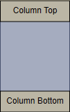
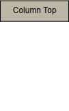
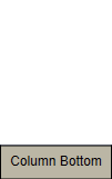
The following figure illustrates labels in a tabular presentation with a single row and a single column, together with their setup in code:
const graph = getMyGraph()
const table = getMyTable()

// Setup of row and column default padding.
table.rowDefaults.padding = new Insets(30, 5, 30, 5)
table.columnDefaults.padding = new Insets(5, 30, 5, 30)

// Create a single column.
const column = table.createColumn(100)
// Add and configure two labels for the column.
table.addLabel(column, 'Column Top')
table.addLabel(column, 'Column Bottom', StretchStripeLabelModel.BOTTOM)

// Create a single row.
const row = table.createRow(100)
// Add and configure two labels for the row.
table.addLabel(row, 'Row Left')
table.addLabel(row, 'Row Right', StretchStripeLabelModel.RIGHT)

// Using TableNodeStyle to render the table structure.
const tableStyle = new TableNodeStyle(table)
tableStyle.backgroundStyle = new ShapeNodeStyle({
  fill: new Color(248, 236, 201)
})

// Create a top-level group node and bind the table to it via the TableNodeStyle
const tableNode = graph.createGroupNode(
  null,
  table.layout.toRect(),
  tableStyle
)
graph.addLabel(tableNode, 'Table', InteriorNodeLabelModel.TOP)Note that row labels that use LEFT are automatically rotated 90 degrees counterclockwise while row labels that use RIGHT are rotated 90 degrees clockwise.
NodeLabelModelStripeLabelModelAdapter can be used to utilize a node label model (e.g., FreeNodeLabelModel) as if the row or column were a node. This allows for label positions that the dedicated stripe label models mentioned above do not readily provide.
CSS Styling of Indicators
The different interactive editing gestures on the table provide visual indicators for better user feedback. Those indicators can be styled through the CSS classes that are provided by the default templates (see Styling of Table Indicators).
User Interaction
TableEditorInputMode is a specialized input mode that provides additional support for handling mouse gestures and keyboard interaction specific to the tabular representation of a diagram.
The mouse gesture support includes:
-
Selecting rows and columns
-
Resizing rows and columns
-
Changing the order of rows and columns
TableEditorInputMode can be used in conjunction with GraphEditorInputMode as shown in the following code snippet, or it can be used on its own.
const geim = getMyGraphEditorInputMode()

geim.add(new TableEditorInputMode())Upon initialization, TableEditorInputMode creates and installs the input modes listed in the following table as concurrent input modes.
| Type Name | Description |
|---|---|
Handles resizing rows and columns. |
|
Recognizes and handles mouse gestures for reordering rows and columns. |
|
Recognizes mouse clicks, including double clicks. This child input mode is disabled if TableEditorInputMode is used as a child input mode of GraphEditorInputMode. |
|
Recognizes key events. |
|
Handles drag-and-drop operations of nodes onto the canvas. Facilitates the creation of new rows and columns, and provides visual feedback to the user. This child input mode is disabled if TableEditorInputMode is used as a child input mode of GraphEditorInputMode. |
If used in conjunction with GraphEditorInputMode, the ClickInputMode and KeyboardInputMode child input modes of TableEditorInputMode are disabled and the corresponding GraphEditorInputMode counterparts are enabled.
Each of the input modes can be obtained or replaced using a property with the same name that is defined by TableEditorInputMode.
In order for TableEditorInputMode and its child input modes to properly recognize the connection between a table structure/table model and its group node, they rely on the table model being bound to the group node. The input modes query the group node’s look-up and expect to find a table model:
const table = groupNode.lookup(ITable)Interaction Customization
The TableEditorInputMode class provides properties and callbacks that allow fine-grained control over user interaction support.
TableEditorInputMode Customization lists the customization properties of TableEditorInputMode. Most properties support specifying combinations of stripe types using the constants defined in the StripeTypes enumeration.
| Name | Purpose |
|---|---|
A combination of StripeTypes that specifies whether rows and/or columns can be selected with mouse clicks. |
|
A StripeTypes combination that specifies whether rows and/or columns can be selected. |
|
A StripeTypes combination that specifies whether row and/or column labels can be edited. |
|
A StripeTypes combination that specifies whether rows and/or columns can be deleted. |
|
A StripeSubregionTypes combination that specifies the subregions of rows and columns that respond to mouse clicks. |
|
A StripeSubregionTypes combination that specifies the subregions of rows and columns that can be selected with mouse clicks. |
Hit-testing
Hit-testing in a table structure considers the overall rendering order of rows and columns (as defined by class TableNodeStyle) and the complexities introduced by nested rows and columns.
By default, the specific hit-testing needs for a table structure are handled by the StripeHitTester class. The actual instance that is used is also available in the group node’s look-up.
The following convenience methods in TableEditorInputMode help find which parts of a table structure are located under a given location. The StripeSubregion class identifies the stripe (row or column) and the specific sub-region within that stripe.
- findStripe
-
Depending on the rendering order of rows and columns, this method returns the sub-region of either a row or a column that is under the given location.
- findStripes
-
Returns an ordered list of sub-regions of (nested) rows and columns that are under the given location. The ordering considers the rendering order of rows and columns, as well as the nesting of child rows (columns).
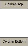
The StripeSubregionTypes enumeration defines constants for the different sub-regions within a stripe. The figure below shows the default definitions of these sub-regions, along with their corresponding constants, for the column of the table structure in Row and column labels at both ends of row and column, respectively.
The stripe sub-regions for a row are defined similarly.
Hit-testing for the sub-regions can be handled through dedicated IHitTestable implementations. The IStripeHitTestHelper interface bundles all stripe-related IHitTestable instances and makes the default implementations conveniently accessible.
Automatic Layout
Automatic layout for a diagram containing table structures that are modeled using ITable implementations can be conveniently invoked using LayoutExecutor, which performs all necessary setup. Internally, the LayoutExecutor uses the TableLayoutConfigurator class.
const graphComponent = getMyGraphComponent()

// Configure HierarchicalLayout.
const hl = new HierarchicalLayout()
hl.componentLayout.enabled = false
hl.layoutOrientation = LayoutOrientation.LEFT_TO_RIGHT
hl.groupLayeringPolicy = GroupLayeringPolicy.IGNORE_GROUPS

// Start layout.
try {
  const layoutExecutor = new LayoutExecutor({
    graphComponent,
    layout: hl,
    animationDuration: '0.5s',
    updateContentBounds: true
  })
  layoutExecutor.tableLayoutConfigurator.compaction = false
  layoutExecutor.start()
} catch (e) {
  console.log('Layout failed')
}TableLayoutConfigurator converts relevant parts of the table structure into LayoutGrid-based information that is understood by algorithms which support automatic tabular layout. In particular, this information includes:
-
The geometric information of all rows and columns, i.e., the top and bottom borders, left and right borders, and padding.
-
The row and column that each content node belongs to.
Note that the row and column is determined geometrically by the node’s center coordinates.
Tutorial Demo Code
The following tutorial demo applications demonstrate how to create table models using the Table class and how to use the TableNodeStyle for tabular data representation:
-
The Table Editor demo demonstrates user interaction and shows how to customize it. The demo also presents a way to create new rows and columns via drag-and-drop gestures.