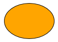
With the ShapeNodeStyle, predefined shapes such as rectangle and triangle can be displayed
very easily. The style supports both a background fill and a border stroke. With the property
shape you also can specify the desired shape.
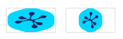
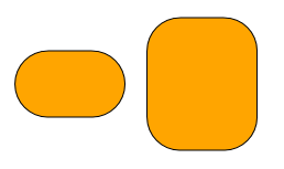
By default the shapes are stretched to fit the node’s layout. Setting keepIntrinsicAspectRatio
to true will force the shapes to keep their intrinsic aspect ratios (depending on the shape, 1:1 for most shapes)
within the node’s layout. The shape
ELLIPSE, for example, will always be rendered as circle, then.
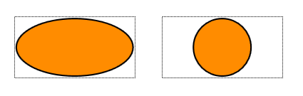
ShapeNodeStyle with keepIntrinsicAspectRatio set to false (left) and true (right).
Images
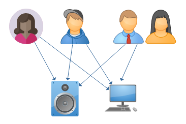
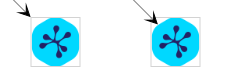
yFiles for HTML can use images to render nodes. The ImageNodeStyle uses an
SVG <image> element to render the node.
Images from different subject areas as node representation.
const imageUrl = './resources/yFiles.svg'// determine the intrinsic aspect ratio of the imageconst imageAspectRatio = await ImageNodeStyle.getAspectRatio(imageUrl)
// the outline of the image between 0 and 1const outlinePath = new GeneralPath()
outlinePath.appendEllipse(new Rect(0, 0, 1, 1), true)
const node = graph.createNode(
[0, 0, 50, 50],
new ImageNodeStyle({
image: imageUrl,
aspectRatio: imageAspectRatio,
normalizedOutline: outlinePath
})
)
ImageNodeStyle with aspectRatio set to 0 (left) and 1 (right).
The optional normalizedOutline can be used to refine the behavior such as hit tests or edge cropping.
The shape itself is not visualized.
ImageNodeStyle without (left) and with an normalizedOutline (right).
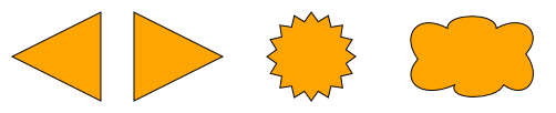
Polygons
The GeneralPathNodeStyle supports arbitrary polygons to create a visual representation of a node.
Similar to the other shape-based styles, the GeneralPathNodeStyle supports a background
fill and an outline stroke.
Different nodes with GeneralPathNodeStyle
const triangleLeft = new GeneralPath()
triangleLeft.moveTo(0.0, 0.5)
triangleLeft.lineTo(1.0, 0.0)
triangleLeft.lineTo(1.0, 1.0)
triangleLeft.close()
graph.createNode(
  new Rect(0, 0, 80.0, 80.0),
  new GeneralPathNodeStyle({
    fill: 'orange',
    path: triangleLeft
  })
)

const triangleRight = new GeneralPath()
triangleRight.moveTo(1.0, 0.5)
triangleRight.lineTo(0.0, 1.0)
triangleRight.lineTo(0.0, 0.0)
triangleRight.close()
graph.createNode(
  new Rect(110, 0, 80.0, 80.0),
  new GeneralPathNodeStyle({
    fill: 'orange',
    path: triangleRight
  })
)

const starPath = new GeneralPath()
// ...
graph.createNode(
  new Rect(220, 0, 100.0, 80.0),
  new GeneralPathNodeStyle({
    fill: 'orange',
    path: starPath
  })
)

const cloudPath = new GeneralPath()
// ...
graph.createNode(
  new Rect(350, 0, 130.0, 80),
  new GeneralPathNodeStyle({
    fill: 'orange',
    path: cloudPath
  })
)
The TemplateNodeStyle allows for using
an SVG snippet as template for the visual representation of
nodes. Using this style is discussed in detail in the customizing styles section.
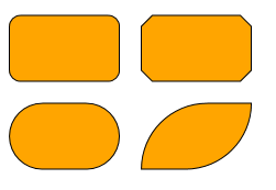
Rectangles
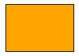
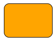
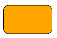
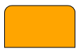
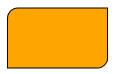
The RectangleNodeStyle uses a rectangular shape as basis and supports configurable round or diagonal corners.
Similar to the other shape-based styles, the RectangleNodeStyle supports a background fill and an outline stroke.
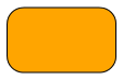
Some nodes drawn with different settings of RectangleNodeStyle
If set to true the value of the cornerSize is interpreted as ratio between 0 and 1.
Otherwise, it is interpreted as absolute value. This mainly affects how the shape looks when the node is resized.<para class="dguide-para"><span class="api">scaleCornerSize</span> = <code>false</code>, <span class="api">cornerSize</span> = <code>30</code></para><para class="dguide-para"><span class="api">scaleCornerSize</span> = <code>true</code>, <span class="api">cornerSize</span> = <code>0.5</code></para>
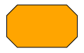
Configures how to draw the corners, either as round corners or straight line.<para class="dguide-para"><span class="api">ROUND</span></para><para class="dguide-para"><span class="api">CUT</span></para>
Configures which corners are affected. By default, all
corners are affected. Note that all affected corners share the same corner style and size.<para class="dguide-para"><span class="api">ALL</span> (the default)</para><para class="dguide-para"><span class="api">TOP</span></para><para class="dguide-para"><span class="api">TOP_LEFT</span>, <span class="api">BOTTOM_RIGHT</span></para>When corners will not meet, e.g. in the second and third example above, the corner size may extend all the way to the other side of the node.
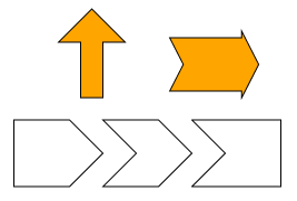
The ArrowNodeStyle renders nodes as arrows. It supports different kinds of arrow shapes
with a configurable angle of the arrow head and a configurable shaft thickness.
Similar to all shape based node styles, the ArrowNodeStyle supports setting a
border stroke and background fill.
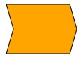
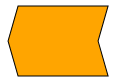
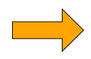
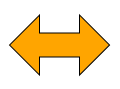
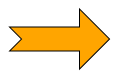
The ArrowNodeStyle can render different arrow shapes. These are defined in the ArrowStyleShape
enumeration and can be set using the shape property.
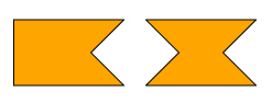
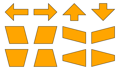
Shapes of ArrowNodeStyleARROWDOUBLE_ARROWNOTCHED_ARROW
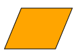
ArrowNodeStyle also supports some shapes that are no typical arrows. These are discussed
in more detail below.
Non-arrow shapes of ArrowNodeStylePARALLELOGRAMTRAPEZOID
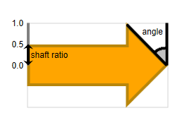
Angle and Thickness
Aside from the shape the appearance of an arrow is defined by the thickness of its shaft
and the angle of its head.
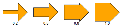
angle and shaftRatio
The thickness of the arrow shaft can be set with the shaftRatio property.
It is defined as a ratio between 0 and 1.
Different values for the shaft ratio
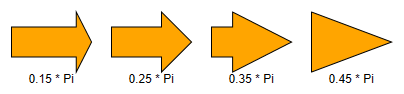
The size of the head is determined by its angle. The angle is measured in radians and can be set using the
angle property. Values between 0 and π / 2 are supported.
Different angles
At shaftRatio1 the angle property also supports negative values.
This allows for rendering concave shapes.
Concave arrow shapes with negative angles (- π / 4): ARROW and DOUBLE_ARROW
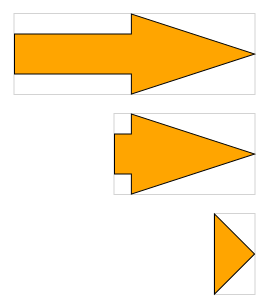
Note that the arrow head will always spread the full height of the node for horizontal arrows or the full width
for vertical arrows. If this is not possible with the set angle then the angle is capped to the largest value which
meets this requirement, as shown in the bottommost image of the figure below.
Resizing behavior
Direction
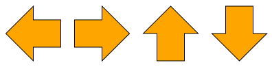
The arrow shape can be rotated to point in the four major directions
LEFT, RIGHT, UP, and DOWN
using the direction property.
The directions LEFT, RIGHT, UP, and DOWN
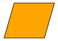
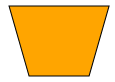
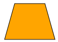
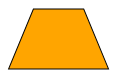
Trapezoid and Parallelogram
The shapes PARALLELOGRAM and TRAPEZOID are no arrow shapes in
the proper sense. However, they technically behave like arrow shapes: they have an angled side and exhibit a
similar resizing behavior. The shaftRatio property has no effect on these shapes and is ignored.
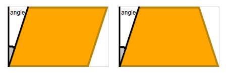
The angle for PARALLELOGRAM and TRAPEZOID
The trapezoid’s direction is chosen in a way that stretching the shape at the parallel sides keeps the angle stable.
Therefore, with direction RIGHT the small side of the trapezoid points upwards.
Rotation angles of a parallelogram and a trapezoid compared to an arrow
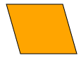
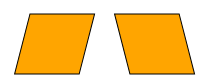
The parallelogram is symmetric to 180° rotation. To get a mirrored parallelogram choose
a negative angle
Applying a negative angle to get a mirrored parallelogram
Groups and Folders
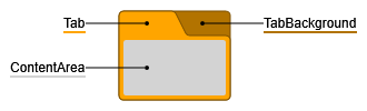
GroupNodeStyle is a style primarily intended for group and folder (i.e. collapsed group) nodes. This style
creates visualizations similar to tabbed file folders. Like all shape based node styles, GroupNodeStyle
supports setting a border stroke. Additionally, there are several properties for coloring specific
areas in a GroupNodeStyle.
The specific areas of GroupNodeStyle
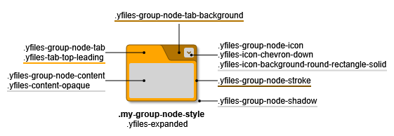
The cssClass property enables support for CSS classes on the style. The given CSS class is
applied to the root <g> element and the GroupNodeStyle implicitly adds more specific CSS classes, prefixed
with yfiles- to all distinctive parts of its visualization.
CSS classes when setting cssClass
The described CSS classes above only depict the current state of shown node. You can find more details on the available
CSS classes in the following subsections and general information about CSS item styling with yFiles for HTML in
CSS Item Styles.
Aside from its coloring properties, GroupNodeStyle offers lots of configuration options for fine-grained
control over tab position, shape, and size.
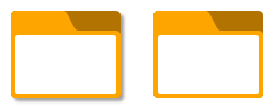
Different expanded and collapsed group nodes with GroupNodeStyle
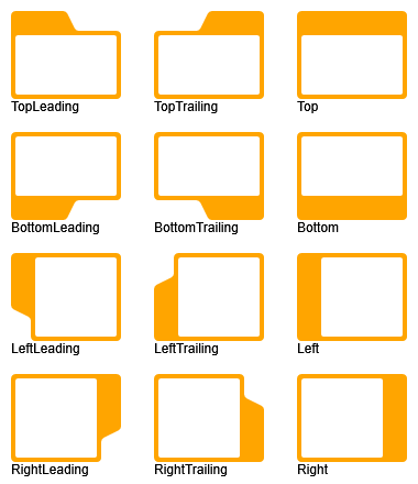
The enumeration GroupNodeStyleTabPosition defines several tab positions for GroupNodeStyle which
can be set using the tabPosition property. If the cssClass property
is defined, each position also sets a CSS class like yfiles-tab-<position>, for example yfiles-tab-top-leading.
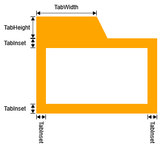
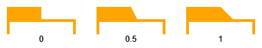
tabWidth, tabHeight, and tabInsetDifferent values for tabSlope
tabWidth and tabSlope are ignored if
tabPosition is neither a leading nor a trailing position.
In Supported tab positions, this can be observed for positions
TOP,
BOTTOM,
LEFT, and
RIGHT.
Group and Folder Icon
GroupNodeStyle supports drawing an interactive handle for
toggling the expansion state of a group node. The style offers several
properties for configuring the position and the look of the handle and multiple CSS classes if the
cssClass property is defined. The container element in general holds the yfiles-group-node-icon
CSS class with more specific classes depending on the actual icon.
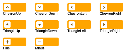
The enumeration GroupNodeStyleIconType defines different icon types for the visualization of the handle that come
with a CSS class like yfiles-icon-<type>, for example yfiles-icon-chevron-up.
Supported icon types
GroupNodeStyle supports different types of icons depending on the expansion state of its node.
Property folderIcon determines which icon to show for collapsed nodes.
Conversely, property groupIcon determines the icon for expanded nodes.
Moreover, there are several additional properties for controlling the look of the icon that are independent of
expansion state.
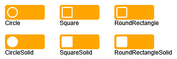
iconBackgroundShape governs the background shape of the icon and the
GroupNodeStyleIconBackgroundShape enumeration defines supported shape types and comes with CSS classes like
yfiles-icon-background-<shape>, for example yfiles-background-circle.
Supported icon background shapes
Of course, icon background and
icon foreground can be set individually or styled with the
yfiles-icon-background and yfiles-icon-foreground CSS classes if the cssClass property
is defined.
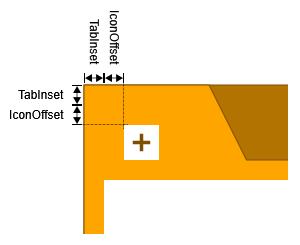
The position of the icon is controlled with
iconPosition and iconOffset
(together with properties tabPosition and tabInset).
The position of the icon is anchored to two sides of the corresponding node. tabPosition
determines the first side, iconPosition the second side. The sum of
tabInset and iconOffset is the distance from the icon to the two anchor
sides.
iconOffset for a leading icon in a top tabDifferent values for iconOffsetLeading icon positions for different tab positionsTrailing icon positions for different tab positions
Finally, the size of the icon can be set using iconSize.
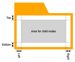
Content Area
For expanded groups, the style’s content area holds the child nodes of the group.
Its insets (together with the tabInset)
determine how close child nodes can be moved to the border of their parent node.
The area for child nodes in a GroupNodeStyle
For easier interaction with child nodes of expanded groups, the behavior of hit tests, marquee selection tests, and
lasso selection tests in the content area can be changed. By default, the aforementioned tests treat the content area
in the same way as any other (part of the) node. If hitTransparentContentArea is enabled,
the content area is treated as if it was not part of any node. In this state, it is, for example, possible to start a
marquee selection inside the content area for easy selection of child nodes without selecting the parent node, too.
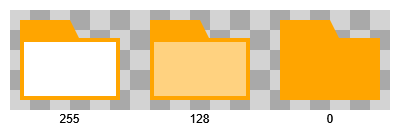
There are two rendering modes for the content area. By default, it is rendered over tab and tab background:
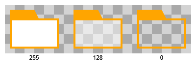
For collapsed groups, the content area visualization can be turned off through property
showFolderContentArea.
If the cssClass property is defined, the style also creates CSS classes for the different
areas and states:
yfiles-expanded or yfiles-collapsed: On the root container of the group visualization.
yfiles-group-node-content: General CSS class for the content area.
yfiles-content-opaque or yfiles-content-transparent: Additional class on the content area, depending on
hitTransparentContentArea.
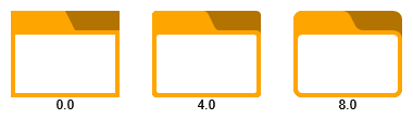
Corner Radius and Drop Shadow
The corners of a GroupNodeStyle's shape can be rounded off using
property cornerRadius.
Different values for cornerRadius
Finally, GroupNodeStyle can render a drop shadow, if drawShadow is enabled.
Nodes with and without drop shadow
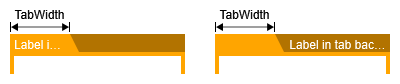
Tab Labels
One common use case for GroupNodeStyle's tabbed file folder visualization is displaying text in the tab or
the tab background of the visualization. GroupNodeStyle supports this use case with the help of class
GroupNodeLabelModel.
The model’s
default parameter
places labels in the tab and its
tab background parameter
places labels in the tab background.
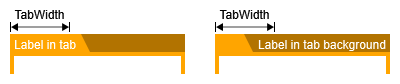
Additionally, property tabSizePolicy determines if the preferred sizes of tab (and tab
background) labels affect the size of the tab. By default, this is not the case.
FIXED behavior for tabSizePolicy
However, using value ADJUST_TO_LABEL,
the width of the tab may grow beyond or shrink below GroupNodeStyle's tabWidth
to accomodate a tab label or a tab background label.
ADJUST_TO_LABEL behavior for tabSizePolicy
Size Constraints
By default, GroupNodeStyle constrains the minimum size of the node to ensure that the tab, as well as the icon
are visible. This means that the group cannot shrink below the size of the tab and the icon if they are displayed at all.
Additionally, you can configure the minimum size of the content area with the property
minimumContentAreaSize. This value defines the minimum size of the content area, i.e. the part
of the group that contains the child nodes. This minimum size includes the contentAreaInsets.
Using other Node Styles for Groups and Folders
In addition to the GroupNodeStyle, yFiles for HTML offers the
CollapsibleNodeStyleDecorator
to represent group and folder nodes.
The CollapsibleNodeStyleDecorator is a special node style that decorates
any other node style with an interactive handle for
toggling the expansion state
of a group node.
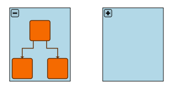
By default, this handle is rendered as a plus sign (+) when in collapsed
state, and a minus sign (-) when in expanded state. The following sample shows the group node
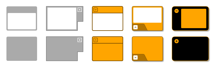
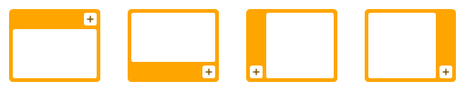
representation for a group node with three child nodes and a collapsed group node side by side:
Group node representation using CollapsibleNodeStyleDecorator
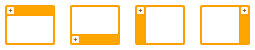
The CollapsibleNodeStyleDecorator provides several properties to control the
location of the toggle handle. The visualization of the handle can be changed with
a custom renderer.
The following example presents the setup for the group node style shown above. The handle is
placed
with some distance from the top left corner of the node. The
insets
ensure that the upper area containing the handle is not overlapped by the content of the group.
Setting the default group node style
// create the style to decorateconst decoratedStyle = new ShapeNodeStyle({
shape: 'rectangle',
fill: 'lightblue'
})
// decorate the style and set as default style for group nodes
masterGraph.groupNodeDefaults.style = new CollapsibleNodeStyleDecorator({
wrapped: decoratedStyle,
buttonPlacement: new FreeNodeLabelModel().createParameter({
layoutRatio: [0, 0],
layoutOffset: [3, 3],
labelRatio: [0, 0]
}),
insets: [25, 5, 5, 5]
})
// create the style to decorateconst decoratedStyle = new ShapeNodeStyle({ shape: 'rectangle', fill: 'lightblue' })
// decorate the style and set as default style for group nodes
masterGraph.groupNodeDefaults.style = new CollapsibleNodeStyleDecorator({
wrapped: decoratedStyle,
buttonPlacement: new FreeNodeLabelModel().createParameter({
layoutRatio: [0, 0],
layoutOffset: [3, 3],
labelRatio: [0, 0]
}),
insets: [25, 5, 5, 5]
})
CollapsibleNodeStyleDecorator needs to be set to the group node in the
master graph.
The representations of a group node’s collapsed state and expanded state can be different.
By default, however, the initial style that is used to render a folder node in a folding view is the
style of the original (expanded) group node from the master graph.
See the section Maintaining the Folder Node State for details.
Custom Styles
yFiles for HTML offers an abstract style implementation, the NodeStyleBase<TVisual>. Creating custom styles using
this class as base class is discussed in detail in section Customizing Styles.
Invisible Nodes
The VoidNodeStyle can be used to render a node invisible, while the node is still in the graph.
Additionally, the node is not visible to any interactions like mouse clicks.


