Custom Item Indication
The basics about selection, focus and highlight indicators have been introduced in section Selection, Focus, and Highlight and simple customizations using element styles was explained in section Styling Selection, Focus, and Highlight.
Going more in depth, this chapter first handles the technical details behind and the classes involved in item indication namely Model Manager and Indicator Installer and also introduces the classes responsible for the default indicators.
Further sections describe advanced customizations and usage of the features. These cover Customizing Indicator Templates, implementing a Complex Custom Indicator Installer for node highlights, and how Additional Indicators can be added using the Model Manager mechanism.
Finally, we demonstrate Building Indicators into Styles instead of using the default selection visualization mechanism to have full control over and maximal integration into the graph item styles.
Model Manager
Each type of indicator has its own model manager that is defined on GraphComponent: The selectionIndicatorManager, focusIndicatorManager, and highlightIndicatorManager. These are small entities that manage a model (the selection, the focused item or the highlighted items) by creating and updating the visual appearances (ICanvasObject) for it. Each manager places its ICanvasObjects into its own ICanvasObjectGroup in the GraphComponent (mentioned in The main canvas object groups). The model managers are properties on the GraphComponent and of course, your own implementation can be set for them.
Which items a manager should decorate is provided by its underlying model.
- SelectionIndicatorManager<T> operates on the GraphComponent’s
SelectionModel and decorates the items on
which the selection is set to
true. - FocusIndicatorManager<T> operates on the GraphComponent’s currentItem and decorates it.
- HighlightIndicatorManager<T> operates on an internal model where the items to decorate must be manually added / removed.
The decoration itself is performed by creating an ICanvasObject via an ICanvasObjectInstaller. The result is inserted in one of the above-mentioned manager specific ICanvasObjectGroups on the GraphComponent. To do this, the manager queries the ICanvasObjectInstaller from the item to decorate using lookup. This means that you can insert your own implementation of ICanvasObjectInstaller for a given item by simply decorating its lookup.
The graph-specific subclasses GraphSelectionIndicatorManager, GraphFocusIndicatorManager and GraphHighlightIndicatorManager introduced above priorize using the set item styles as indicators and only use the lookup if no style is set. A drawback of this simplicity is that they do not support individual indicators per item.
There are some properties on the model managers for general configuration.
- Configuration of the selection and focus indication
- FocusIndicatorManager<T>.focusedItem
- Sets the item that should be decorated with the focus indication. This is normally done automatically by GraphComponent and GraphEditorInputMode, as well when using the SET_CURRENT_ITEM command.
- FocusIndicatorManager<T>.showFocusPolicy
- Determines when to show the focus indication of an item.
- SelectionIndicatorManager<T>.model
- Changes the underlying model for the selection.
Additionally, each manager has the getInstaller and getCanvasObjectGroup methods. You can override them for more control over the visualization. Instead of decorating the lookup, you can use the former method to return a ICanvasObjectInstaller for a given item. The ICanvasObjectInstaller will then be used to retrieve the ICanvasObject for the item. The latter method can be used to specify into which ICanvasObjectGroup the visualization for the indicator of that item should be put (instead of using always the same ICanvasObjectGroup).
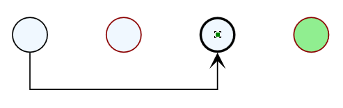
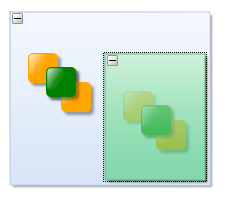
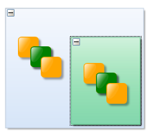
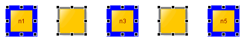
The example below uses the green node styles for node and group node selection that have been introduced in section Per-item styling of the Styling Selection, Focus, and Highlight chapter.
A customized SelectionIndicatorManager<T>, that renders the green node decorations just above the nodes themselves, is set as selectionIndicatorManager:
/**
 * A SelectionIndicatorManager that places the selection decoration of an item
 * just above the items visualization.
 */
class MySelectionIndicatorManager extends SelectionIndicatorManager {
  /**
   * @param {!IModelItem} item - The item to find a canvas object group for.
   * @returns {?ICanvasObjectGroup}
   */
  getCanvasObjectGroup(item) {
    // instead of using one selection group, the selection decoration for an item
    // shall be put into the same canvas object group as the item's visualization
    const co = this.$getCanvasObject(item)
    return co !== null ? co.group : super.getCanvasObjectGroup(item)
  }

  /**
   * @param {!IModelItem} item - The item to add.
   * @returns {?ICanvasObject}
   */
  addItem(item) {
    const selectionCanvasObject = super.addItem(item)
    const itemCanvasObject = this.$getCanvasObject(item)
    // super.addItem(item) has added the selectionCanvasObject in the front of
    // the canvas object group of the itemCanvasObject
    // but it should be moved just above the itemCanvasObject
    if (selectionCanvasObject !== null && itemCanvasObject !== null) {
      selectionCanvasObject.above(itemCanvasObject)
    }
    return selectionCanvasObject
  }

  /**
   * @param {!IModelItem} item
   * @returns {?ICanvasObject}
   */
  $getCanvasObject(item) {
    // return the canvas object visualizing the item
    return this.canvasComponent.graphModelManager.getCanvasObject(item)
  }
}/**
 * A SelectionIndicatorManager that places the selection decoration of an item
 * just above the items visualization.
 */
class MySelectionIndicatorManager extends SelectionIndicatorManager<IModelItem> {
  /**
   * @param item - The item to find a canvas object group for.
   */
  getCanvasObjectGroup(item: IModelItem): ICanvasObjectGroup | null {
    // instead of using one selection group, the selection decoration for an item
    // shall be put into the same canvas object group as the item's visualization
    const co = this.$getCanvasObject(item)
    return co !== null ? co.group : super.getCanvasObjectGroup(item)
  }

  /**
   * @param item - The item to add.
   */
  addItem(item: IModelItem): ICanvasObject | null {
    const selectionCanvasObject = super.addItem(item)
    const itemCanvasObject = this.$getCanvasObject(item)
    // super.addItem(item) has added the selectionCanvasObject in the front of
    // the canvas object group of the itemCanvasObject
    // but it should be moved just above the itemCanvasObject
    if (selectionCanvasObject !== null && itemCanvasObject !== null) {
      selectionCanvasObject.above(itemCanvasObject)
    }
    return selectionCanvasObject
  }

  private $getCanvasObject(item: IModelItem): ICanvasObject | null {
    // return the canvas object visualizing the item
    return (this.canvasComponent as GraphComponent).graphModelManager.getCanvasObject(item)
  }
}graphComponent.selectionIndicatorManager = new MySelectionIndicatorManager()
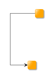
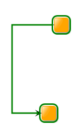
The following figures show the difference between the default behavior and the custom manager (in both cases using the green node selection decoration):
Indicator Installer
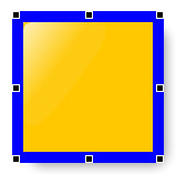
The aforementioned model managers use the ICanvasObjectInstaller interface to build the visualization of the selection, focus, or highlight indication for a specific item. There are three sub-interfaces of ICanvasObjectInstaller that are used in yFiles for HTML by default: ISelectionIndicatorInstaller for creating the selection indicator for the item for which it is queried, IFocusIndicatorInstaller for the focus indicator, and IHighlightIndicatorInstaller for the highlight indicator.
These indicator installers actually create the visual representation of the selection, focus, or highlight for a given item. They are called installer because they install an ICanvasObject for a given item into the ICanvasObjectGroup of the selection, focus, or highlight and simultaneously provide an ICanvasObjectDescriptor that creates the visual appearance.
For each type of graph element (except for bends) there are default indicator installer classes. They allow to customize the visualization of the indicators without the need to change the implementation, by providing certain objects via resource keys. The Default indicator installer for graph elements and customization options table shows the default indicator installer for the different graph elements, the resource keys, and the type the resource key should return.
| Graph element | Default Indicator Installer | Resource Keys | Expected Type |
|---|---|---|---|
Bends do not have distinct indicator installers because they are not selectable or focusable by default. Their indicators are drawn as part of the edge visualization and can be customized using the corresponding BEND_TEMPLATE_KEY.
Customizing Indicator Templates
- RectangleIndicatorInstaller
- Installs an ICanvasObject as a rectangle. The actual drawing of the rectangle is done by an IVisualTemplate which can be set using the template property or, if not set, is queried using the appropriate ResourceKey.The getRectangle method can be overridden. It returns the bounds of the rectangle to render for the object for which the indicator is installed for.
- OrientedRectangleIndicatorInstaller
- Installs an ICanvasObject as an oriented rectangle, which is defined by an anchor in the lower left corner of the rectangle and an up vector that defines the rotation of the rectangle. Just like the RectangleIndicatorInstaller, the actual drawing of the rectangle is done by an IVisualTemplate.The getRectangle method can be overridden. It returns an IOrientedRectangle instead of a normal rectangle.
- EdgeSelectionIndicatorInstallerEdgeFocusIndicatorInstallerEdgeHighlightIndicatorInstaller
- Installs an ICanvasObject that renders a line along the edge path and also decorates the bends. The STROKE_KEY can be used to change the stroke that the line is drawn with. The BEND_TEMPLATE_KEY can be used to change the visual appearance for the decorated bends.
- PointSelectionIndicatorInstaller
- Has two properties: stroke and fill that can be used to change the style of the selection indicator. Also, you can override the getCenterPoint method to return the center of the visualization for the object to decorate.
The following example shows how to change the selection indication for nodes. We simply have to register a custom IVisualTemplate that renders the indication, using the appropriate resource key.
// create a custom selection template with a blue border and transparent fill
const selectionTemplate = new (class extends BaseClass(IVisualTemplate) {
  /**
   * @param {!IRenderContext} context
   * @param {!Rect} bounds
   * @param {*} dataObject
   * @returns {?SvgVisual}
   */
  createVisual(context, bounds, dataObject) {
    const rect = document.createElementNS('http://www.w3.org/2000/svg', 'rect')
    rect.x.baseVal.value = bounds.x
    rect.y.baseVal.value = bounds.y
    rect.width.baseVal.value = bounds.width
    rect.height.baseVal.value = bounds.height
    rect.setAttribute('stroke', 'blue')
    rect.setAttribute('fill', 'none')
    return new SvgVisual(rect)
  }

  /**
   * @param {!IRenderContext} context
   * @param {!SvgVisual} oldVisual
   * @param {!Rect} bounds
   * @param {*} dataObject
   * @returns {?SvgVisual}
   */
  updateVisual(context, oldVisual, bounds, dataObject) {
    const rect = oldVisual.svgElement
    rect.x.baseVal.value = bounds.x
    rect.y.baseVal.value = bounds.y
    rect.width.baseVal.value = bounds.width
    rect.height.baseVal.value = bounds.height
    return oldVisual
  }
})()
// register the template to be used for drawing the selection indicator of nodes
graphComponent.resources.set(RectangleIndicatorInstaller.SELECTION_TEMPLATE_KEY, selectionTemplate)
// create a custom selection template with a blue border and transparent fill
const selectionTemplate = new (class extends BaseClass(IVisualTemplate) {
  createVisual(context: IRenderContext, bounds: Rect, dataObject: any): SvgVisual | null {
    const rect = document.createElementNS('http://www.w3.org/2000/svg', 'rect')
    rect.x.baseVal.value = bounds.x
    rect.y.baseVal.value = bounds.y
    rect.width.baseVal.value = bounds.width
    rect.height.baseVal.value = bounds.height
    rect.setAttribute('stroke', 'blue')
    rect.setAttribute('fill', 'none')
    return new SvgVisual(rect)
  }

  updateVisual(context: IRenderContext, oldVisual: SvgVisual, bounds: Rect, dataObject: any): SvgVisual | null {
    const rect = oldVisual.svgElement as SVGRectElement
    rect.x.baseVal.value = bounds.x
    rect.y.baseVal.value = bounds.y
    rect.width.baseVal.value = bounds.width
    rect.height.baseVal.value = bounds.height
    return oldVisual
  }
})()
// register the template to be used for drawing the selection indicator of nodes
graphComponent.resources.set(RectangleIndicatorInstaller.SELECTION_TEMPLATE_KEY, selectionTemplate)
The last example modifies the selection indication for all nodes. If you want to change the selection indication for only certain nodes instead, then you have to decorate the graph with a custom ISelectionIndicatorInstaller. In the next example we specify a custom ISelectionIndicatorInstaller for nodes that have at least one label. For all other nodes the default ISelectionIndicatorInstaller is used. The modified selection style is defined in a data template with the key attribute "MyCustomTemplate" (not shown).
const nodeDecorator = graphComponent.graph.decorator.nodeDecorator
nodeDecorator.selectionDecorator.setFactory(
  (node) => node.labels.size > 0,
  (node) => {
    const installer = new RectangleIndicatorInstaller(node.layout)
    installer.template = selectionTemplate
    return installer
  }
)
Since the indicator installers are always created anew when being queried from an item via lookup, simply getting them from the lookup and setting the properties on the returned instance will not do. Instead, you have to decorate the lookup in such a way that the configured instance is returned; either by adjusting the instance that is returned from the inner lookup or returning a configured object directly (via creation with new and adjusting the new object).
Complex Custom Indicator Installer
ISelectionIndicatorInstaller, IFocusIndicatorInstaller, and IHighlightIndicatorInstaller all extend the same interface ICanvasObjectInstaller which has only one method: addCanvasObject. This method takes an item to install the indicator for and the ICanvasObjectGroup in which the indicator for the item should be installed into.
In principle the method should somewhere call addChild and return the resulting ICanvasObject.
To implement this meaningfully, you have to provide an ICanvasObjectDescriptor for the given object. This descriptor should yield an IVisualCreator for the visualization as well as IHitTestable, IVisibilityTestable, and IBoundsProvider for the logical bounds of the visualization as described in the section Visualizing Arbitrary Objects.
You can then use your custom indicator installer for the selection, focus, or highlighting for decoration on the item’s lookup and it will use your implementation when decorating this item.
Example
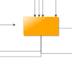
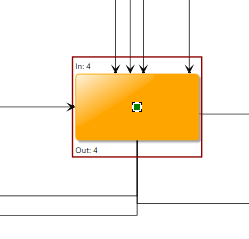
The following example customizes the highlighting of nodes. Nodes are highlighted during reparenting and interactive edge editing when the mouse hovers over a potential target group node respectively target node of the new edges.
The custom highlight includes labels that show the inDegree and outDegree of the node as well as a red box around the node and labels:
class MyHighlightIndicatorInstaller extends BaseClass(IHighlightIndicatorInstaller) {
  /**
   * @param {!ICanvasContext} context - The context that contains the information required to install the visual representation.
   * @param {!ICanvasObjectGroup} group - The canvas object group to add the newly generated {@link ICanvasObject} to.
   * @param {*} item - The item to install.
   * @returns {?ICanvasObject}
   */
  addCanvasObject(context, group, item) {
    if (item instanceof INode) {
      return group.addChild(item, new MyCanvasObjectDescriptor())
    }
    return null
  }
}

class MyCanvasObjectDescriptor extends BaseClass(
  ICanvasObjectDescriptor,
  IVisualCreator,
  IBoundsProvider,
  IVisibilityTestable
) {
  $node

  /**
   * @param {!object} forUserObject - the user object to query the bounds for
   * @returns {!IBoundsProvider}
   */
  getBoundsProvider(forUserObject) {
    this.$node = forUserObject
    return this
  }

  /**
   * @param {!object} forUserObject - the user object to do the hit testing for
   * @returns {!IHitTestable}
   */
  getHitTestable(forUserObject) {
    return IHitTestable.NEVER
  }

  /**
   * @param {!object} forUserObject - the user object to query visibility for
   * @returns {!IVisibilityTestable}
   */
  getVisibilityTestable(forUserObject) {
    this.$node = forUserObject
    return this
  }

  /**
   * @param {!object} forUserObject - the user object to create a Visual for
   * @returns {!IVisualCreator}
   */
  getVisualCreator(forUserObject) {
    this.$node = forUserObject
    return this
  }

  /**
   * @param {!ICanvasContext} context - The context that will be used for the update.
   * @param {*} canvasObject - The object to check.
   * @returns {boolean}
   */
  isDirty(context, canvasObject) {
    return true
  }

  /**
   * @param {!IRenderContext} context - The context that describes where the visual will be used.
   * @returns {!Visual}
   */
  createVisual(context) {
    const bounds = this.getBounds(context)
    const visualGroup = new SvgVisualGroup()

    // add a rectangle with a red border
    const rect = document.createElementNS('http://www.w3.org/2000/svg', 'rect')
    rect.setAttribute('stroke', 'darkred')
    rect.setAttribute('stroke-width', '2')
    rect.setAttribute('fill', 'none')
    rect.width.baseVal.value = bounds.width
    rect.height.baseVal.value = bounds.height
    SvgVisual.setTranslate(rect, bounds.x, bounds.y)
    visualGroup.add(new SvgVisual(rect))

    // add labels above and below the node indicating its in- and out-degree
    const graph = context.canvasComponent.graph
    const labelIn = document.createElementNS('http://www.w3.org/2000/svg', 'text')
    labelIn.textContent = `In: ${graph.inDegree(this.$node)}`
    SvgVisual.setTranslate(labelIn, bounds.x + 2, bounds.y + 12)
    visualGroup.add(new SvgVisual(labelIn))

    const labelOut = document.createElementNS('http://www.w3.org/2000/svg', 'text')
    labelOut.textContent = `Out: ${graph.outDegree(this.$node)}`
    SvgVisual.setTranslate(labelOut, bounds.x + 2, bounds.maxY - 2)
    visualGroup.add(new SvgVisual(labelOut))

    return visualGroup
  }

  /**
   * @param {!IRenderContext} context - The context that describes where the visual will be used in.
   * @param {!Visual} oldVisual - The visual instance that had been returned the last time
   *  the {@link IVisualCreator#createVisual} method was called on this instance.
   * @returns {!Visual}
   */
  updateVisual(context, oldVisual) {
    return this.createVisual(context)
  }

  /**
   * @param {!ICanvasContext} context - the context to calculate the bounds for
   * @returns {!Rect}
   */
  getBounds(context) {
    // extend the node bounds to keep a small margin and space for the labels
    return this.$node.layout.toRect().getEnlarged(new Insets(5, 25, 5, 25))
  }

  /**
   * @param {!ICanvasContext} context - The context to determine the visibility for.
   * @param {!Rect} rectangle - The visible region clip.
   * @returns {boolean}
   */
  isVisible(context, rectangle) {
    return this.getBounds(context).intersects(rectangle)
  }
}class MyHighlightIndicatorInstaller
  extends BaseClass(IHighlightIndicatorInstaller)
  implements IHighlightIndicatorInstaller
{
  /**
   * @param context - The context that contains the information required to install the visual representation.
   * @param group - The canvas object group to add the newly generated {@link ICanvasObject} to.
   * @param item - The item to install.
   */
  addCanvasObject(context: ICanvasContext, group: ICanvasObjectGroup, item: any): ICanvasObject | null {
    if (item instanceof INode) {
      return group.addChild(item, new MyCanvasObjectDescriptor())
    }
    return null
  }
}

class MyCanvasObjectDescriptor
  extends BaseClass(ICanvasObjectDescriptor, IVisualCreator, IBoundsProvider, IVisibilityTestable)
  implements ICanvasObjectDescriptor, IVisualCreator, IBoundsProvider, IVisibilityTestable
{
  private $node: any

  /**
   * @param forUserObject - the user object to query the bounds for
   */
  getBoundsProvider(forUserObject: object): IBoundsProvider {
    this.$node = forUserObject
    return this
  }

  /**
   * @param forUserObject - the user object to do the hit testing for
   */
  getHitTestable(forUserObject: object): IHitTestable {
    return IHitTestable.NEVER
  }

  /**
   * @param forUserObject - the user object to query visibility for
   */
  getVisibilityTestable(forUserObject: object): IVisibilityTestable {
    this.$node = forUserObject
    return this
  }

  /**
   * @param forUserObject - the user object to create a Visual for
   */
  getVisualCreator(forUserObject: object): IVisualCreator {
    this.$node = forUserObject
    return this
  }

  /**
   * @param context - The context that will be used for the update.
   * @param canvasObject - The object to check.
   */
  isDirty(context: ICanvasContext, canvasObject: any): boolean {
    return true
  }

  /**
   * @param context - The context that describes where the visual will be used.
   */
  createVisual(context: IRenderContext): Visual {
    const bounds = this.getBounds(context)
    const visualGroup = new SvgVisualGroup()

    // add a rectangle with a red border
    const rect = document.createElementNS('http://www.w3.org/2000/svg', 'rect')
    rect.setAttribute('stroke', 'darkred')
    rect.setAttribute('stroke-width', '2')
    rect.setAttribute('fill', 'none')
    rect.width.baseVal.value = bounds.width
    rect.height.baseVal.value = bounds.height
    SvgVisual.setTranslate(rect, bounds.x, bounds.y)
    visualGroup.add(new SvgVisual(rect))

    // add labels above and below the node indicating its in- and out-degree
    const graph = (context.canvasComponent as GraphComponent).graph
    const labelIn = document.createElementNS('http://www.w3.org/2000/svg', 'text')
    labelIn.textContent = `In: ${graph.inDegree(this.$node)}`
    SvgVisual.setTranslate(labelIn, bounds.x + 2, bounds.y + 12)
    visualGroup.add(new SvgVisual(labelIn))

    const labelOut = document.createElementNS('http://www.w3.org/2000/svg', 'text')
    labelOut.textContent = `Out: ${graph.outDegree(this.$node)}`
    SvgVisual.setTranslate(labelOut, bounds.x + 2, bounds.maxY - 2)
    visualGroup.add(new SvgVisual(labelOut))

    return visualGroup
  }

  /**
   * @param context - The context that describes where the visual will be used in.
   * @param oldVisual - The visual instance that had been returned the last time
   *  the {@link IVisualCreator#createVisual} method was called on this instance.
   */
  updateVisual(context: IRenderContext, oldVisual: Visual): Visual {
    return this.createVisual(context)
  }

  /**
   * @param context - the context to calculate the bounds for
   */
  getBounds(context: ICanvasContext): Rect {
    // extend the node bounds to keep a small margin and space for the labels
    return this.$node.layout.toRect().getEnlarged(new Insets(5, 25, 5, 25))
  }

  /**
   * @param context - The context to determine the visibility for.
   * @param rectangle - The visible region clip.
   */
  isVisible(context: ICanvasContext, rectangle: Rect): boolean {
    return this.getBounds(context).intersects(rectangle)
  }
}
Adding Additional Indicator
If you want to add an indicator for your objects that is neither a selection, nor a focus indication, nor a general highlighting, you can use the model manager concept to implement your own indicator for items.
ModelManager<T> has four abstract methods:
- onEnabled and onDisabled
- These methods are called when the manager is being enabled or disabled and are commonly used to set up the manager and clean up resources.
- getCanvasObjectGroup
- Returns the ICanvasObjectGroup in which the indicators for the items should reside in. This can be a predefined ICanvasObjectGroup (obtainable from GraphComponent) or a new one (creatable by addGroup on the parent group)
- getInstaller
- Retrieves the ICanvasObjectInstaller instance that creates the indicator for the given item. In the yFiles for HTML model managers, this uses the lookup of the item to query the implementations, however this can be implemented as needed.
That’s it. When an item is added to a model manager via addItem then the other methods are used to install an ICanvasObject into the ICanvasObjectGroup that decorates the item. You can wire up some user interaction to the addItem and removeItem methods to manage decoration for certain gestures, for example. This concept can be extended as needed to bind the manager to more complex models.
Example
The following example uses a customized GraphHighlightIndicatorManager to add highlights to edges the mouse hovers over as well as their source and target nodes.
/** @type {GraphHighlightIndicatorManager} */
let hoverIndicatorManager

/**
 * @param {!ItemHoverInputMode} hoverInputMode
 * @param {!INodeStyle} nodeStyleHighlight
 * @param {!IEdgeStyle} edgeStyleHighlight
 */
function initializeHoverEffects(hoverInputMode, nodeStyleHighlight, edgeStyleHighlight) {
  // configure hover input mode to highlight the hovered edge, its source and target node
  hoverInputMode.hoverItems = GraphItemTypes.EDGE
  hoverInputMode.addHoveredItemChangedListener(onHoveredItemChanged)

  hoverIndicatorManager = new GraphHighlightIndicatorManager({
    nodeStyle: nodeStyleHighlight,
    edgeStyle: edgeStyleHighlight
  })
  hoverIndicatorManager.install(graphComponent)
}

/**
 * @param {*} sender
 * @param {!HoveredItemChangedEventArgs} args
 */
function onHoveredItemChanged(sender, args) {
  if (hoverIndicatorManager === null) {
    return
  }
  hoverIndicatorManager.clearHighlights()
  if (args.item instanceof IEdge) {
    hoverIndicatorManager.addHighlight(args.item)
    hoverIndicatorManager.addHighlight(args.item.sourceNode)
    hoverIndicatorManager.addHighlight(args.item.targetNode)
  }
}let hoverIndicatorManager: GraphHighlightIndicatorManager

function initializeHoverEffects(
  hoverInputMode: ItemHoverInputMode,
  nodeStyleHighlight: INodeStyle,
  edgeStyleHighlight: IEdgeStyle
): void {
  // configure hover input mode to highlight the hovered edge, its source and target node
  hoverInputMode.hoverItems = GraphItemTypes.EDGE
  hoverInputMode.addHoveredItemChangedListener(onHoveredItemChanged)

  hoverIndicatorManager = new GraphHighlightIndicatorManager({
    nodeStyle: nodeStyleHighlight,
    edgeStyle: edgeStyleHighlight
  })
  hoverIndicatorManager.install(graphComponent)
}

function onHoveredItemChanged(sender: any, args: HoveredItemChangedEventArgs): void {
  if (hoverIndicatorManager === null) {
    return
  }
  hoverIndicatorManager.clearHighlights()
  if (args.item instanceof IEdge) {
    hoverIndicatorManager.addHighlight(args.item)
    hoverIndicatorManager.addHighlight(args.item.sourceNode!)
    hoverIndicatorManager.addHighlight(args.item.targetNode!)
  }
}
Building Indicators into your Styles
Instead of working with the ICanvasObjectInstaller, the indications for selection, focus or highlight can also be handled by the item styles.
The following node style renders the background and border with different colors depending on the selection state:
class CircleNodeStyle extends NodeStyleBase {
  /**
   * @param {!IRenderContext} context
   * @param {!INode} node
   * @returns {?Visual}
   */
  createVisual(context, node) {
    const isSelected = CircleNodeStyle.$isSelected(context, node)
    const circle = document.createElementNS('http://www.w3.org/2000/svg', 'ellipse')
    circle.setAttribute('stroke', isSelected ? 'darkred' : 'black')
    circle.setAttribute('fill', isSelected ? 'lightgreen' : 'aliceblue')
    const layout = node.layout
    circle.cx.baseVal.value = layout.center.x
    circle.cy.baseVal.value = layout.center.y
    const size = Math.min(node.layout.width, node.layout.height)
    circle.rx.baseVal.value = size / 2
    circle.ry.baseVal.value = size / 2
    return new SvgVisual(circle)
  }

  /**
   * @param {!IRenderContext} context
   * @param {!INode} node
   * @returns {boolean}
   */
  static $isSelected(context, node) {
    return context.canvasComponent instanceof GraphComponent && context.canvasComponent.selection.isSelected(node)
  }
}

class CircleNodeStyle extends NodeStyleBase {
  createVisual(context: IRenderContext, node: INode): Visual | null {
    const isSelected = CircleNodeStyle.$isSelected(context, node)
    const circle = document.createElementNS('http://www.w3.org/2000/svg', 'ellipse')
    circle.setAttribute('stroke', isSelected ? 'darkred' : 'black')
    circle.setAttribute('fill', isSelected ? 'lightgreen' : 'aliceblue')
    const layout = node.layout
    circle.cx.baseVal.value = layout.center.x
    circle.cy.baseVal.value = layout.center.y
    const size = Math.min(node.layout.width, node.layout.height)
    circle.rx.baseVal.value = size / 2
    circle.ry.baseVal.value = size / 2
    return new SvgVisual(circle)
  }

  private static $isSelected(context: IRenderContext, node: INode): boolean {
    return context.canvasComponent instanceof GraphComponent && context.canvasComponent.selection.isSelected(node)
  }
}
For a selected node, the circular style is rendered in selection state and the default selection indication is added as well. The default selection can easily be disabled, either for all items:
graphComponent.selectionIndicatorManager.enabled = false
Or only for nodes:
Either using a VoidNodeStyle:
graphComponent.selectionIndicatorManager = new GraphSelectionIndicatorManager({
  nodeStyle: VoidNodeStyle.INSTANCE
})
or via GraphDecorator:
graphComponent.graph.decorator.nodeDecorator.selectionDecorator.hideImplementation()
In a similar way, the style can consider the focus or hover state of a node:
class CircleNodeStyle extends NodeStyleBase {
  /**
   * @param {!IRenderContext} context
   * @param {!INode} node
   * @returns {?Visual}
   */
  createVisual(context, node) {
    const isSelected = CircleNodeStyle.$isSelected(context, node)
    const isFocused = CircleNodeStyle.$isFocused(context, node)
    const isHighlighted = CircleNodeStyle.$isHighlighted(context, node)
    const circle = document.createElementNS('http://www.w3.org/2000/svg', 'ellipse')
    circle.setAttribute('stroke', isSelected ? 'darkred' : 'black')
    circle.setAttribute('stroke-width', isHighlighted ? '2' : '1')
    circle.setAttribute('fill', isFocused ? 'lightgreen' : 'aliceblue')
    const layout = node.layout
    circle.cx.baseVal.value = layout.center.x
    circle.cy.baseVal.value = layout.center.y
    const size = Math.min(node.layout.width, node.layout.height)
    circle.rx.baseVal.value = size / 2
    circle.ry.baseVal.value = size / 2
    return new SvgVisual(circle)
  }

  /**
   * @param {!IRenderContext} context
   * @param {!INode} node
   * @returns {boolean}
   */
  static $isSelected(context, node) {
    return context.canvasComponent instanceof GraphComponent && context.canvasComponent.selection.isSelected(node)
  }

  /**
   * @param {!IRenderContext} context
   * @param {!INode} node
   * @returns {boolean}
   */
  static $isFocused(context, node) {
    return context.canvasComponent instanceof GraphComponent && context.canvasComponent.currentItem === node
  }

  /**
   * @param {!IRenderContext} context
   * @param {!INode} node
   * @returns {boolean}
   */
  static $isHighlighted(context, node) {
    return (
      context.canvasComponent instanceof GraphComponent &&
      context.canvasComponent.highlightIndicatorManager.selectionModel !== null &&
      context.canvasComponent.highlightIndicatorManager.selectionModel.isSelected(node)
    )
  }
}class CircleNodeStyle extends NodeStyleBase {
  createVisual(context: IRenderContext, node: INode): Visual | null {
    const isSelected = CircleNodeStyle.$isSelected(context, node)
    const isFocused = CircleNodeStyle.$isFocused(context, node)
    const isHighlighted = CircleNodeStyle.$isHighlighted(context, node)
    const circle = document.createElementNS('http://www.w3.org/2000/svg', 'ellipse')
    circle.setAttribute('stroke', isSelected ? 'darkred' : 'black')
    circle.setAttribute('stroke-width', isHighlighted ? '2' : '1')
    circle.setAttribute('fill', isFocused ? 'lightgreen' : 'aliceblue')
    const layout = node.layout
    circle.cx.baseVal.value = layout.center.x
    circle.cy.baseVal.value = layout.center.y
    const size = Math.min(node.layout.width, node.layout.height)
    circle.rx.baseVal.value = size / 2
    circle.ry.baseVal.value = size / 2
    return new SvgVisual(circle)
  }

  private static $isSelected(context: IRenderContext, node: INode): boolean {
    return context.canvasComponent instanceof GraphComponent && context.canvasComponent.selection.isSelected(node)
  }

  private static $isFocused(context: IRenderContext, node: INode): boolean {
    return context.canvasComponent instanceof GraphComponent && context.canvasComponent.currentItem === node
  }

  private static $isHighlighted(context: IRenderContext, node: INode): boolean {
    return (
      context.canvasComponent instanceof GraphComponent &&
      context.canvasComponent.highlightIndicatorManager.selectionModel !== null &&
      context.canvasComponent.highlightIndicatorManager.selectionModel.isSelected(node)
    )
  }
}