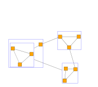
Customizing the Graph Outline
By default, nodes and edges are visualized in the GraphOverviewComponent as simple rectangles and lines as described in the Graph Outline chapter. You might want to change these visualizations, either because you want them to look differently, or because you want some items to be visually hidden, e.g. because they are less important for an overview.
GraphOverviewComponent uses the GraphOverviewSvgVisualCreator set to its GraphOverviewComponent.graphVisualCreator to visualize its nodes and edges.

Customizations of the outline can include adjusting the OverviewGraphVisualCreator, using a second GraphComponent or adjusting the viewport rectangle decoration.
OverviewGraphVisualCreator
The GraphOverviewSvgVisualCreator iterates over the nodes and edges:
- For each non-group node getNodeVisualCreator is called that delegates to getNodeStyle(INode) which in turn returns the the value of the nodeStyle property.
- For each group nodegetGroupNodeVisualCreator is called that delegates to getGroupNodeStyle(INode) which in turn returns the the value of the groupNodeStyle property.
- For each edge getEdgeVisualCreator is called that delegates to getEdgeStyle(IEdge) which in turn returns the the value of the edgeStyle property.
This provides three levels of customization:
Change Style Properties
If a certain style for all items of a type (node, group node, edge) shall be used, it is sufficent to change the style properties:
const overviewGraphVisualCreator = graphOverviewComponent.graphVisualCreator
overviewGraphVisualCreator.nodeStyle = new ShapeNodeStyle({ fill: 'orange' })
overviewGraphVisualCreator.groupNodeStyle = new ShapeNodeStyle({
  stroke: 'blue',
  fill: null
})
overviewGraphVisualCreator.edgeStyle = new PolylineEdgeStyle()

const overviewGraphVisualCreator = graphOverviewComponent.graphVisualCreator as GraphOverviewSvgVisualCreator
overviewGraphVisualCreator.nodeStyle = new ShapeNodeStyle({ fill: 'orange' })
overviewGraphVisualCreator.groupNodeStyle = new ShapeNodeStyle({ stroke: 'blue', fill: null })
overviewGraphVisualCreator.edgeStyle = new PolylineEdgeStyle()
Override Style Provider Methods
The style provider methods get the node or edge as parameter so custom implementations can return different styles depending on the individual node or edge instance.
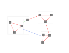
The following example uses different colored edge styles depending on whether the source and target node of the edge are group nodes or not.
class MyOverviewGraphVisualCreator extends GraphOverviewSvgVisualCreator {
  $nodeToNodeStyle = new PolylineEdgeStyle({ stroke: '2px solid red' })
  $nodeToGroupStyle = new PolylineEdgeStyle({ stroke: '2px solid limegreen' })
  $groupToGroupStyle = new PolylineEdgeStyle({ stroke: '2px solid royalblue' })

  /**
   * @param {!IGraph} $graph
   */
  constructor($graph) {
    super($graph)
    this.$graph = $graph
  }

  /**
   * @param {!IEdge} edge - The edge to render.
   * @returns {!IEdgeStyle}
   */
  getEdgeStyle(edge) {
    const sourceIsGroup = this.$graph.isGroupNode(edge.sourceNode)
    const targetIsGroup = this.$graph.isGroupNode(edge.targetNode)
    if (sourceIsGroup && targetIsGroup) {
      return this.$groupToGroupStyle
    } else if (sourceIsGroup || targetIsGroup) {
      return this.$nodeToGroupStyle
    } else {
      return this.$nodeToNodeStyle
    }
  }
}class MyOverviewGraphVisualCreator extends GraphOverviewSvgVisualCreator {
  private $nodeToNodeStyle = new PolylineEdgeStyle({ stroke: '2px solid red' })
  private $nodeToGroupStyle = new PolylineEdgeStyle({ stroke: '2px solid limegreen' })
  private $groupToGroupStyle = new PolylineEdgeStyle({ stroke: '2px solid royalblue' })

  constructor(private readonly $graph: IGraph) {
    super($graph)
  }

  /**
   * @param edge - The edge to render.
   */
  getEdgeStyle(edge: IEdge): IEdgeStyle {
    const sourceIsGroup = this.$graph.isGroupNode(edge.sourceNode)
    const targetIsGroup = this.$graph.isGroupNode(edge.targetNode)
    if (sourceIsGroup && targetIsGroup) {
      return this.$groupToGroupStyle
    } else if (sourceIsGroup || targetIsGroup) {
      return this.$nodeToGroupStyle
    } else {
      return this.$nodeToNodeStyle
    }
  }
}
Override Visual Creator Methods
As third option the getNodeVisualCreator methods can be overridden to return IVisualCreator implementations when no suitable style is available.
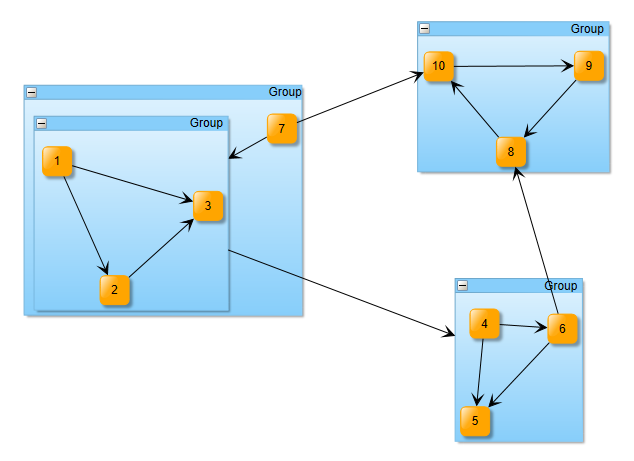
Second GraphComponent
When the outline of the graph shall look exactly like the original view, the easiest way is to just use a second GraphComponent instead of a GraphOverviewComponent:
const graphOverviewComponent = new GraphComponent({
  selector: '#overviewComponent',
  graph: graphComponent.graph,
  inputMode: new OverviewInputMode({
    canvasComponent: graphComponent
  })
})
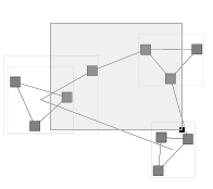
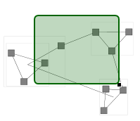
Viewport Rectangle
One visual decoration of the graph outline is not rendered by the GraphOverviewSvgVisualCreator but added by the OverviewInputMode: A rectangle indicating the current viewport of the OverviewInputMode.canvasComponent.
This rectangle can be customized with a custom data template:
- OverviewInputMode.template
- Directly set the custom data template visualizing the viewport rectangle
- OverviewInputMode.VIEWPORT_TEMPLATE_KEY
- Define a custom data template using the corresponding template key
const overviewComponent = new GraphOverviewComponent('overviewComponent')
overviewComponent.graphComponent = graphComponent

// create a custom viewport template with a green border and fill
const viewportTemplate = new (class extends BaseClass(IVisualTemplate) {
  /**
   * @param {!IRenderContext} context
   * @param {!Rect} bounds
   * @param {*} dataObject
   * @returns {?SvgVisual}
   */
  createVisual(context, bounds, dataObject) {
    const rect = document.createElementNS('http://www.w3.org/2000/svg', 'rect')
    rect.width.baseVal.value = bounds.width
    rect.height.baseVal.value = bounds.height
    rect.rx.baseVal.value = 5
    rect.ry.baseVal.value = 5
    SvgVisual.setTranslate(rect, bounds.x, bounds.y)
    rect.setAttribute('stroke', 'darkgreen')
    rect.setAttribute('fill', '#006400')
    rect.setAttribute('fill-opacity', '0.25')
    return new SvgVisual(rect)
  }

  /**
   * @param {!IRenderContext} context
   * @param {!SvgVisual} oldVisual
   * @param {!Rect} bounds
   * @param {*} dataObject
   * @returns {?SvgVisual}
   */
  updateVisual(context, oldVisual, bounds, dataObject) {
    const rect = oldVisual.svgElement
    rect.width.baseVal.value = bounds.width
    rect.height.baseVal.value = bounds.height
    SvgVisual.setTranslate(rect, bounds.x, bounds.y)
    return oldVisual
  }
})()

// register the template to be used for drawing the selection indicator of nodes
overviewComponent.resources.set(OverviewInputMode.VIEWPORT_TEMPLATE_KEY, viewportTemplate)

const overviewComponent = new GraphOverviewComponent('overviewComponent')
overviewComponent.graphComponent = graphComponent

// create a custom viewport template with a green border and fill
const viewportTemplate = new (class extends BaseClass(IVisualTemplate) {
  createVisual(context: IRenderContext, bounds: Rect, dataObject: any): SvgVisual | null {
    const rect = document.createElementNS('http://www.w3.org/2000/svg', 'rect')
    rect.width.baseVal.value = bounds.width
    rect.height.baseVal.value = bounds.height
    rect.rx.baseVal.value = 5
    rect.ry.baseVal.value = 5
    SvgVisual.setTranslate(rect, bounds.x, bounds.y)
    rect.setAttribute('stroke', 'darkgreen')
    rect.setAttribute('fill', '#006400')
    rect.setAttribute('fill-opacity', '0.25')
    return new SvgVisual(rect)
  }

  updateVisual(context: IRenderContext, oldVisual: SvgVisual, bounds: Rect, dataObject: any): SvgVisual | null {
    const rect = oldVisual.svgElement as SVGRectElement
    rect.width.baseVal.value = bounds.width
    rect.height.baseVal.value = bounds.height
    SvgVisual.setTranslate(rect, bounds.x, bounds.y)
    return oldVisual
  }
})()

// register the template to be used for drawing the selection indicator of nodes
overviewComponent.resources.set(OverviewInputMode.VIEWPORT_TEMPLATE_KEY, viewportTemplate)