Themes
In yFiles for HTML a Theme is used to define the general look and feel of its interaction visualization.
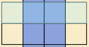
The theme contains a primaryColor, a secondaryColor, and a backgroundColor that are used in different combinations by the visualizations.
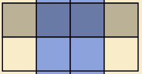
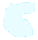
In the following figure the primary color (orange) is used by node selection and handle stroke, the secondary color (light blue) is used by the snapline and the background color (dark blue) is used as handle fill.
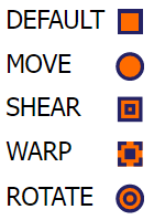
When and how those colors are used is determined by the variant that also defines the general visualization style. The following ThemeVariants are available:
| ThemeVariant | Description |
|---|---|
The theme’s scale property is independent of the variant and is used as a factor to scale the size of IHandles and IPortCandidates.
Using a Custom Theme
A custom theme can easily be used by assigning a new instance to the theme property:
// set a new Theme using the round variant,and orange and blue colors
graphComponent.theme = new Theme('simple-round', '#ff6c00', '#b5dcee', '#662b00')
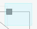
Setting this custom theme results in the following visualization:
A custom theme should be set before usage (e.g. immediately at or shortly after instantiating the GraphComponent).
Effects on Selection
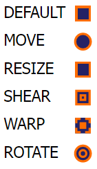
Table Effects of ThemeVariants on item selection shows which visualization of selected items is used depending on the ThemeVariant. An orange primary, light blue secondary and dark blue background color is used in the example figures.
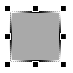
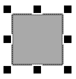
| Selected Item | SIMPLE_ROUND | SIMPLE_SQUARE | CLASSIC |
|---|---|---|---|
 | 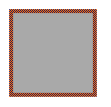 | ||
 |  | ||
 |  |  | |
 |  | ||
 | |||
 |  | ||
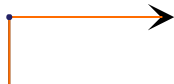
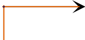
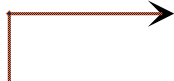
Effects on Focus
The focus visualizations of the currentItem for nodes and edges use a dashed stroke using the primaryColor.
An orange primary color is used in the example figures below:

Effects on Highlight
Table Effects of ThemeVariants on item highlight shows which visualization of highlighted items is used depending on the ThemeVariant. An orange primary, light blue secondary and dark blue background color is used in the example figures.
| Highlighted Item | SIMPLE_ROUND | SIMPLE_SQUARE | CLASSIC |
|---|---|---|---|
 |  | ||
 |  | ||
 |  | ||
 |  | ||
Effects on Lasso and Marquee
The visualizations of the current region of the LassoSelectionInputMode and MarqueeSelectionInputMode edges use an outline in secondaryColor and a half-transparent fill using the secondaryColor.
A light-blue primary color is used in the example figures below:
Effects on Overview
The visualizations of the viewport of the GraphOverviewComponent use an outline in secondaryColor and a half-transparent fill using the secondaryColor.
A light-blue primary color is used in the example figure below:
Effects on Handles
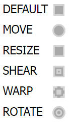
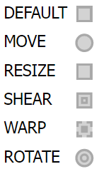
Table Effects of ThemeVariants on handles shows which handle visualization is used for each Variant type depending on the ThemeVariant. An orange primary, light blue secondary and dark blue background color is used in the example figures.
| Handle Item | SIMPLE_ROUND | SIMPLE_SQUARE | CLASSIC |
|---|---|---|---|
 |  |  | |
 | |||
 | |||
 | |||
 | |||
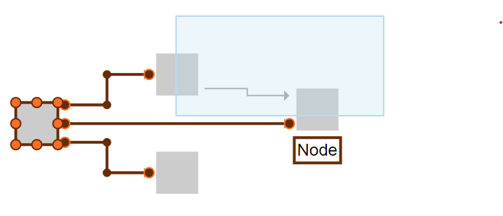
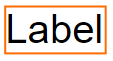
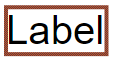
Effects on Label Candidates
When dragging an ILabel to a different location provided by its ILabelModel using the MoveLabelInputMode, the possible label location candidates are visualized and the one that would currently be chosen is highlighted.
Table Effects of ThemeVariants on Label Candidates shows how label candidates are visualized depending on the ThemeVariant. An orange primary, light blue secondary and dark blue background color is used in the example figures.
| Label Candidate | SIMPLE_ROUND | SIMPLE_SQUARE | CLASSIC |
|---|---|---|---|
 |  |  | |
 |  |  |
Effects on Port Candidates
When creating new edges or reconnecting existing ones the valid and invalid IPortCandidate are visualized and the one that would currently be chosen is highlighted.
Table Effects of ThemeVariants on Port Candidates shows how port candidates are visualized depending on the ThemeVariant. Highlighted port candidates use the same visualization as not highlighted candidates, but are increased in size. An orange primary, light blue secondary and dark blue background color is used in the example figures.
| Port Candidate Validity | SIMPLE_ROUND | SIMPLE_SQUARE | CLASSIC |
|---|---|---|---|
 |  |  | |
 |  |  |
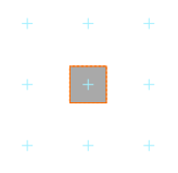
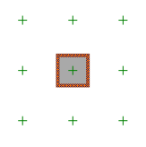
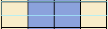
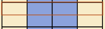
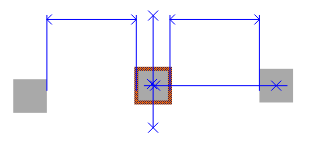
Effects on Snap Lines
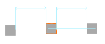
The Snapping feature supports easy alignment of moved or resized graph items. When an item is snapped, the SnapResult is visualized using one or several Snap Lines that indicate, where the item is aligned.
These snap lines use a blue color (CLASSIC) respectively the secondaryColor (SIMPLE_ROUND and SIMPLE_SQUARE) and additional crosses are added at important locations when CLASSIC is used.
An orange primary, light blue secondary and dark blue background color is used in the example figures.
When snapping to Grid points, those Grid points are visualized with plus signs that use a green color (CLASSIC) respectively the secondaryColor (SIMPLE_ROUND and SIMPLE_SQUARE)