| Visual Representation of Graph Elements | ||
|---|---|---|
| Prev | Chapter 2. Displaying and Editing Graphs | Next |
Model items used in an
IGraph (i.e., items of type
INode, IEdge, IPort, and ILabel) by themselves do not provide any visual
representation.
Instead, the functionality to render model items in the GraphCanvasComponent is
encapsulated by so-called "styles."
Along with their complementing counterparts, the so-called "style renderers,"
they hold all necessary state and provide all logic needed to create the visual
appearance of graph elements.
(i.e., items of type
INode, IEdge, IPort, and ILabel) by themselves do not provide any visual
representation.
Instead, the functionality to render model items in the GraphCanvasComponent is
encapsulated by so-called "styles."
Along with their complementing counterparts, the so-called "style renderers,"
they hold all necessary state and provide all logic needed to create the visual
appearance of graph elements.
The following sections cover:
Additionally, in the section called “Label Support” so-called label models are presented.
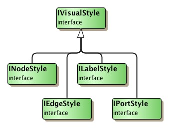
For either type of graph element there is a specialized style type available:
interfaces INodeStyle and
IEdgeStyle for nodes and
edges, and interfaces
IPortStyle and
ILabelStyle for ports and
labels, respectively.
Figure 2.6, “Hierarchy of style types” shows the type hierarchy of available
styles.
The following sections cover the predefined style implementations for the model item types:
Using styles along with class DefaultGraph, the default IGraph implementation, is described in the section called “Working with Styles”.
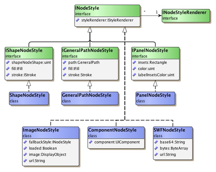
Node styles are responsible for the graphical rendering of nodes in the canvas.
Interface INodeStyle is
the common base type for actual implementations.
Figure 2.7, “Hierarchy of node style types” shows a part of the type hierarchy of node
style implementations.
Table 2.3, “Predefined node style implementations” lists the predefined node style
implementations present in package
com.yworks.graph.drawing.
Table 2.3. Predefined node style implementations
| Type Name | Description |
|---|---|
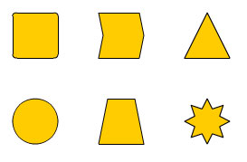
| ShapeNodeStyle |
Provides a variety of predefined shapes for the visual appearance of a node.
Class ShapeNodeShape
defines constants for the available shapes.
|
| ImageNodeStyle |
Enables using a bitmap or vector image to create the visual representation for a node. The image can be either set directly using an embedded image, or it can be loaded from an URL. This style supports the vector-based FXG, SVG, and SWF formats, as well as GIF, JPEG and PNG bitmap images. |
| BitmapNodeStyle |
Enables using a bitmap image to create the visual representation of a node. In contrast to the ImageNodeStyle, the default serialization mechanism of this style uses Base64-encoded bitmap data for writing the image. |
| ComponentNodeStyle |
An INodeStyle implementation that enables using arbitrary Flex UIComponents for the visual representation of nodes. This style has been deprecated. Please use TemplateNodeStyle instead. |
| TemplateNodeStyle |
An INodeStyle implementation that enables using arbitrary Flex UIComponents for the visual representation of nodes. In contrast to the ComponentNodeStyle, these components are aware of their context, i.e. the nodes they represent and the data associated with the nodes. For details see the section called “Node Representation Using Flex Components”. |
| GeneralPathNodeStyle |
Allows arbitrary
GeneralPath objects to
create the visual representation for a node.
|
| PanelNodeStyle |
An implementation of interface
IPanelNodeStyle that can
be used to create the visual representation for group nodes, for example.
By default, this style renders a drop shadow by itself.
|
| BevelNodeStyle |
An implementation of interface
IBevelNodeStyle that can
be used to create rectangular nodes with rounded corners, a bevel border, and
a shining background.
|
| ShinyPlateNodeStyle |
Can be used to create rectangular nodes with rounded corners and a 'shiny plate' interior. |
The node style
TemplateNodeStyle allows
to use Flex components for the representation of nodes in an IGraph. Typically,
the components are created as MXML components. The components need to define
properties for user data (an arbitrary object, e.g. an object which
represents the "data behind" the graph item) and the context which is of type
TemplateStyleDataContext.
Both properties can have an arbitrary name which has to be set to the style
instance. Their values will be set by the renderer during the rendering process.
The user data is retrieved by an
IUserTagProvider which can
be specified in the TemplateNodeStyle's
userTagProvider
property. By default, a
TagOwnerUserTagProvider
is used. This provider retrieves the user data from the item's tag owner (see
the section called “User Tags”).
In addition to the item related user data it is possible to use the
TemplateNodeStyle's
styleTag
property to set a style related user object.
The following example demonstrates how to create a
TemplateNodeStyle together
with a matching template component:
As user data, a class Person is used which represents data related to a person:
Example 2.14. The class Person which represents the data behind the nodes.
public class Person
{
    public var name:String; // the person's name
    public var id:String;   // the person's id
    public var vip:Boolean; // whether the person is a VIP
}
The node which corresponds to a person is rendered as a Canvas with a background color which is defined by the style. The name and ID are displayed as labels. The name is displayed with a red font if the person is a VIP, otherwise with a black font. Such a component is shown in Example 2.15, “Creating a custom component to be used with the TemplateNodeStyle”.
Example 2.15. Creating a custom component to be used with the TemplateNodeStyle
<?xml version="1.0" encoding="utf-8"?>
<mx:Canvas xmlns:mx="http://www.adobe.com/2006/mxml"
  width="{INode(context.modelItem).layout.width}"
  height="{INode(context.modelItem).layout.height}"
  backgroundColor="{SolidColor(context.styleTag).color}"
  horizontalScrollPolicy="off"
  verticalScrollPolicy="off">
<!-- width and height are the node's width and height. -->
<!-- The node is retrieved from the context's modelItem property. -->
<!-- The backgroundColor is taken from the style's styleTag. -->
<!-- The scrollbars are disabled. -->

  <mx:Script>
    <![CDATA[
      // the property for the user data
      [Bindable]
      public var person:Person;

      // the property for the context
      [Bindable]
      public var context:TemplateStyleDataContext;
    ]]>
  </mx:Script>

  <mx:VBox width="100%" height="100%">
    <mx:HBox width="100%" height="100%">
      <mx:Label text="Name:"/>
      <!-- the label text is set to the person's name property -->
      <!-- the text color according to the person's vip property -->
      <mx:Label text="{person.name}"
                color="{person.vip?0xFF0000:0x000000}"/>
    </mx:HBox>
    <mx:HBox width="100%" height="100%">
      <mx:Label text="ID:"/>
      <!-- // the label text is set to the person's id property -->
      <mx:Label text="{person.id}" />
    </mx:HBox>
  </mx:VBox>
</mx:Canvas>
Example 2.16, “Creating a new TemplateNodeStyle instance” shows how to create a new style instance which uses the above class, TemplateComponent, as component. The person property identifier is set as the style's dataPropertyName and the context property identifier is set as contextPropertyName. Also, the style's styleTag is set to a SolidColor instance to yield a light gray background.
Example 2.16. Creating a new TemplateNodeStyle instance
// create a new TemplateNodeStyle
var style:TemplateNodeStyle = new TemplateNodeStyle(TemplateComponent, "person", "context");
style.styleTag = new SolidColor(0xEEEEEE);
As no custom userTagProvider is set, the user data (i.e. the
Person instances) will be retrieved from the node's
ITagOwner. In other words, each
node has to have its Person instance mapped
to its ITagOwner's tag.
The TemplateStyleDemo demonstrates how to use the TemplateNodeStyle.
Custom node styles need to implement the
styleRenderer
property defined in interface INodeStyle and the
install()
method from interface IVisualStyle.
See also the section called “Creating Custom Styles”.
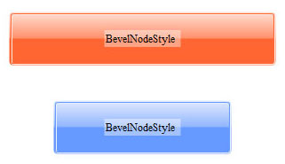
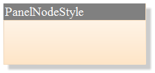
Figure 2.8, “Sample renderings of BevelNodeStyle, PanelNodeStyle, and ShapeNodeStyle” shows examples of nodes using BevelNodeStyle, PanelNodeStyle, and ShapeNodeStyle respectively. Note that PanelNodeStyle renders a drop shadow by itself.
yFiles FLEX includes specialized style implementations for compatibility with yFiles Java. For details about working with yFiles FLEX and yFiles Java, please see the section called “Communicating with yFiles Java on the Server”.
Table 2.4. yFiles Java compatibility node styles
| Type Name | Description |
|---|---|
| JavaShapeNodeStyle |
A node style implementation that corresponds to the yFiles Java
ShapeNodeRealizer |
| JavaImageNodeStyle |
A node style implementation that corresponds to the yFiles Java
ImageNodeRealizer |
| JavaGroupNodeStyle |
A node style implementation that corresponds to the yFiles Java
GroupNodeRealizer |
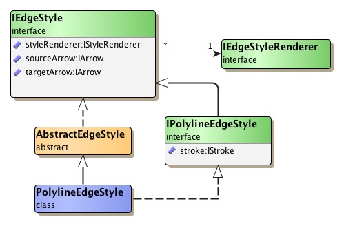
Edge styles are responsible for the graphical rendering of edges in the canvas.
Interface IEdgeStyle
is the common base type for actual implementations, and abstract class
AbstractEdgeStyle provides
default implementations for the methods of interface IEdgeStyle.
Figure 2.9, “Hierarchy of edge style types” shows the type hierarchy of edge style
implementations.
Table 2.5, “Predefined edge style implementations” lists the predefined edge style
implementations present in package
com.yworks.graph.drawing.
Table 2.5. Predefined edge style implementations
| Type Name | Description |
|---|---|
| PolylineEdgeStyle |
An edge representation where straight line segments are used to connect the bends. |
Abstract class
AbstractEdgeStyle serves
as a convenient basis for actual edge styles.
Custom edge styles still need to implement the
install()
method from interface IVisualStyle.
See also the section called “Creating Custom Styles”.
Because bends are an integral part of an edge, they are rendered by the edge style, too.
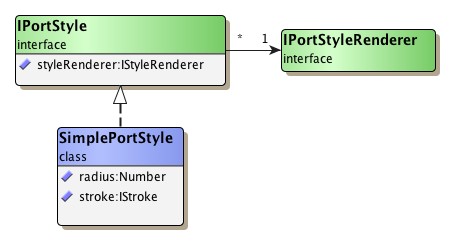
Port styles are responsible for the graphical rendering of ports in the canvas.
Interface IPortStyle
is the common base type for actual implementations.
Figure 2.10, “Hierarchy of port style types” shows the type hierarchy of port style
implementations.
Table 2.6, “Predefined port style implementations” lists the predefined port style
implementations present in package
com.yworks.graph.drawing.
Table 2.6. Predefined port style implementations
| Type Name | Description |
|---|---|
| SimplePortStyle |
Provides a simple representation for ports. |
Custom port styles need to implement the
styleRenderer
property defined in interface IPortStyle and the
install()
method from interface IVisualStyle.
See also the section called “Creating Custom Styles”.
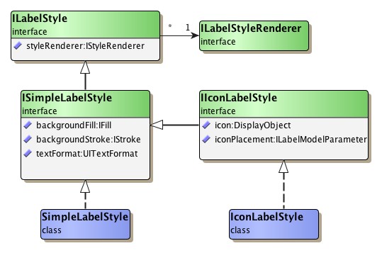
Label styles are responsible for the graphical rendering of labels in the
canvas.
Interface ILabelStyle
is the common base type for actual implementations.
Figure 2.11, “Predefined label style types” shows the type hierarchy of label style
implementations.
Table 2.7, “Predefined label style implementations” lists the predefined label style
implementations present in package
com.yworks.graph.drawing.
Table 2.7. Predefined label style implementations
| Type Name | Description |
|---|---|
| SimpleLabelStyle |
Enables rendering of a label's text. |
| TLFLabelStyle |
A simple label style which uses the Flash Text Engine and the Text Layout Framework (TLF) to render the label text. This style supports CFF fonts, bidirectional text and different text converters. The Text Layout Framework is part of Flex 4. |
| CSSLabelStyle |
A simple label style which uses style sheets instead of TextFormat for formatting texts. |
| IconLabelStyle |
Builds on the functionality that SimpleLabelStyle provides and additionally allows to place an icon at several positions relative to the label's text. |
| IconLabelStyleDecorator |
Allows to place an icon at several positions relative to the label's text on a label which is rendered by an arbitrary ILabelStyle. |
| NodeStyleLabelStyleAdapter |
Allows to add the rendering of a given node style as the background for the visual representation of the wrapped label style. |
| TemplateLabelStyle |
An ILabelStyle implementation that enables using arbitrary Flex UIComponents for the visual representation of nodes.These components are aware of their context, i.e. the labels they represent and the data associated with the labels. The TemplateLabelStyle is used like the TemplateNodeStyle whose usage is explained in the section called “Node Representation Using Flex Components”. |
Custom label styles need to implement the
styleRenderer
property defined in interface ILabelStyle and the
install()
method from interface IVisualStyle.
See also the section called “Creating Custom Styles”.
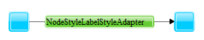
Class
NodeStyleLabelStyleAdapter
is an ILabelStyle implementation that allows to decorate label styles.
It can be used to add the rendering of a given node style as the background for
the visual representation of the wrapped label style.
Figure 2.12, “Edge label that uses NodeStyleLabelStyleAdapter” shows an edge label where a
BevelNodeStyle is used to render the background.
Setting up different node styles and associating them with nodes of a graph is presented in Example 2.17, “Creating a graph”. The resulting graph is depicted in Figure 2.13, “Shape node style and image node style”.
Example 2.17. Creating a graph
[Embed(source="resources/image.png")]
private static var imageClass:Class;

private function createGraph():IGraph {
  var graph:IGraph = new DefaultGraph();

  // Set up a node style that uses a circle.
  var sns:ShapeNodeStyle = ShapeNodeStyle( graph.defaultNodeStyle );
  sns.shapeNodeShape = ShapeNodeShape.ELLIPSE;

  // Set up a node style that uses an image to represent nodes.
  var ins:ImageNodeStyle = new ImageNodeStyle();
  ins.imageClass = imageClass;
  graph.defaultNodeStyle = ins;
  graph.defaultNodeSize =
    com.yworks.canvas.geom.Size.create(ins.image.width, ins.image.height);

  // Create some nodes.
  var nodes:Array = new Array(6);
  for (var i:int = 0; i < nodes.length - 1; i += 2) {
    nodes[i] = graph.createNodeAt(i * 50, 100);
    graph.setNodeStyle(nodes[i], sns);
    graph.setBounds(nodes[i], nodes[i].layout.x, nodes[i].layout.y, 40, 40);
    nodes[i + 1] = graph.createNodeAt(i * 50, 200);
  }

  return graph;
}
Styles can be associated with model items using different schemes: an IVisualStyle instance for a specific kind of model item can be both
Style sharing can be easily achieved whenever a single style instance is associated with a model item by reference. Example 2.18, “Style sharing” presents this scheme using the setNodeStyle method to associate a single custom ShapeNodeStyle instance by reference with a set of nodes. Similarly, when associating a single ShapeNodeStyle instance by reference at node creation time, the style can also be shared among multiple nodes.
Example 2.18. Style sharing
// 'graph' is of type com.yworks.graph.model.IGraph.

var shapeNS:MyShapeNodeStyle = new MyShapeNodeStyle();
for (var it:Iterator = myNodeList.iterator(); it.hasNext(); ) {
  graph.setNodeStyle(INode( it.next() ), shapeNS);
}
In contrast, when a node is associated with a style via the default style
mechanism provided by class DefaultGraph, a copy of the style instance that is
returned by the
defaultNodeStyle
property is used.
Example 2.19, “Changing the color of a node” shows how to obtain the style that is used for a specific node from its graph and changing the node's color. Styles for the other kinds of items can be obtained and modified in a similar manner.
Each style type teams up with a corresponding style renderer type, separating duties as follows: the actual style implementation ideally only holds the state that is needed for rendering an item, while the style renderer provides the logic that performs the real work using the style's state. This separation enables sharing of style renderer instances among an arbitrary number of style objects and is also known as the Flyweight pattern.
As a consequence, creating a custom style is mainly the task of creating a proper style renderer.
Framework requirements for an actual custom style type are minimal: the style's
styleRenderer property is expected to return an instance of the
style's complementing renderer type.
The instance is then used for the rendering of corresponding model items.
Also needed is an implementation for the
install()
method defined in interface IVisualStyle.
In almost all cases, however, this can be safely realized as a lean
implementation that just forwards all invocations to the renderer's
install method.
Additionally, a style type needs to provide a clone method that can be used to create copies of an instance.
Example 2.20, “Custom node style implementation” presents a sample implementation of a node style type that fulfills the framework requirements as described above.
Example 2.20. Custom node style implementation
public class CustomStyle implements INodeStyle {
  private var _styleRenderer:CustomStyleRenderer;
  private var _stroke:IStroke;
  private var _percentage:Number = 0.5;
  private var _fill:IFill;

  /**
   * Create a new style instance.
   * @param styleRenderer Custom renderer instance for this style.
   *                      If <code>null</code>, a default style renderer
   *                      is used.
   * @param stroke The initial stroke for this style.
   *               If <code>null</code>, a default stroke is used.
   * @param fill The initial fill for this style.
   *             If <code>null</code>, a default fill is used.
   */
  public function CustomStyle( styleRenderer:CustomStyleRenderer = null,
                               stroke:IStroke = null, fill:IFill = null ) {
    if( null != styleRenderer ) {
      this._styleRenderer =  styleRenderer;
    } else {
      this._styleRenderer = new CustomStyleRenderer();
    }

    if( null != stroke ) {
      this._stroke = stroke;
    } else {
      this._stroke = new Stroke( 0x000000, 1.0, 1.0 );
    }

    if( null != fill ) {
      this._fill = fill;
    } else {
      this._fill = new SolidColor( 0xFFCC00, 1.0 );
    }
  }

  public function set fill( fill:IFill ):void {
    this._fill = fill;
  }

  public function get fill():IFill {
    return this._fill;
  }

  public function set stroke( stroke:IStroke ):void {
    this._stroke = stroke;
  }

  public function get stroke():IStroke {
    return this._stroke;
  }

  public function set percentage( percentage:Number):void {
    this._percentage = percentage;
  }

  public function get percentage():Number {
    return this._percentage;
  }

  public function get styleRenderer():IStyleRenderer {
    return this._styleRenderer;
  }

  public function install( canvas:CanvasComponent, group:ICanvasObjectGroup,
                           modelItem:IModelItem ):Array {
    return this._styleRenderer.install( canvas, group, modelItem );
  }

  public function clone():Object {
    var clone:CustomStyle =
      new CustomStyle( this._styleRenderer, this._stroke, this._fill );
    clone.percentage = percentage;
    return clone;
  }
}
To create a custom style renderer type one of the abstract classes provided by the framework can be conveniently used as the base type. Table 2.8, “Base types for custom style renderer implementations” lists the available style renderer base types.
Table 2.8. Base types for custom style renderer implementations
| Base Type | Description |
|---|---|
| AbstractNodeStyleRenderer |
Abstract base type for node style renderer types. |
| PathBasedEdgeStyleRenderer |
Abstract base type for edge style renderer types. |
| AbstractLabelStyleRenderer |
Abstract base type for label style renderer types. |
| AbstractStyleRenderer |
Abstract base type for port style renderer types. |
Example 2.21, “Custom node style renderer implementation” presents a sample implementation for a node style renderer that complements the above node style type and provides the actual rendering logic.
Example 2.21. Custom node style renderer implementation
public class CustomStyleRenderer extends AbstractNodeStyleRenderer {

  override public function createDisplayObject(context:IDisplayObjectContext):DisplayObject {
    var displayObject:YDisplayObject = new YDisplayObject();
    paint(displayObject.yGraphics,context);
    updateLayout(displayObject, context);
    return displayObject;
  }

  protected function paint( g:YGraphics, ctx:IPaintContext ):void {
    var nodeBounds:IRectangle = this.layout;

    var width:Number = nodeBounds.width;
    var height:Number = nodeBounds.height;

    var stroke:IStroke = this.stroke;
    var fill:IFill = this.fill;
    var percentage:Number = this.percentage;

    if( null != fill ) {
        g.applyFill( fill );
    }
    if( null != stroke ) {
        g.applyStroke( stroke );
    }
    g.drawRect( 0, 0, width, height );

    if( null != fill ) {
        g.endFill( fill );
    }

    g.applyStroke(Strokes.NO_STROKE);
    g.applyFill(new SolidColor(0xFF0000, 0.8));
    g.drawRect(1, 1, (width-2)*percentage, height-2);
    g.endFill();
  }

  protected function updateLayout(obj:DisplayObject, context:IDisplayObjectContext):void {
    var layout:IRectangle = this.layout;
    obj.x = layout.x;
    obj.y = layout.y;
  }

  protected function get fill():IFill {
    return CustomStyle( this._style ).fill;
  }

  protected function get percentage():Number {
    return CustomStyle( this._style ).percentage;
  }

  protected function get stroke():IStroke {
    return CustomStyle( this._style ).stroke;
  }

  override public function lookup( type:Class ):Object {
    if( type == ISerializer ) {
      return CustomStyleSerializer.instance;
    }
    return super.lookup( type );
  }
}
The methods that need to be implemented to realize the actual rendering of either kind of model item naturally differ for each style renderer type. Below, the respective sections on the node, edge, port, and label style renderers describe these methods.
Common to all available abstract base types is a convenient implementation for the install method that is used by the framework to actually install canvas objects into the scene graph and establish the connection to the logic within the renderer. This default implementation suffices for almost all cases and can be used to delegate the calls to the style's install method to.
As an option, a custom style renderer can also implement the
configure()
method defined in abstract class AbstractStyleRenderer.
This method is called by most of the methods defined in interface
IStyleRenderer
and enables configuration of the renderer instance relating to these method
invocations.
The CustomStyle demo application shows how to create and use a custom style and a custom renderer implementation.
A special kind of abstract style and renderer are the delegating styles
DelegatingNodeStyle,
DelegatingEdgeStyle,
DelegatingLabelStyle and
DelegatingPortStyle.
These styles can wrap an existing style and delegate the rendering to the wrapped
style's renderer. Subclasses can use this to decorate the wrapped styles,
e.g. by adding a flex effect or filter to them. The
DelegatingStyleDemo shows how to create delegating styles and wrap
existing styles with them.
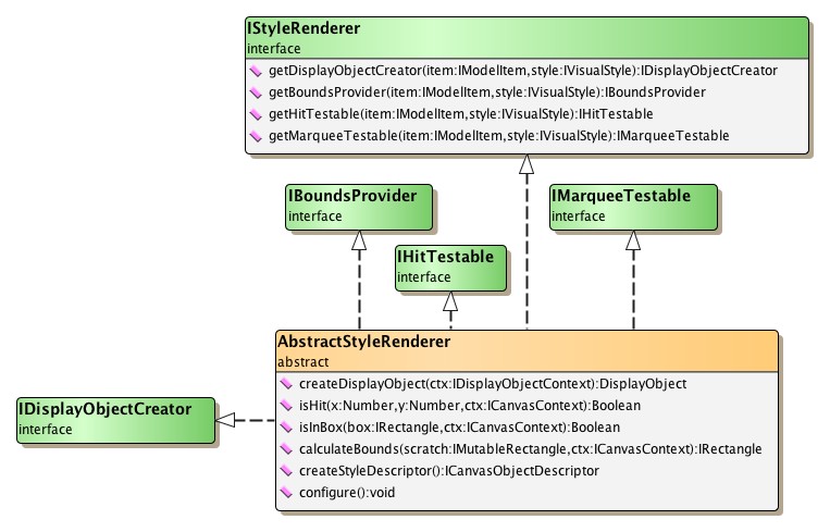
The available style renderer implementations either directly or indirectly
inherit from abstract class
AbstractStyleRenderer,
which combines all necessary functionality that relates to the visual
appearance of graph elements.
In particular, it implements interface
IDisplayObjectCreator, which
defines the methods for creating and updating the DisplayObject for a model item.
Figure 2.14, “Common style renderer base type AbstractStyleRenderer” depicts the inheritance structure
of AbstractStyleRenderer.
Node style renderers are the complementary counterparts to the node styles.
They provide the actual logic that is invoked by the canvas for rendering an
item.
Interface
INodeStyleRenderer is the
common base type for actual implementations.
The predefined node style renderer implementations together with the respective styles they correspond to are listed in Table 2.9, “Predefined node style renderer implementations”.
Table 2.9. Predefined node style renderer implementations
| Style Type | Complementing Renderer Type | Description |
|---|---|---|
| IShapeNodeStyle |
ShapeNodeStyleRenderer |
Renders a node using the shape that is defined by the shapeNodeShape property of the node's associated IShapeNodeStyle object. |
| ImageNodeStyle |
ImageNodeStyleRenderer |
Renders a node using the vector or bitmap image returned by the image property of the node's associated ImageNodeStyle object. |
| BitmapNodeStyle |
BitmapNodeStyleRenderer |
Renders a node using the bitmap image returned by the image property of the node's associated BitmapNodeStyle object. |
| ComponentNodeStyle |
ComponentNodeStyleRenderer |
Renders a node using the UIComponent returned by the component property of the node's associated ComponentNodeStyle object. |
| TemplateNodeStyle |
TemplateNodeStyleRenderer |
Renders a node using the UIComponent returned by the templateClass property of the node's associated TemplatetNodeStyle object. Passes associated data and the context to that component. |
| IGeneralPathNodeStyle |
GeneralPathNodeStyleRenderer |
Renders a node using the GeneralPath object returned by the path property of the node's associated IGeneralPathNodeStyle object. |
| IBevelNodeStyle |
BevelNodeStyleRenderer |
Renders a node using the properties of the node's associated IBevelNodeStyle object. |
| IPanelNodeStyle |
PanelNodeStyleRenderer |
Renders a node using the properties of the node's associated IPanelNodeStyle object. |
Abstract class
AbstractNodeStyleRenderer
provides default implementations for most of the abstract methods from its base
type AbstractStyleRenderer.
Inheriting types only need to implement the createDisplayObject method (see below)
appropriately.
createDisplayObject(ctx:IDisplayObjectContext):DisplayObject |
|
| Description | Abstract method in class AbstractNodeStyleRenderer for creating the DisplayObject for a node. |
Edge style renderers are the complementary counterparts to the edge styles.
They provide the actual logic that is invoked by the canvas for rendering an
item.
Interface
IEdgeStyleRenderer is the
common base type for actual implementations.
The predefined edge style renderer implementations together with the respective styles they correspond to are listed in Table 2.10, “Predefined edge style renderer implementations”.
Table 2.10. Predefined edge style renderer implementations
| Style Type | Complementing Renderer Type | Description |
|---|---|---|
| IPolylineEdgeStyle |
PolylineEdgeStyleRenderer |
Renders an edge as a poly-line path using the properties of the edge's associated IPolylineEdgeStyle object. |
Abstract class
AbstractEdgeStyleRenderer
provides default implementations for most of the methods from its base type
AbstractStyleRenderer.
The remaining methods that need to be implemented by inheriting types are listed
below.
getPath():GeneralPath |
|
| Description | Abstract method from class AbstractEdgeStyleRenderer. |
Port style renderers are the complementary counterparts to the port styles.
They provide the actual logic that is invoked by the canvas for rendering an
item.
Interface
IPortStyleRenderer is the
common base type for actual implementations.
The predefined port style renderer implementations together with the respective styles they correspond to are listed in Table 2.11, “Predefined port style renderer implementations”.
Table 2.11. Predefined port style renderer implementations
| Style Type | Complementing Renderer Type | Description |
|---|---|---|
| SimplePortStyle |
SimplePortStyleRenderer |
Renders a port as a circle using the stroke and radius properties of the port's associated SimplePortStyle. |
Note that SimplePortStyleRenderer directly inherits from abstract class AbstractStyleRenderer.
Label style renderers are the complementary counterparts to the label styles.
They provide the actual logic that is invoked by the canvas for rendering an
item.
Interface
ILabelStyleRenderer is the
common base type for actual implementations.
The predefined label style renderer implementations together with the respective styles they correspond to are listed in Table 2.12, “Predefined label style renderer implementations”.
Table 2.12. Predefined label style renderer implementations
| Style Type | Complementing Renderer Type | Description |
|---|---|---|
| ISimpleLabelStyle |
SimpleLabelStyleRenderer |
Renders a label's text. The renderer uses the properties of the label's associated ISimpleLabelStyle object. |
| TLFLabelStyle |
TLFLabelStyleRenderer |
Renders a label's text within the oriented rectangle that describes the label's layout. Uses the Flash Text Engine and the Text Layout Framework for rendering. |
| CSSLabelStyle |
CSSLabelStyleRenderer |
Renders a label's text within the oriented rectangle that describes the label's layout. Uses a style sheet instead of a TextFormat for text formatting. |
| IIconLabelStyle |
IconLabelStyleRenderer |
Renders a label's text (see description of SimpleLabelStyleRenderer) and the icon that the label's associated IIconLabelStyle object returns. |
| IIconLabelStyleDecorator |
IconLabelStyleRenderer |
Renders a label's text using the ILabelStyle and the icon that the label's associated IIconLabelStyleDecorator object returns. Note that this renderer can handle both IIconLabelStyle and IIconLabelStyleDecorator. |
| TemplateLabelStyle |
TemplateLabelStyleRenderer |
Renders a node using the UIComponent returned by the templateClass property of the node's associated TemplatetLabelStyle object. Passes associated data and the context to that component. |
Note that SimpleLabelStyleRenderer directly inherits from abstract class AbstractStyleRenderer.
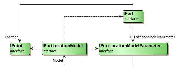
The location of a port at a node, in both static as well as dynamic scenarios, is determined by a so-called port location model. It is responsible for finding the proper location for a port with respect to a port location model parameter. The port location model parameter is associated with a port and encodes its desired position. It is created by a port location model and is valid only in the context of this port location model.
In a dynamic scenario, where a user resizes or moves a node, or moves a port, port location models are queried to determine the proper location of the port(s).
Although a port location model determines the position of a port, it cannot be
associated with one.
Instead, a
port location model parameter
that is created by a port location model instance is associated with a given
port.
Then, to determine the port's position, this port location model instance is
found via the model parameter's
model
property.
Interface
IPortLocationModel
provides the basis for port location model implementations.
Table 2.13, “Predefined port location model implementations” lists the predefined port
location model implementations.
Table 2.13. Predefined port location model implementations
| Model Type | Description |
|---|---|
| NodeScaledPortLocationModel |
The location of a port is specified relative to the center of the node and in relation to its geometry. See the description below. |
Class NodeScaledPortLocationModel defines a port location model where the location of a port is specified relative to the center of the node and in relation to the geometry of the node's bounding rectangle.
The center of the node is interpreted as the origin of a "coordinate system" where going up/to the left means negative sign and going down/to the right means positive sign. The distances to the borders of the node are interpreted relative to the node's width and height, respectively, so that the distance to the left (right) border, for example, is always half the width. Thus, the top left corner of the node corresponds to the relative location (-0.5, -0.5), the bottom right corner to (0.5, 0.5).
When the width or height of a node changes, the location of a port is appropriately updated according to the node's new geometry. In effect, this means that the distances to the center of the node are scaled using the same factor that the width/height have changed.
NodeScaledPortLocationModel provides convenient support for nine predefined port locations. Example 2.22, “Creating a model parameter for a custom port location” shows how a model parameter for a custom port location can be created. It uses a relative offset that defines the port to be anchored at a discrete location right of the node's center, half way to the node's border.
Example 2.22. Creating a model parameter for a custom port location
// 'node' is of type com.yworks.canvas.model.INode

var nsplm:NodeScaledPortLocationModel = NodeScaledPortLocationModel.instance;
var plmp:IPortLocationModelParameter =
    nsplm.createOffsetParameter(node, YPoint.create(0.25, 0.0));
When the node is resized, this custom port location will be scaled accordingly so that the port is always located right of the node's center, half way to the node's border.
A port location model parameter is an implementation of interface
IPortLocationModelParameter
that is created by a port location model.
It encodes a possible port position that is valid in the context of its
corresponding port location model.
To create a model parameter, IPortLocationModel defines the following method which can be used to obtain a model parameter that best matches a given (world coordinates) port location. The available port location models provide further model-specific methods to create valid model parameters.
function createParameter(portOwner:IPortOwner, location:IPoint):IPortLocationModelParameter |
|
| Description | Default port location model parameter creation method |
The following methods provided by interface IGraph can be used to specify the port location model parameter for a port.
When a port is added to a model item of the graph using
addPort(), class
DefaultGraph creates an
appropriate parameter of the NodeScaledPortLocationModel.
function addPortWithParameter( portOwner:IPortOwner, modelParameter:IPortLocationModelParameter ):IPort |
|
| Description | Setting the port location model parameter when adding a new port to the graph model. |
function setPortLocationModelParameter( port:IPort, modelParameter:IPortLocationModelParameter ):void |
|
| Description | Setting the port location model parameter for an existing port. |
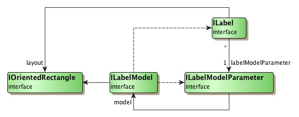
The geometry of both node labels and edge labels is determined by so-called label models. Specifically, a label model is responsible for finding the proper location for a label with respect to a "label model parameter." The label model parameter is associated with a label and encodes its desired position. It is created by a label model and is valid only in the context of this label model.
Although a label model determines the position of a label, it cannot be
associated with one.
Instead, a
label model parameter
that is created by a label model instance is associated with a given label.
Then, to determine the label's position, this label model instance is found via
the model parameter's
model
property.
Interface ILabelModel
provides the basis for both
node label model and
edge label model implementations
described below.
ILabelModel is also the basis for class
GenericLabelModel
which can be used to
create user-defined node label and edge label models.
A label model parameter is an implementation of interface
ILabelModelParameter that is
created by a label model.
It encodes a possible label position that is valid in the context of its
corresponding label model.
Most often, the position that a model parameter encodes is a predefined
position that is defined relative to the owner of the label.
For example, the node label model
ExteriorLabelModel uses
model parameters that encode eight distinct logical positions around a node,
named north, northEast, east,
southEast, etc., which define positions outside the bounds of a
node.
To create a model parameter, the following method defined in interface ILabelModel can be used to obtain the so-called "default model parameter" for a given label model. The available node label models and edge label models provide further model-specific methods to create valid model parameters.
createDefaultParameter():ILabelModelParameter |
|
| Description | Method for creating the default label model parameter. |
The following methods provided by interface IGraph can be used to specify the label model parameter for a label.
When a label is added to the graph using the addLabel method
lacking the label model parameter, class DefaultGraph associates the default
label model parameter that is returned by the
createDefaultParameter method of the label model returned by
either of the
defaultNodeLabelModelParameter
or
defaultEdgeLabelModelParameter
properties.
addLabel(item:ILabeledItem, text:String, labelModelParameter:ILabelModelParameter = null, style:ILabelStyle = null):ILabel |
|
| Description | Sets the label model parameter when adding a new label to the graph model. |
setLabelModelParameter(label:ILabel, parameter:ILabelModelParameter):void |
|
| Description | Sets the label model parameter for an existing label. |
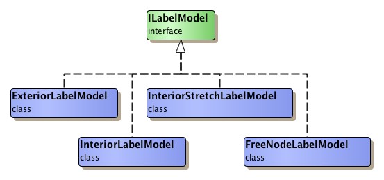
Node label models are responsible for determining the geometry of labels where the actual owner is an INode. Figure 2.17, “Hierarchy of node label model types” depicts the type hierarchy of available node label models.
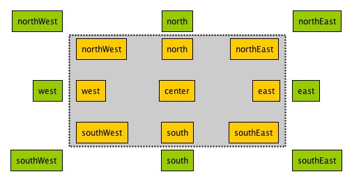
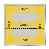
The predefined node label positions of the node label models are depicted in Figure 2.18, “Possible node label positions”.
It is important to note that the set of valid positions varies with the model types, i.e., not all possible positions are valid for each node label model. Table 2.14, “Valid node label positions for each model type” lists the sets of valid positions for each node label model.
The default node label model classes provide static constants that define both the position strings of all available label positions and predefined shareable model instances provided by the corresponding model.
Table 2.14. Valid node label positions for each model type
| Model Type | Valid Positions |
|---|---|
| InteriorLabelModel |
northWest, north, northEast, west, center, east, southWest, south, southEast |
| ExteriorLabelModel |
northWest, north, northEast, west, east, southWest, south, southEast |
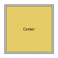
The predefined node label positions of InteriorStretchLabelModel consist of the following five positions: north, east, south, west, and center as shown in Figure 2.19, “Possible node label positions with InteriorStretchLabelModel”.
When a label is at the east or west position, it is also rotated so that the base line of the label text is near the center of the node. In addition, InteriorStretchLabelModel also changes the length of the labels to match the node's height (east and west positions) or its width (north and south positions). Labels at center position use the entire geometry of the node.
For east and west positions, the font that is used by the label needs to be embedded in the application's SWF file. Otherwise, the displayed text will not reflect the rotated nature of the label, but will instead have default (horizontal) orientation.
Figure 2.19. Possible node label positions with InteriorStretchLabelModel
 |
 |
| Non-center label positions. Note the label orientation at east and west positions. | Labels at center position are stretched to use the entire geometry of the node. |
Example 2.23, “Adding a node label using a specific label model parameter” demonstrates how to set a label model parameter that describes a position valid in the context of ExteriorLabelModel.
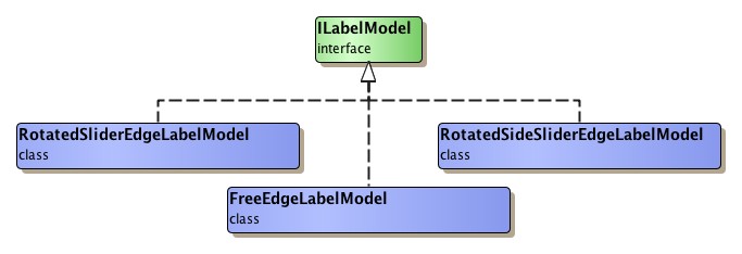
Edge label models are responsible for determining the geometry of labels where the actual owner is an IEdge. Figure 2.20, “Hierarchy of edge label model types” depicts the type hierarchy of available edge label models.
Example 2.24, “Sharing a label model parameter instance among a set of edge labels” demonstrates how to set an edge label model parameter that describes a position valid in the context of RotatedSliderEdgeLabelModel.
Example 2.24. Sharing a label model parameter instance among a set of edge labels
// 'graph' is of type com.yworks.graph.model.IGraph.

var model:RotatedSliderEdgeLabelModel = new RotatedSliderEdgeLabelModel();
// The label will be placed at the side of the edge near the first bend.
model.distance = 10;
var param:ILabelModelParameter = model.createParameterFromSource(0, 1.0);

for (var it:Iterator = myEdgeList.iterator(); it.hasNext(); ) {
  graph.setLabelModelParameter(it.next(), param);
}
Setting up and using edge label models is extensively presented in tutorial demo application EdgeLabelingDemo.
Edge labels also support being rotated, and using an appropriate edge label model it is possible to have the text of an edge label be in parallel to its corresponding edge segment, even in a dynamic scenario where the slope of the edge segment changes.
In order to render the rotated label text properly it is necessary to embed the label font. See the knowledge base article Fonts are not displayed correctly for details.
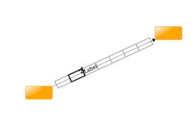
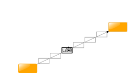
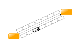
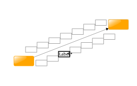
Figure 2.21. Candidates for the different rotated (side) slider label models
 |
 |
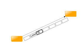 |
| Possible label candidates along the edge's path as found by RotatedSliderEdgeLabelModel for an auto-rotated edge label. | ...the same, but for a non-auto-rotated edge label... | ...auto rotated again, but with a distance > 0. |
 |
 |
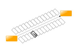 |
| Possible label candidates along the edge's path as found by RotatedSideSliderEdgeLabelModel for an auto-rotated edge label. | ...the same, but for a non-auto-rotated edge label... | ...the same, but for a non-auto-rotated edge label that has a preset rotation angle (of 135 degrees counterclockwise). |
or
RotatedSideSliderEdgeLabelModel the label placement can be controlled by a number of properties:
autoRotationEnabled:Boolean |
|
| Description | Specifies whether or not edge labels are automatically rotated according to the angle of the corresponding reference edge segment. By default, this feature is enabled. |
angle:Number |
|
| Description | The angle of the label in radians. If autorotation is enabled the angle is measured counterclockwise relative to the edge, if not it is relative to the x-axis. The default is 0. |
distance:Number |
|
| Description | The distance of the label's box to the edge. The distance is measured from the corner which is nearest to the edge. A distance of 0 places the label centered on the edge. To place the label at the side of the edge without a distance use Number.MIN_VALUE. The interpretation of positive/negative values depends on property distanceRelativeToEdge. The default is 0. |
distanceRelativeToEdge:Boolean |
|
| Description | A value indicating whether the distance to the edge is interpreted relative to the edge's path: If this property is set to true, the label is placed to the left of the edge segment (relative to the segment direction) if distance is less than 0 and to the right of the edge segment if distance is greater than 0. This property is only available for the RotatedSliderEdgeLabelModel. |
The parameters for both label models place the label on a specific segment of the edge with a given ratio where
0.0 places the label at the start of the segment and 1.0 at the end. The methods
createParameterFromSource and
createParameterFromTarget
create a parameter with a segment index and ratio counting from the source or the target node of the edge, respectively,
for a RotatingSliderEdgeLabelModel.
In addition, the
corresponding methods
for a RotatedSideSliderEdgeLabelModel allow to determine whether
the label should be placed left or right to the edge.
The following example demonstrates how to place labels using the RotatedSliderEdgeLabelModel and the RotatedSideSliderEdgeLabelModel.
Example 2.25. Using the Rotated(Side)SliderEdgeLabelModel
// graph is of type IGraph
// edge1 and edge2 are of type IEdge

// create a label model which places the label along the edge
var centerModel:RotatedSliderEdgeLabelModel =
                                    new RotatedSliderEdgeLabelModel();
centerModel.distance = 0;					// centered on the edge
centerModel.autoRotationEnabled = true; 	// with auto rotation enabled

// create a parameter for this model which places the label
// in the middle (ratio 0.5) of the second (0-based index 1) segment
// counting from the source node
var centerParam:ILabelModelParameter =
                          centerModel.createParameterFromSource(1, 0.5);
// add the label
graph.addLabel(edge1, "Center", centerParam);

//////////////////////////////////////////////////////////////////////////

// create a label model which places the labels at either side of the edge
var sideModel:RotatedSideSliderEdgeLabelModel =
                                    new RotatedSideSliderEdgeLabelModel();
sideModel.distance = 10;				// 10 units away from the edge
sideModel.autoRotationEnabled = false;	// with auto rotation disabled
sideModel.angle = 0;					// and parallel to the x-axis

// create a parameter which places the label
// at the beginning of the first edge segment
// seen from the target node
var sideParam:ILabelModelParameter =
                        sideModel.createParameterFromTarget(0, 0.0, true);
// add the label
graph.addLabel(edge2, "Side", sideParam);
Class
GenericLabelModel
provides a generic means to create user-defined label models for either node
labels or edge labels.
It allows to compose a custom blend of arbitrary label positions that are
available with the predefined label models using the methods below:
GenericLabelModel(defaultParameter:ILabelModelParameter) |
|
| Description | Determines the default label model parameter. |
addParameter( parameter:ILabelModelParameter ):ILabelModelParameter |
|
| Description | Adds a new parameter. |
For example, it is easily possible to create a node label model that uses the northEast label positions of the InteriorNodeLabelModel and the ExteriorNodeLabelModel together with a center position as the default parameter. See Example 2.26, “Composing a node label model”.
|
Copyright ©2007-2015, yWorks GmbH. All rights reserved. |