| Tabular Data Presentation | ||
|---|---|---|
| Prev | Chapter 2. Displaying and Editing Graphs | Next |
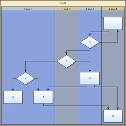
Many application areas require a presentation of data where the nodes of a diagram are organized in a tabular way, i.e., where each node is associated to a specific row and column in the grid-like structure of a table. Swimlane layouts are a popular example of such presentations. Figure 2.45, “Tabular data presentation” shows samples of tabular presentations of diagrams.
Figure 2.45. Tabular data presentation
 |
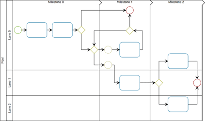 |
| Swimlane layout with four lanes from top to bottom. | A diagram following the Business Process Modeling Notation (BPMN) where swimlanes are additionally subdivided by so-called milestones. |
The yFiles diagramming library contains comprehensive support for tabular data presentation, which builds on the general concept of grouped graphs. The provided functionality covers the "look" as well as the "feel," i.e., table structures with rows and columns can be both rendered and also interactively edited. Rows and columns can be:
Furthermore, the hierarchical layout style, more precisely class IncrementalHierarchicLayouter, provides advanced support for automatic tabular layout.
The presentation of a diagram in a tabular way needs an additional element, namely a table structure to encompass the proper nodes of the diagram. This table structure is backed by a group node, and the diagram's proper nodes, i.e., the actual content nodes, need to be set up so that they are child nodes of this group node.
Using a group node to hold the content nodes brings all advantages of this concept as described in the section called “Grouping”. For example, when the group node is moved, the child nodes move accordingly, thus maintaining the visual clue that they are contained in the table group node.
The table structure, which typically shows some rows and columns within which the content nodes lie, directly results from the table model which actually defines these rows and columns.
The group node that "is behind" the table structure uses a special node style implementation to govern the actual rendering. The visualization of individual rows and columns can be conveniently achieved by using node styles.
User interaction with the table structure is supported by a specialized input mode, which makes avaliable support for resizing rows and columns, re-parenting them, or editing their labels, for example.
It is crucial to understand, however, that the content nodes of a diagram and the table structure are only loosely coupled. More precisely, the association of a content node to a row and a column is only done on a geometric basis, i.e., the node's center coordinates determine the row (column) that it belongs to. This also means that when a content node is moved, for example, the representation of the table does not change in any way.
Basically, the table model represents the blueprint for the rendering of the table structure. The table model defines the rows and columns of a table, their sizes, and in particular their nesting structure, i.e., rows (columns) may have so-called child rows (columns) to support nested row (column) structures.
Figure 2.46, “Table structure with nested rows and columns” shows a table structure with nested rows and columns. The table has two top-level rows where one consists of two child rows. Similarly, there are two top-level columns where one consists of two child columns. Note that there are no content nodes.
Figure 2.46. Table structure with nested rows and columns
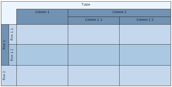 |
| Table structure with nested rows and columns. |
The table model is constituted by the types listed in Table 2.29, “Table model types”.
Table 2.29. Table model types
| Type name | Description |
|---|---|
ITable |
Provides the virtual roots of the row and column hierarchies of a table model.
The Table class is the default
implementation.
|
| IStripe |
Models common aspects of rows and columns in a table model. This includes the layout, insets, (minimum) sizes, for example, and also support for labels. |
| IRow |
Models a row in a table model. Note that IStripe is the superinterface. |
| IColumn |
Models a column in a table model. Note that IStripe is the superinterface. |
The ITable implementation provides the virtual roots of the row and column hierarchies of a table model. These allow to add top-level rows and columns, to which in turn child rows and child columns can be added to.
The area that belongs to a row (column) is determined by its height (width) as well as by its position with respect to the order of rows (columns). A row (column) spans all columns (rows) of the table structure, i.e., its width (height) is the accumulated width (height) of all columns (rows).
While the width of a row (height of a column) is determined implicitly, its height (width) can be set. This size, however, is restricted by the row's (column's) minimum size. In other words, a row (column) cannot be made smaller than its minimum size.
setSize(stripe:IStripe, newSize:Number):void |
|
| Description | Sets the preferred size for a given IStripe, i.e., the height of a row or the width of a column. |
Also, if the row (column) contains any nested child rows (columns), setting the size does not take effect, since it is implicitly constrained to the accumulated sizes of the nested rows (columns).
For the same reason the actual bounds, or layout, of a row (column) also cannot
be set explicitly.
Instead, they are determined as a result of the table structure, which means they
are calculated anew through the row's (column's) layout
property whenever necessary.
Figure 2.47. Insets in a table structure
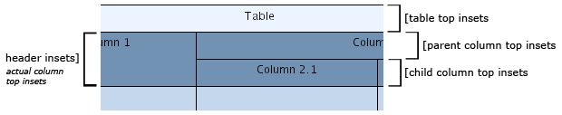 |
| Table, column, and child column insets at the top of a table structure. Similarly, insets can also be specified for the bottom, left, and right sides of the table and the rows and columns. |
From a geometric point of view, a table consists of its content area, which is determined by the geometry of its rows and columns, and the surrounding border area. The border area is determined by the table insets, and may be used to display a table description, for example.
insets:IRectangle |
|
| Description | Sets the table's insets. The insets define a border around the rows and columns of a table structure. |
Similarly, rows and columns also have a content area and a border area. The content area contains the content nodes of the row (column), respectively the content area of nested rows (colunns). The border area which is determined by corresponding row (column) insets, however, denotes both extra space outside of a row's (column's) content area as well as some padding inside the content area.
setInsets(stripe:IStripe, insets:IRectangle):void |
|
| Description | Sets insets for a given IStripe, i.e., a row or column. The insets denote extra space to the left and right of a row's content area, respectively at the top and bottom of a column's content area. The top and bottom values (row) as well as the left and right values (column) denote padding space at the inside of the content area. |
In a parent row (column), i.e., a row (column) with nested child rows (columns), the content area of the child rows (columns) lies completely within the content area of the parent row (column). The border area of the parent row (column) is to the left and right of its nested child rows (at the top and bottom of its nested child columns).
The actual insets and the actual size of a parent row (column) where nested child rows (columns) affect the parent row's (column's) preferred insets and size can be queried using the following methods:
getActualSize(item:IStripe):Number |
|
| Description | Convenience getter methods for interface IStripe to get the actual size of a row or column. |
Unless explicitly set, insets for new rows and columns are adopted from the default
values as specified by the rowDefaults/columnDefaults
provided by the ITable instance:
rowDefaults:IStripeDefaults |
|
| Description |
Properties to manage the IStripeDefaults
instances that hold default values for the rows and columns of a table structure.
Among other things, the default values also include the default insets that are
used for newly created rows and columns.
|
Creating a table model that uses the default ITable implementation class Table
goes as follows:
Example 2.43. Creating a table model
// Creating a new table model using the default ITable implementation.
var table:ITable = new Table();
To actually get a table model rendered, it needs yet two other things: a group node, to which the table model needs to be bound to, and an appropriate node style implementation that can handle table models and that is set as the group node's style.
Binding the table model to a group node means making the table model available in the group node's look-up, so that it can be queried using the look-up mechanism:
var table:ITable = groupNode.lookup(ITable) as ITable;
This is important for properly handling user interaction with a table structure, for example.
Using class TableNodeStyle,
one of the predefined ITableNodeStyle implementations,
as the node style for a group node, for example, conveniently binds a table model
to the group node as a side effect:
Example 2.44. Associating a table model with a group node
// 'groupedGraph' is of type com.yworks.graph.model.IGroupedGraph.
// 'table' is of type com.yworks.graph.model.ITable.

var tableStyle:TableNodeStyle = new TableNodeStyle(table);

// Create a top-level group node and bind, via the TableNodeStyle, the table to
// it.
groupedGraph.createGroupNode(groupedGraph.hierarchy.root, table.layout, tableStyle);
Upon initialization, a Table instance holds an empty model that has no rows or columns. Rows and columns can be created using the following Table methods:
createRow(owner:IRow, index:int, height:Number, minHeight:Number, insets:IRectangle, style:INodeStyle, tag:Object):IRow |
|
| Description | Creates a new row (column) as a child of the given IRow (IColumn). |
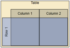
Example 2.45, “Adding rows and columns” illustrates a simple tabular presentation with two rows and columns together with its setup in code.
Example 2.45. Adding rows and columns
 |
| A minimalistic table with 2 rows and columns. |
// 'groupedGraph' is of type com.yworks.graph.model.IGroupedGraph.

// Create a new table model and set insets on the table so that the rows and
// columns stand out.
var table:ITable = new Table();
table.insets = ImmutableRectangle.create(10, 10, 10, 10);

var rdSns:ShapeNodeStyle = new ShapeNodeStyle();
rdSns.fill = new SolidColor(0.0);
table.rowDefaults.style = rdSns;

var cdSns:ShapeNodeStyle = new ShapeNodeStyle();
cdSns.fill = new SolidColor(0x8ba2dc);
table.columnDefaults.style = cdSns;

table.columnDefaults.size = table.rowDefaults.size = 30;

// Add top-level rows and columns. The table's size is then 2x2.
table.createRow();
table.createRow();
table.createColumn();
table.createColumn();

// Using TableNodeStyle to render the table structure.
var tableStyle:TableNodeStyle = new TableNodeStyle(table);
var bgSns:ShapeNodeStyle = new ShapeNodeStyle();
bgSns.fill = new SolidColor(0xf8ecc9);
tableStyle.backgroundStyle = bgSns;

// Create a top-level group node and bind, via the TableNodeStyle, the table to
// it.
groupedGraph.createGroupNode(groupedGraph.hierarchy.root, table.layout, tableStyle);
Rows and columns can be deleted using the following method defined by the ITable interface:
remove(stripe:IStripe):void |
|
| Description | Removes a given IStripe, i.e., a row or column. |
The following convenience methods support recursively deleting rows or columns and deletion followed by resizing of the remaining rows or columns:
static removeWithResize(table:ITable, stripe:IStripe):void |
|
| Description | Convenience methods for interface ITable to remove rows or columns. |
Support for Undo/Redo operations for the tables in a diagram can be easily enabled using the convenience functionality in class Table:
static registerStaticUndoSupport(graph:IGraph, undoSupport:IUndoSupport):void |
|
| Description | Undo/Redo support for tables. Uses the given IUndoSupport implementation to handle Undo/Redo operations. |
static registerDynamicUndoSupport(graph:IGraph):void |
|
| Description | Undo/Redo support for tables. The IUndoSupport implementation to handle Undo/Redo operations is retrieved from the given graph. |
Example 2.46. Enabling support for Undo/Redo operations for tables
// 'groupedGraph' is of type com.yworks.graph.model.IGroupedGraph.

if (groupedGraph != null) {
  // Enabling general undo support.
  var defaultGraph:DefaultGraph =
      groupedGraph.graph.lookup(DefaultGraph) as DefaultGraph;
  if (defaultGraph != null) {
    defaultGraph.undoEngineEnabled = true;
  }
  // Using the undo support from the graph also for all future table instances.
  Table.registerStaticUndoSupport(
      groupedGraph.graph, groupedGraph.graph.lookup(IUndoSupport) as IUndoSupport);
}
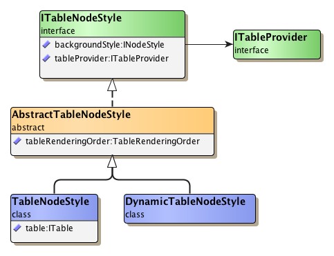
A table model's visual representation is provided by a special node style implementation
that can handle table models.
Interface ITableNodeStyle defines
the general contract for such node styles:
Class TableNodeStyle, the default
implementation of ITableNodeStyle, can be set as the style for a group node as follows:
Example 2.47. Setting a table node style with a group node
// 'groupedGraph' is of type com.yworks.graph.model.IGroupedGraph.
// 'table' is of type com.yworks.graph.model.ITable.

var tableStyle:TableNodeStyle = new TableNodeStyle(table);

// Create a top-level group node and bind, via the TableNodeStyle, the table to
// it.
groupedGraph.createGroupNode(groupedGraph.hierarchy.root, table.layout, tableStyle);
The ITable instance that is set with the TableNodeStyle instance defines the style's table model. When the TableNodeStyle instance is set as the style of a group node, this table model is used to render a table structure that has the group node's dimensions and location.
As a side effect of setting the TableNodeStyle instance as the style for a group node, the table model is also conveniently bound to the group node. This means that it is made available in the group node's look-up, so that it can be queried using the look-up mechanism:
var table:ITable = groupNode.lookup(ITable) as ITable;
This is important for properly handling user interaction with a table structure, for example.
Note that because of its table model class TableNodeStyle does not support style
sharing among multiple group nodes.
Style sharing is supported by class DynamicTableNodeStyle.
ITableNodeStyle governs the overall rendering of a table structure and allows to use a separate node style implementation to render the background behind all rows and columns:
backgroundStyle:INodeStyle |
|
| Description | Sets the node style that is used to render the background behind all rows and columns of a table structure. |
Abstract class AbstractTableNodeStyle
defines the following property to determine the rendering order of rows and columns:
tableRenderingOrder:TableRenderingOrder |
|
| Description | Sets the rendering order of the rows and column of a table structure. By default, columns are rendered first, then rows. |
The rendering order also affects the fill colors for rows and columns. Using the default rendering order, for example, neither column fill colors nor border lines can be seen for non-transparent row fill colors.
The rendering order is also taken into account for hit-testing.
The visual representation of rows and columns of a table structure is conveniently provided by INodeStyle implementations. Node styles can be associated with IStripe instances either at creation time or using the following method defined in interface ITable:
setStyle(stripe:IStripe, style:INodeStyle):void |
|
| Description | Sets the node style for an IStripe instance, i.e., the row or column of a table structure. |
The overall rendering of a table structure, which is governed by the ITableNodeStyle
implementation that is set with the group node, delegates to these row and column
node styles.
Rows and columns of a table structure can have labels whose position is determined by label models. The following methods defined in ITable can be used to add labels to IStripe instances:
addLabel(item:IStripe, text:String, labelModelParameter:ILabelModelParameter, style:ILabelStyle, preferredSize:ISize, tag:Object):ILabel |
|
| Description | Adds a label to an IStripe instance, i.e., to a row or column of a table structure. |
Class StretchStripeLabelModel
is specifically tailored to support positions for the labels of rows and columns
in a table structure.
It is used as the default label model when adding labels to an IStripe.
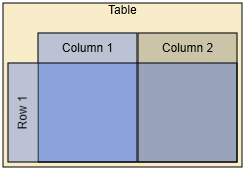
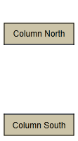
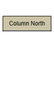
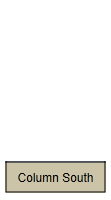
Example 2.48, “Row and column labels” illustrates labels in a tabular presentation with a single row and a single column together with their setup in code.
Example 2.48. Row and column labels
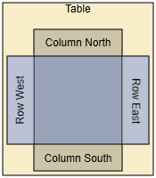 |
| Row and column labels at both ends of row and column, respectively. |
// 'groupedGraph' is of type com.yworks.graph.model.IGroupedGraph.
// 'table' is of type com.yworks.graph.model.ITable.

// Setup of row and column default insets.
table.rowDefaults.insets = ImmutableRectangle.create(30, 5, 30, 5);
table.columnDefaults.insets = ImmutableRectangle.create(5, 30, 5, 30);

// Create a single column.
var column:IColumn = table.createColumn(100);
// Add and configure two labels for the column.
table.addLabel(column, "Column North");
table.addLabel(column, "Column South", StretchStripeLabelModel.south);

// Create a single row.
var row:IRow = table.createRow(100);
// Add and configure two labels for the row.
table.addLabel(row, "Row West");
table.addLabel(row, "Row East", StretchStripeLabelModel.east);

// Using TableNodeStyle to render the table structure.
var tableStyle:TableNodeStyle = new TableNodeStyle(table);
var bgSns:ShapeNodeStyle = new ShapeNodeStyle();
bgSns.fill = new SolidColor(0xf8ecc9);
tableStyle.backgroundStyle = bgSns;

// Create a top-level group node and bind, via the TableNodeStyle, the table to
// it.
groupedGraph.createGroupNode(groupedGraph.hierarchy.root, table.layout, tableStyle);
Note that row labels that use StretchStripeLabelModel.west are automatically rotated 90 degrees counterclockwise while row labels that use StretchStripeLabelModel.east are rotated 90 degress clockwise.
Input mode class TableEditorInputMode
is a specialized controller that brings additional support for handling mouse gestures
and keyboard interaction specific to the tabular representation of a diagram.
The additional mouse gesture support covers, for example:
TableEditorInputMode can be used in conjunction with input mode GraphEditorInputMode as shown in the following code snippet, or can be used stand-alone.
Example 2.49. Enabling TableEditorInputMode to handle mouse gestures
// 'geim' is of type com.yworks.graph.input.GraphEditorInputMode.

// Sets the priority higher than for the handle input mode so that handles win
// if both gestures are possible.
geim.addConcurrent(new TableEditorInputMode(), geim.handleModePriority + 1);
Upon initialization, TableEditorInputMode creates and installs the input modes listed in Table 2.30, “Input modes used by TableEditorInputMode” as concurrent input modes. If used in conjunction with GraphEditorInputMode, the ClickInputMode, KeyboardInputMode, and TextEditorInputMode child input modes of TableEditorInputMode are disabled and the respective GraphEditorInputMode counterparts are enabled.
Table 2.30. Input modes used by TableEditorInputMode
| Type Name | Description |
|---|---|
| ResizeStripeInputMode |
Handles resizing of rows and columns. |
| ReparentStripeInputMode |
Recognizes and handles row (column) re-parenting/reordering mouse gestures. |
| ClickInputMode |
Recognizes mouse clicks, including double clicks. This child input mode is disabled, if TableEditorInputMode is used as a child input mode of GraphEditorInputMode. |
| KeyboardInputMode |
Recognizes key events. This child input mode is disabled, if TableEditorInputMode is used as a child input mode of GraphEditorInputMode. |
| StripeDropInputMode |
Handles drag'n'drop operations of nodes onto the canvas. Facilitate convenient creation of new rows and columns, including visual feedback for a user. This child input mode is disabled, if TableEditorInputMode is used as a child input mode of GraphEditorInputMode. |
| TextEditorInputMode |
Handles label editing. This child input mode is disabled, if TableEditorInputMode is used as a child input mode of GraphEditorInputMode. |
Each of the input modes can be obtained or replaced using a like-named property defined by TableEditorInputMode.
In order for TableEditorInputMode and its child input modes to properly recognize the connection between a table structure/table model and its group node, they rely on the table model being bound to the group node. The input modes query the group node's look-up and expect to find a table model:
var table:ITable = groupNode.lookup(ITable) as ITable;
Class TableEditorInputMode provides properties and callbacks that allow for fine-grained
control over the support for user interaction.
Table 2.31, “TableEditorInputMode customization” lists the customization
properties of class TableEditorInputMode.
Most of the properties support that combinations of stripe types can be specified
using the constants defined in the StripeTypes
enumeration type.
Table 2.31. TableEditorInputMode customization
| Name | Purpose |
|---|---|
| clickSelectableItems |
A combination of StripeTypes that specifies whether rows and/or columns can be selected by mouse clicks. |
| selectableItems |
A combination of StripeTypes that specifies whether rows and/or columns can be selected. |
| labelEditableItems |
A combination of StripeTypes that specifies whether labels of rows and/or columns can be edited. |
| deletableItems |
A combination of StripeTypes that specifies whether rows and/or columns can be deleted. |
| clickSelectableRegions |
A combination of StripeSubregion
that specifies the set of subregions of rows and columns that can be selected by
mouse clicks.
|
Hit-testing support in a table structure takes into account the overall rendering order of rows and columns (as defined by abstract class AbstractTableNodeStyle) as well as the complexities introduced by nested rows and columns.
By default, the specific needs for hit-testing support in a table structure are
provided by the StripeHitTestIterator
class.
The actual instance that is used is also available in the group node's look-up.
The following convenience methods in TableEditorInputMode help in finding which
part(s) of a table structure is (are) underneath a given location.
The StripeSubregionDescriptor
class encodes both the stripe, i.e., row or column, and the actual subregion within
the stripe.
findStripe(x:Number, y:Number, stripeTypes:uint, subregions:StripeSubregion, predicate:Function):StripeSubregionDescriptor |
|
| Description | Depending on the rendering order of rows and columns, returns the subregion of either a row or a column that is underneath the given location. |
findStripes(x:Number, y:Number, stripeTypes:uint, subregions:StripeSubregion, predicate:Function):Iterable |
|
| Description | Returns an ordered list of subregions of (nested) rows and columns that are underneath the given location. The ordering takes into account the rendering order of rows and columns and also the nesting of child rows (columns). |
The StripeSubregion enumeration
defines constants for the different subregions within a stripe.
Figure 2.50, “Stripe subregions in a column” depicts the default definitions of these
subregions together with their corresponding constants for the column of the table
structure in Example 2.48, “Row and column labels”.
The stripe subregions for a row are defined analogously.
Figure 2.50. Stripe subregions in a column
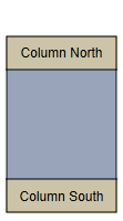 |
 |
 |
 |
|
The column's STRIPE
subregion,
|
HEADER
subregion,
|
LEADING_HEADER
subregion,
|
and TRAILING_HEADER
subregion.
|
The hit-testing for the subregions can be handled through dedicated IHitTestable
implementations.
The IStripeHitTestHelper interface
bundles all stripe-related IHitTestable instances and makes the default implementations
conveniently accessible.
Automatic layout for a diagram containing table structures that are modeled using ITable implementations can be conveniently invoked using class LayoutExecutor, which performs all necessary setup. Internally, LayoutExecutor uses the TableLayoutConfigurator class.
Example 2.50. Using LayoutExecutor for automatic layout of table structures
// 'graphCanvas' is of type com.yworks.ui.GraphCanvasComponent.

// Configure IncrementalHierarchicLayouter.
var ihl:IncrementalHierarchicLayouter = new IncrementalHierarchicLayouter();
ihl.componentLayouterEnabled = false;
ihl.layoutOrientation = LayoutOrientation.LEFT_TO_RIGHT;
ihl.orthogonalRouting = true;
ihl.recursiveGroupLayering = false;
SimplexNodePlacer(ihl.nodePlacer).baryCenterMode = true;

// Start layout.
try {
  var layoutExecutor:LayoutExecutor = new LayoutExecutor(graphCanvas, ihl);
  layoutExecutor.configureTableNodeLayout = true;
  layoutExecutor.duration = 500;
  layoutExecutor.updateContentRect = true;
  layoutExecutor.tableLayoutConfigurator.compactionEnabled = false;
  layoutExecutor.start();
}
catch (exception:Error) {
  trace(exception);
}
TableLayoutConfigurator converts relevant parts of the table structure into PartitionGrid-based information that is understood by IncrementalHierachicLayouter which supports automatic tabular layout. In particular, this information includes:
Note that the row and column is determined geometrically, by the node's center coordinates.
|
Copyright ©2007-2015, yWorks GmbH. All rights reserved. |